 Indietro
Scatterplots, Correlation, and Regression: Exploring Relationships in Data
Guida di studio - Note intelligenti
 Appunti personalizzati basati sui tuoi materiali, ampliati con definizioni chiave, esempi e contesto.
Scatterplots, Correlation, and Regression
Introduction
This section explores how to analyze paired quantitative data using graphical and numerical methods. The focus is on understanding the relationship between two variables through scatterplots, correlation, and regression analysis. These tools are essential for identifying patterns, measuring the strength of associations, and making predictions based on data.
Scatterplots and Correlation
A scatterplot (or scatter diagram) is a graphical representation of paired data, where each point represents an observation with two quantitative variables. The horizontal axis (x-axis) typically represents the independent variable, while the vertical axis (y-axis) represents the dependent variable.
Correlation exists when the values of one variable are associated with the values of another variable.
Linear correlation occurs when the pattern of points can be approximated by a straight line.
Scatterplots help visually assess whether a correlation exists and its direction (positive, negative, or none).
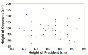
Example: A scatterplot of the heights of presidents and their main opponents shows no distinct pattern, indicating no correlation between the two variables.
Linear Correlation Coefficient (r)
The linear correlation coefficient, denoted by r, measures the strength and direction of the linear relationship between two variables. Its value ranges from -1 to 1:
If r is close to 1: strong positive linear correlation.
If r is close to -1: strong negative linear correlation.
If r is close to 0: little or no linear correlation.
Formula for r:
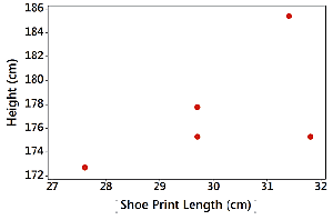
Example: A scatterplot of shoe print lengths and heights for a small sample shows a moderate positive correlation (r = 0.591).
P-Value in Correlation Analysis
The P-value in correlation analysis tests the hypothesis that there is no linear correlation between two variables. It represents the probability of obtaining a correlation coefficient as extreme as the observed value, assuming no actual correlation exists.
A small P-value (typically ≤ 0.05) suggests the observed correlation is unlikely due to chance, supporting the existence of a linear correlation.
A large P-value indicates insufficient evidence to conclude a linear correlation exists.
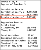
Example: For a sample with r = 0.591, the P-value is 0.294, which is not small enough to conclude a significant linear correlation.
Interpreting Larger Samples
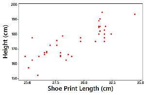
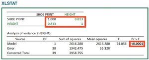
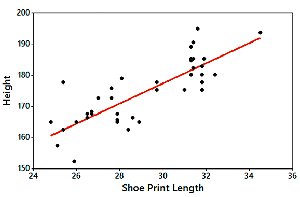
With larger samples, patterns become clearer and statistical evidence stronger. For example, a scatterplot of shoe print lengths and heights for n = 40 shows a distinct positive pattern, with r = 0.813 and a P-value < 0.0001, indicating a strong, statistically significant linear correlation.
Regression Analysis
Regression is the process of finding the equation of the line that best fits the scatterplot of paired data. This line is called the regression line or least-squares line. The regression equation is:
\( b_0 \): y-intercept of the regression line
\( b_1 \): slope of the regression line
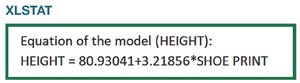
Example: For the shoe print and height data, the regression equation is:
The regression line can be plotted on the scatterplot to visualize the best-fit relationship.
Summary Table: Correlation and Regression Interpretation
Statistic | Interpretation |
|---|---|
r close to 1 | Strong positive linear correlation |
r close to -1 | Strong negative linear correlation |
r close to 0 | No linear correlation |
P-value ≤ 0.05 | Statistically significant correlation |
P-value > 0.05 | Not enough evidence for correlation |
Regression equation | Predicts y from x using best-fit line |
Key Takeaways
Scatterplots are essential for visualizing relationships between two quantitative variables.
The linear correlation coefficient (r) quantifies the strength and direction of a linear relationship.
P-values help determine the statistical significance of observed correlations.
Regression analysis provides an equation for predicting one variable from another based on the best-fit line.
