 Indietro
Step-by-Step Guidance for Practice Midterm Exam – Introductory Statistics
Guida di studio - Note intelligenti
 Appunti personalizzati basati sui tuoi materiali, ampliati con definizioni chiave, esempi e contesto.
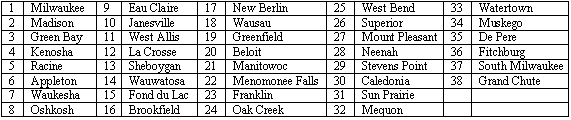
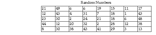
Q20. Select a random sample of four cities from the list below using the two-digit list of random numbers provided. Begin with the uppermost left random number and proceed down each column. When a column is complete, use the numbers at the top of the next right column and proceed down that column.
Background
Topic: Random Sampling
This question tests your understanding of how to use a random number table to select a simple random sample from a list of items (cities).
Key Terms and Concepts:
Simple Random Sample: Every item in the population has an equal chance of being selected.
Random Number Table: A tool used to ensure randomness in selection.
Step-by-Step Guidance
Number each city in the list from 1 to 38, matching the order in the table.
Start with the first random number in the table (top left) and proceed down the column, then move to the next column to the right.
For each random number, check if it corresponds to a valid city number (1–38). If so, select that city. If not, skip it and move to the next random number.
Continue this process until you have selected four unique cities. Do not select the same city twice.
Record the names of the four cities corresponding to the first four valid random numbers.
Try solving on your own before revealing the answer!
Final Answer: Manitowoc, La Crosse, Franklin, Oshkosh
The first four valid random numbers (in the range 1–38) are 21, 12, 23, and 8. These correspond to Manitowoc, La Crosse, Franklin, and Oshkosh, respectively.
This demonstrates the use of a random number table to select a simple random sample from a population.
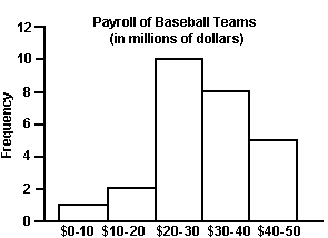
Q26. Approximately what percentage of the payrolls were in the $30-$40 million range? Round to the nearest whole percent.
Background
Topic: Frequency Distribution and Percentages
This question tests your ability to interpret a histogram and calculate the percentage of data values within a specified range.
Key Terms and Formulas:
Frequency: The number of occurrences in a given class interval.
Percentage:
Step-by-Step Guidance
Identify the frequency for the $30-$40 million range from the histogram.
Find the total frequency by summing the frequencies for all payroll ranges.
Set up the formula:
Plug in the values for frequency and total frequency, but do not calculate the final percentage yet.
Try solving on your own before revealing the answer!
Final Answer: 31%
There are 8 teams in the \frac{8}{26} \times 100 \approx 31\%$.
This shows how to use a frequency distribution to determine the percentage of data in a specific interval.
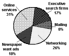
Q28. Construct a pie chart for the data. Label each category with its percentage.
Background
Topic: Pie Charts and Relative Frequency
This question tests your ability to represent categorical data visually using a pie chart and to calculate percentages for each category.
Key Terms and Formulas:
Pie Chart: A circular chart divided into sectors representing categories.
Percentage:
Step-by-Step Guidance
Sum the frequencies for all job sources to find the total number of respondents.
For each category, calculate the percentage using the formula above.
Draw a pie chart, dividing it into sectors proportional to each category's percentage.
Label each sector with the job source and its percentage.
Try solving on your own before revealing the answer!
Final Answer: Pie chart with percentages
The pie chart shows: Online services 31%, Networking 26%, Newspaper want ads 18%, Executive search firms 17%, Mailings 8%.
Each sector is labeled with its category and percentage, visually representing the data.
Q32. Construct a dot plot for the data: The local police, using radar, checked the speeds (in mph) of 30 motorists at a busy intersection.
Background
Topic: Dot Plots
This question tests your ability to construct and interpret a dot plot, which is a simple graphical display of data values.
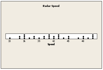
Key Terms and Concepts:
Dot Plot: A graphical display where each data value is represented by a dot above its value on a number line.
Step-by-Step Guidance
List all the speed values and identify the range (minimum and maximum values).
Draw a number line covering the range of speeds.
For each speed value, place a dot above the corresponding value on the number line. Stack dots vertically if values repeat.
Continue until all 30 data points are plotted.
Try solving on your own before revealing the answer!
Final Answer: Dot plot as shown
The dot plot displays the distribution of radar speeds, with each dot representing a motorist's speed. This helps visualize the spread and frequency of the data.
