 Indietro
Data Types, Graphs, Charts, and Tables—Describing Your Data
Guida di studio - Note intelligenti
 Appunti personalizzati basati sui tuoi materiali, ampliati con definizioni chiave, esempi e contesto.
Data Types and Data Measurement Levels
Understanding Data Types
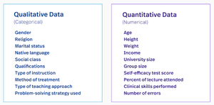
Data in business statistics can be classified into two main types: quantitative and qualitative. Recognizing the type of data is essential for selecting appropriate statistical methods and graphical representations.
Quantitative Data: Numerical values that represent counts or measurements. Examples include age, income, weight, and test scores.
Qualitative Data: Categorical values that describe attributes or characteristics. Examples include gender, marital status, and type of instruction.
Time-Series vs. Cross-Sectional Data
Data can also be classified based on how and when it is collected:
Time-Series Data: Observations collected at successive points in time (e.g., monthly sales figures).
Cross-Sectional Data: Observations collected at a single point in time (e.g., survey responses from different individuals in one year).
Levels of Data Measurement
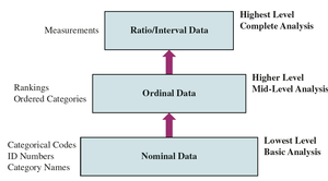
The level of measurement determines the mathematical operations that can be performed on data and the statistical techniques that are appropriate.
Nominal: Categories with no inherent order (e.g., marital status, college name).
Ordinal: Categories with a meaningful order but not equal intervals (e.g., rankings, satisfaction levels).
Interval: Ordered categories with equal intervals but no true zero (e.g., temperature in Celsius).
Ratio: Ordered categories with equal intervals and a true zero (e.g., weight, income).
Example: Categorizing Data
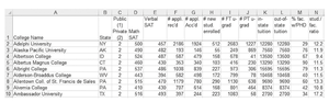
Consider a dataset of U.S. colleges and universities. Variables such as college name and state are qualitative (nominal), while variables like SAT scores and tuition are quantitative (ratio).

Frequency Distributions and Histograms
Frequency Distribution
A frequency distribution summarizes data by displaying the number of observations in each category or class. This is useful for both discrete and continuous data.
Discrete Data: Data that can take on a countable number of values (e.g., number of trips).
Continuous Data: Data that can take any value within an interval (e.g., weight, time).
Relative Frequency Distribution
The relative frequency is the proportion of observations in each category, calculated as:
Example: Frequency and Relative Frequency Distributions
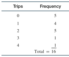
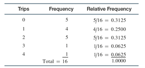
Suppose a survey of 16 city employees records the number of ride-sharing trips taken in a month. The frequency and relative frequency distributions are shown below:
Constructing Frequency Distributions in Excel
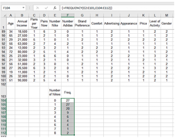
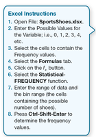
Excel can be used to efficiently create frequency distributions using the FREQUENCY function. This is especially useful for large datasets.
Grouped Data Frequency Distributions
For continuous data, values are grouped into classes. Criteria for classes include:
Mutually exclusive (no overlap)
All-inclusive (cover all possible values)
Equal width (if possible)
No empty classes (if possible)
Example: Frequency Distribution for Continuous Variables
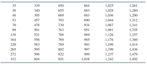
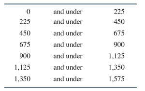
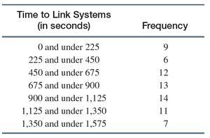
Suppose the time to link emergency communication systems in 72 cities is recorded. The data are grouped into classes, and frequencies are calculated:
Histograms
Understanding Histograms
A histogram is a graphical representation of a frequency distribution for quantitative data. It helps visualize the center, spread, and shape of the data distribution.
The horizontal axis shows the classes (intervals).
The vertical axis shows the frequency or relative frequency.
Examples of Histograms
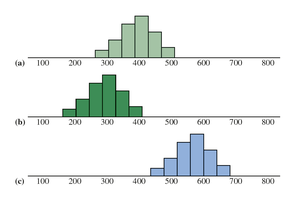
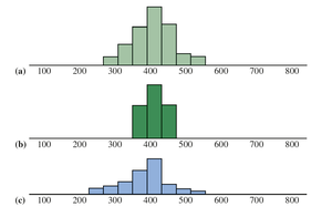
Histograms can illustrate differences in the center and spread of data distributions.
Bar Charts, Pie Charts, and Stem-and-Leaf Diagrams
Bar Charts
A bar chart is used to display categorical data. Each bar represents a category, and its height corresponds to the frequency or percentage of observations.
Bars can be vertical or horizontal.
Multiple variables can be displayed on the same chart for comparison.
Pie Charts
A pie chart is a circular graph divided into slices, where each slice represents a category's proportion of the total.
Stem-and-Leaf Diagrams
A stem-and-leaf diagram displays quantitative data while preserving individual data values. It is similar to a histogram but provides more detail.
Line Charts, Scatter Diagrams, and Pareto Charts
Line Charts
A line chart is used to display data points over time, showing trends and patterns. The horizontal axis typically represents time, while the vertical axis represents the variable of interest.
Scatter Diagrams
A scatter diagram (or scatter plot) displays the relationship between two quantitative variables. Each point represents a pair of values. The dependent variable is plotted on the y-axis, and the independent variable on the x-axis.
Pareto Charts
A Pareto chart is a special type of bar chart where categories are ordered from highest to lowest frequency. It is commonly used in quality control to identify the most significant factors in a dataset (the 80-20 rule).
Summary Table: Data Types and Measurement Levels
Level | Description | Examples |
|---|---|---|
Nominal | Categories with no order | Gender, State, College Name |
Ordinal | Ordered categories | Rankings, Satisfaction Level |
Interval | Ordered, equal intervals, no true zero | Temperature (Celsius) |
Ratio | Ordered, equal intervals, true zero | Weight, Income, SAT Scores |
