 Indietro
Descriptive Statistics for Business: Central Tendency, Variability, and Association
Guida di studio - Note intelligenti
 Appunti personalizzati basati sui tuoi materiali, ampliati con definizioni chiave, esempi e contesto.
Chapter 3: Calculating Descriptive Statistics
3.1 Measures of Central Tendency
Measures of central tendency are statistical values that describe the center or typical value of a dataset. The three main measures are the mean, median, and mode. These measures help summarize large sets of data with a single representative value.
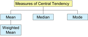
Mean: The arithmetic average, calculated by summing all values and dividing by the number of observations.
Median: The middle value when data are arranged in ascending order; divides the dataset into two equal halves.
Mode: The value that appears most frequently in the dataset; useful for categorical data.
Weighted Mean: A mean where each value is assigned a specific weight, reflecting its importance.
Formulas:
Sample Mean:
Population Mean:
Weighted Mean:
Advantages and Disadvantages:
Mean: Simple to calculate but sensitive to outliers.
Median: Not affected by outliers; better for skewed distributions.
Mode: Useful for categorical data; may not exist or may not be unique.
Choosing the Appropriate Measure: Use the mean for symmetric distributions without outliers, the median for skewed distributions or when outliers are present, and the mode for categorical data.
Distribution Shapes
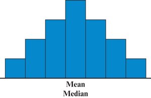
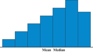
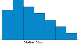
The relationship between the mean and median helps describe the shape of a distribution:
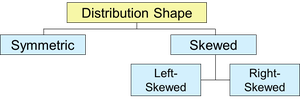
Symmetric: Mean = Median
Left-Skewed: Mean < Median
Right-Skewed: Median < Mean
Using Excel for Central Tendency
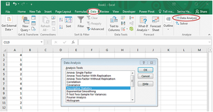
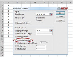
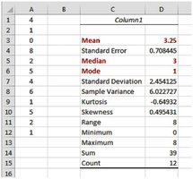
Excel provides functions such as AVERAGE, MEDIAN, and MODE to calculate these measures. The Data Analysis Toolpak can also generate descriptive statistics.
3.2 Measures of Variability
Measures of variability describe the spread or dispersion of data values. They help us understand how much the data values differ from each other and from the central tendency.
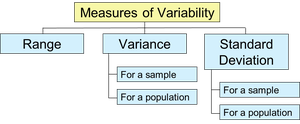
Range: The difference between the highest and lowest values.
Variance: The average of the squared differences from the mean.
Standard Deviation: The square root of the variance; expresses variability in the same units as the data.
Formulas:
Sample Variance:
Sample Standard Deviation:
Population Variance:
Population Standard Deviation:
Excel Output Example:
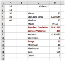
3.3 Using the Mean and Standard Deviation Together
The mean and standard deviation are often used together to describe the center and spread of a dataset. The standard deviation is a key measure of consistency and is widely used in quality control and business applications.
z-Score: Indicates how many standard deviations a value is from the mean. Useful for identifying outliers and comparing values from different distributions.
Formulas:
Population z-score:
Sample z-score:
Empirical Rule: For bell-shaped (normal) distributions:
68% of values fall within 1 standard deviation of the mean
95% within 2 standard deviations
99.7% within 3 standard deviations
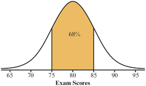
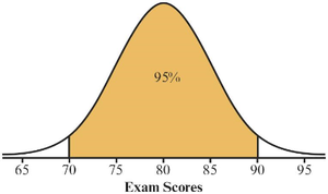
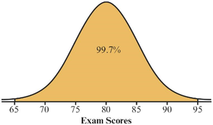
Chebyshev’s Theorem: Applies to any distribution shape. At least of values fall within z standard deviations of the mean for .
3.5 Measures of Relative Position
Measures of relative position indicate the location of a value within a dataset relative to other values. Common measures include percentiles and quartiles.
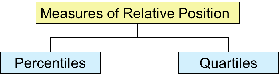
Percentiles: The pth percentile is the value below which p% of the data fall.
Quartiles: Divide the data into four equal parts (Q1, Q2, Q3). Q2 is the median.
Interquartile Range (IQR): The range of the middle 50% of values, .
Five-Number Summary: Minimum, Q1, Median (Q2), Q3, Maximum.
3.6 Measures of Association Between Two Variables
These measures describe the relationship between two quantitative variables. The two main statistics are covariance and the correlation coefficient.
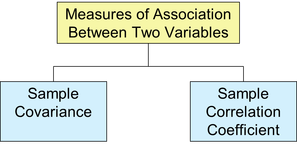
Sample Covariance (sxy): Indicates the direction of the linear relationship between two variables.
Sample Correlation Coefficient (r): Measures both the strength and direction of the linear relationship. Values range from -1 (perfect negative) to +1 (perfect positive).
Formulas:
Sample Covariance:
Sample Correlation Coefficient:
Interpretation of r:
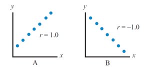
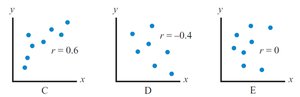
r = 1: Perfect positive linear relationship
r = -1: Perfect negative linear relationship
r = 0: No linear relationship
Excel Functions: Use COVARIANCE.S for sample covariance, COVARIANCE.P for population covariance, and CORREL for the correlation coefficient.
