 Indietro
Displaying and Describing Quantitative Data: Study Notes for Business Statistics
Guida di studio - Note intelligenti
 Appunti personalizzati basati sui tuoi materiali, ampliati con definizioni chiave, esempi e contesto.
Displaying and Describing Quantitative Data
Visualizing Quantitative Variables
Quantitative data, such as monthly average stock prices, are often difficult to interpret when presented in tables. Visualizing this data using graphs clarifies patterns and trends, making it easier to analyze distributions and draw conclusions.
Tables provide raw values but can obscure trends.
Graphs (such as histograms) reveal the shape, center, and spread of the data.
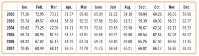
Example: The table below shows monthly average stock prices for AIG from 2002 to 2007.
Year | Jan. | Feb. | Mar. | Apr. | May | June | July | Aug. | Sept. | Oct. | Nov. | Dec. |
|---|---|---|---|---|---|---|---|---|---|---|---|---|
2002 | 77.26 | 72.95 | 73.72 | 71.57 | 68.42 | 65.99 | 61.42 | 64.10 | 60.26 | 65.03 | 65.03 | 59.96 |
2003 | 59.74 | 49.57 | 49.41 | 54.38 | 56.92 | 57.88 | 58.61 | 59.39 | 60.93 | 58.73 | 62.37 | 62.37 |
2004 | 63.73 | 72.06 | 74.21 | 70.31 | 72.61 | 66.60 | 60.57 | 63.21 | 62.17 | 65.32 | 65.32 | 65.32 |
2005 | 65.74 | 66.15 | 51.77 | 53.31 | 59.66 | 66.67 | 60.54 | 62.05 | 63.81 | 66.21 | 66.21 | 66.21 |
2006 | 83.33 | 61.55 | 61.77 | 61.77 | 59.49 | 59.49 | 59.49 | 59.49 | 59.49 | 59.49 | 59.49 | 21.36 |
2007 | 70.45 | 68.99 | 68.14 | 66.25 | 71.78 | 71.75 | 68.64 | 65.21 | 66.62 | 66.12 | 58.13 | 58.13 |
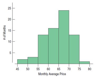
Histograms are used to visualize quantitative variables by grouping values into bins and counting the number of cases in each bin.
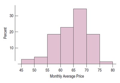
Relative Frequency Histograms display the percentage of cases in each bin, providing a normalized view of the distribution.
Describing Distributions
When analyzing a distribution, it is important to describe its shape, center, and spread. These characteristics help summarize the data and guide further statistical analysis.
Shape: Modes, symmetry, and outliers/gaps.
Center: Mean and median.
Spread: Range, interquartile range (IQR), and standard deviation.
Shape: Modes
The mode of a distribution is the value or values that appear most frequently. Distributions can be:
Unimodal: One main peak.
Bimodal: Two peaks.
Multimodal: Three or more peaks.
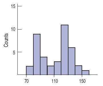
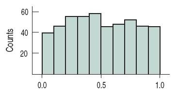
A uniform distribution has no clear mode, with all bars approximately the same height.
Shape: Symmetry
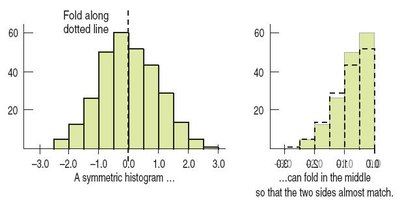
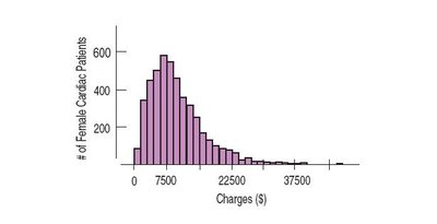
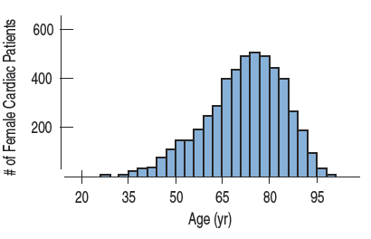
A distribution is symmetric if the halves on either side of the center are mirror images. The thinner ends are called tails. If one tail is longer, the distribution is skewed to that side.
Skewed right: Tail stretches farther to the right.
Skewed left: Tail stretches farther to the left.
Shape: Outliers
Outliers are values that stand apart from the main body of the distribution. They can affect statistical methods, may indicate errors, or provide important information. Always discuss outliers in your analysis.
Shape: Summary
Characterizing shape is often a judgment call.
Understand the data and its collection method.
Consider the questions you hope to answer.
Shape: Example
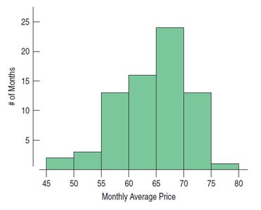
For the AIG stock price data, the histogram below helps describe the shape of the distribution.
Center
The mean is the arithmetic average, calculated as:
Mean: Sensitive to outliers and skewed distributions.
Median: The middle value, resistant to outliers and skew.
If the distribution is symmetric, mean and median are close.
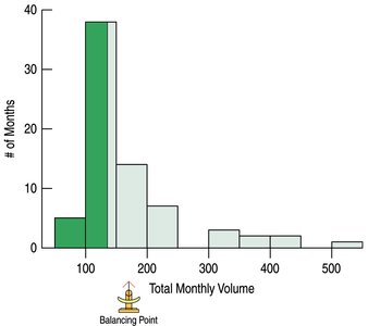
Example: For AIG trading volume, the mean is 170.1 million shares, and the median is 135.9 million shares.
Spread of the Distribution
Spread measures how much the data varies. Common measures include:
Range: Difference between maximum and minimum values.
Interquartile Range (IQR): Difference between the upper (Q3) and lower (Q1) quartiles.
Standard Deviation: Measures average distance from the mean.
Variance: Average squared deviation from the mean.
Note: Use median and IQR for skewed distributions; mean and standard deviation for symmetric distributions.
Summary: Choosing Measures
Skewed: Use median and IQR.
Unimodal and Symmetric: Use mean and standard deviation (possibly median and IQR as well).
Multiple Modes: Consider splitting data into groups.
Unusual Observations: Report statistics with and without outliers.
Always pair: Median with IQR, mean with standard deviation.
Standardizing Variables
Standardizing allows comparison between different variables by expressing values in terms of standard deviations from the mean. The z-score is calculated as:
Interpretation: A z-score tells how many standard deviations a value is from the mean.
Example: Comparing house prices and sizes using z-scores to determine which is more unusual.
For a z = \frac{340,000 - 175,000}{55,000} = 3.0$
For a 5000 sq. ft. house:
The 5000 sq. ft. house is more unusual because its z-score is farther from the mean.
Additional info: Standardization is essential for comparing variables measured on different scales, such as price and size.
