 Indietro
Displaying Descriptive Statistics: Study Notes for Business Statistics II
Guida di studio - Note intelligenti
 Appunti personalizzati basati sui tuoi materiali, ampliati con definizioni chiave, esempi e contesto.
Displaying Descriptive Statistics
Introduction
Descriptive statistics are essential tools in business statistics for summarizing, organizing, and presenting data. This chapter focuses on methods for displaying both quantitative and qualitative data, enabling effective interpretation and decision-making. The main objectives include constructing frequency distributions, histograms, polygons, ogives, bar charts, pie charts, contingency tables, and understanding their applications.
Quantitative Data Display
Frequency Distribution
A frequency distribution is a table that shows the number of data observations that fall into specific intervals or classes. It helps to organize raw data into meaningful groups.
Steps to Construct:
List all data in ascending order.
Determine the number of classes using the rule: (where is the number of data points and is the number of classes).
Calculate class width:
Set class boundaries.
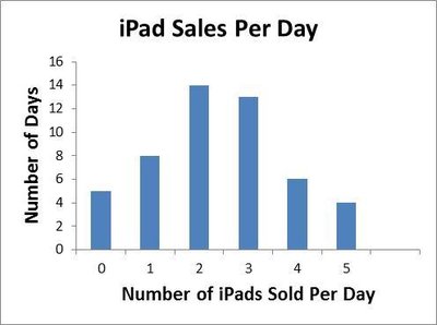
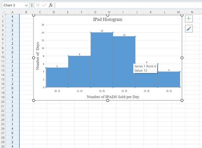
Example: Number of iPads sold per day over 50 days.
Relative Frequency Distribution
A relative frequency distribution displays the proportion of observations in each class relative to the total number of observations.
Formula:
Example: If 3 iPads were sold on 13 days out of 50, relative frequency is .
Cumulative Relative Frequency Distribution
A cumulative relative frequency distribution totals the proportion of observations that are less than or equal to the class at which you are looking.
Formula:
Example: 3 iPads or less were sold on 80% of business days.
Histogram
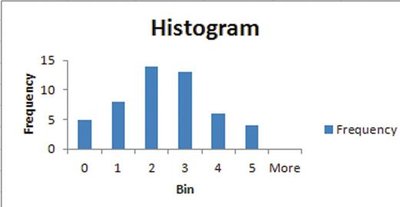
A histogram is a bar graph showing the number of observations in each class, with the height of each bar representing frequency.
Used for quantitative data.
Bars touch each other, indicating continuous data.
Shapes: symmetric, left-skewed, right-skewed, U-shaped.
Polygon and Ogive
A polygon graphs the midpoint of each class as a line, while an ogive represents cumulative frequencies for the classes.
Polygon: Connects points representing class midpoints and frequencies.
Ogive: Useful for identifying medians and percentiles.
Stem and Leaf Display
A stem and leaf display splits data values into stems (larger place values) and leaves (smaller place values), graphically describing the distribution while preserving original data values.
Example: Exam scores, ages, etc.
Scatter Plot
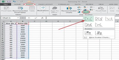
A scatter plot provides a visual representation of the relationship between two quantitative variables. The dependent variable is placed on the vertical axis, and the independent variable on the horizontal axis.
Used to identify correlation and trends.
Line Chart
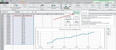
A line chart connects data points in a scatter plot with a line, often used to show changes over time.
Example: Annual revenue trends.
Qualitative Data Display
Frequency Distribution for Qualitative Data
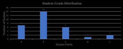
Frequency distributions can also be constructed for qualitative (categorical) data, such as grades or survey responses.
Shows counts and proportions for each category.
Bar Chart
A bar chart is used to display qualitative data organized in categories. Bars can be arranged vertically or horizontally.
Useful for comparing frequencies or proportions across categories.
Pareto Chart
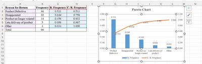
A Pareto chart is a bar chart that displays categories in descending order of frequency, often used in quality control to identify major causes of problems.
Includes cumulative frequency line.
Pie Chart
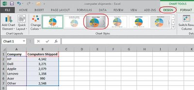
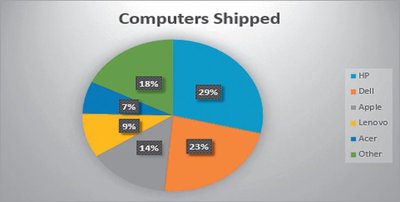
A pie chart is an excellent tool for comparing proportions for qualitative data. Each slice represents a category's proportion of the total.
Useful for visualizing market share, survey results, etc.
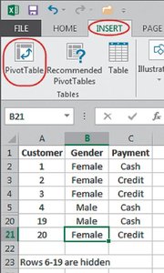
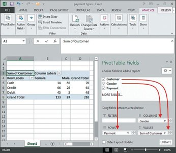
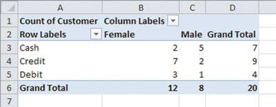
Contingency Table
A contingency table displays the frequencies of two qualitative variables, showing the breakdown of one variable in terms of another.
Used to analyze relationships between categorical variables.
Can be extended to show relative frequencies, column percentages, and row percentages.
Excel Applications for Descriptive Statistics
Activating Excel's Data Analysis ToolPak
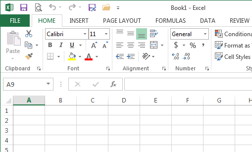
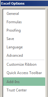
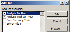
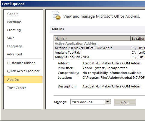
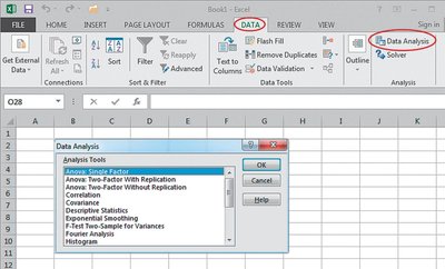
Microsoft Excel provides built-in options for data presentation and statistical analysis. The Analysis ToolPak add-in must be activated to access these features.
Steps: Open Excel > File > Options > Add-Ins > Manage Excel Add-ins > Go > Check Analysis ToolPak > OK.
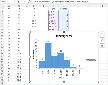
Constructing Frequency Tables and Histograms in Excel
Use the FREQUENCY function:
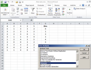
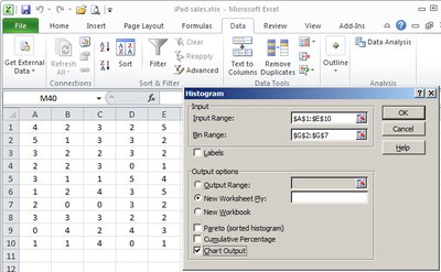
Use Data Analysis > Histogram for graphical representation.
Summary Table: Descriptive Statistics Tools
Statistics Tool | Variable Type | Main Objective |
|---|---|---|
Frequency Tables | Quantitative/Qualitative | Constructs a frequency table |
Histogram | Quantitative | Displays variable distribution |
Scatter Plot | Quantitative | Examines relationship between two quantitative variables |
Line Chart | Quantitative | Shows change in variable over time |
Bar Chart | Qualitative | Compares values of variables |
Pie Chart | Qualitative | Compares values of variables |
Contingency Table | Qualitative | Shows breakdown of variable values in terms of other variables |
Key Formulas
Relative Frequency:
Cumulative Relative Frequency:
Class Width:
Number of Classes:
Conclusion
Displaying descriptive statistics is fundamental for business decision-making. By mastering frequency distributions, histograms, bar charts, pie charts, contingency tables, and their construction in Excel, students can effectively summarize and interpret both quantitative and qualitative data.
