 Indietro
Statistical Thinking and Methods for Describing Data
Guida di studio - Note intelligenti
 Appunti personalizzati basati sui tuoi materiali, ampliati con definizioni chiave, esempi e contesto.
Statistical Thinking in Business Analytics
Introduction to Statistical Thinking
Statistical thinking is fundamental in business analytics, enabling organizations to make informed decisions based on data. It involves recognizing that variation exists in populations and processes, and applying rational, scientific methods to critically assess data and inferences.
Business Analytics: Uses statistical methods to extract useful information from data for better decision-making.
Statistical Thinking: Applies rational thought and statistical science to evaluate data and conclusions.
Variation: Recognizes that data from populations and processes are not identical, but vary.
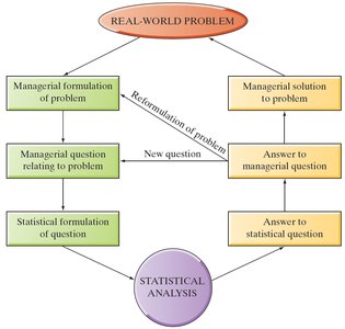
Statistical Analysis Process
The process of statistical analysis in business often follows a structured approach, such as the DMAIC cycle (Define, Measure, Analyze, Improve, Control), which is central to methodologies like Six Sigma.
Define: Identify the real-world problem.
Measure: Collect relevant data.
Analyze: Use statistical methods to interpret data.
Improve: Implement solutions based on analysis.
Control: Monitor outcomes to ensure improvements are sustained.
Data Collection and Types of Studies
Methods of Data Collection
Data can be collected in several ways, each with its own strengths and limitations.
Published Source: Uses historical or existing data (e.g., government databases).
Observational Study: Observes individuals and measures variables without influencing responses.
Designed Experiment: Imposes treatments and observes responses to determine causality.
Types of Samples
Sampling is crucial for obtaining representative data from a population.
Voluntary Response Sample: Individuals choose to participate; often biased.
Simple Random Sample (SRS): Every individual has an equal chance of being selected; unbiased.
Stratified Random Sample: Population divided into strata, and SRS taken from each stratum.
Cluster Sample: Randomly select groups (clusters) and sample all individuals within selected clusters.
Multistage Random Sample: Selects smaller groups in stages, possibly using different sampling methods at each stage.
Sampling Bias and Problems
Even with random selection, bias can occur due to:
Undercoverage: Some groups are left out of the sampling process.
Nonresponse: Selected individuals do not participate.
Response Bias: Responses are influenced by interviewer or respondent behavior.
Poorly Worded Questions: Confusing or leading questions affect responses.
Describing Data with Tables and Graphs
Qualitative (Categorical) Data
Qualitative data categorizes cases into groups. The distribution of a qualitative variable lists categories and their frequencies (counts or percentages).
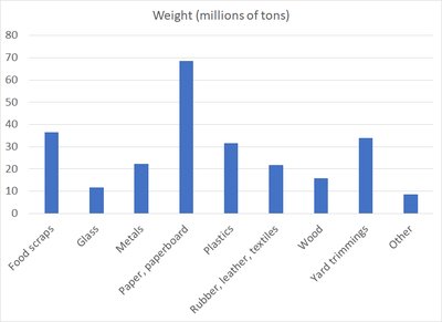
Bar Graph: Displays frequencies for each category; bars do not touch.
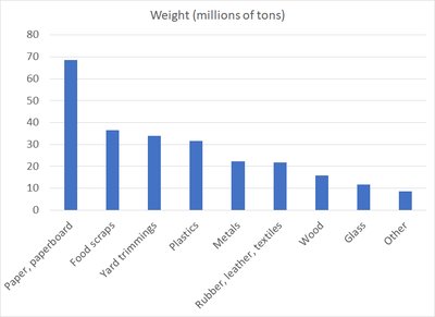
Pareto Chart: Bar graph with categories ordered from highest to lowest frequency.
Pie Chart: Shows proportions of categories as slices of a circle.
Example: American Solid Waste Breakdown
Material | Weight (millions of tons) | Percent of Total (%) |
|---|---|---|
Food scraps | 36.4 | 14.5 |
Glass | 11.6 | 4.6 |
Metals | 22.4 | 8.9 |
Paper, paperboard | 68.6 | 27.4 |
Plastics | 31.7 | 12.7 |
Rubber, leather, textiles | 21.8 | 8.7 |
Wood | 15.8 | 6.3 |
Yard trimmings | 34.0 | 13.5 |
Other | 8.5 | 3.4 |
Total | 250.9 | 100.0 |
Quantitative Data
Quantitative variables are numerical and can be discrete (countable) or continuous (measurable). Several graphical methods are used to describe their distribution.
Stem-and-Leaf Display: Separates numbers into stems and leaves; useful for small data sets.
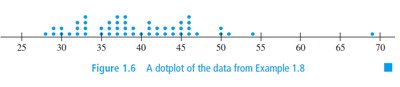
Dotplot: Each observation is a dot above its value; shows location, spread, and gaps.
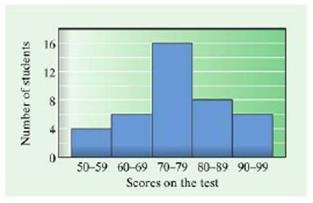
Histogram: Groups data into bins; frequency of each bin is shown as a bar.
Boxplot: Summarizes data using quartiles and median (see later sections).
Dotplot Example
Histograms
Histograms are ideal for large data sets and continuous variables.
Bins: Data grouped into intervals (bins) of equal width.
Frequency: Number of observations in each bin.
Bars: Bars touch each other, representing continuous data.
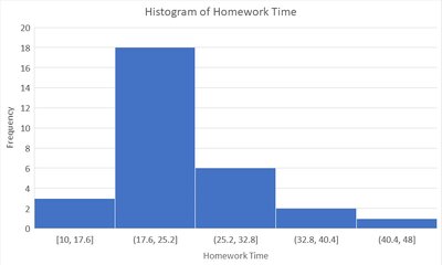
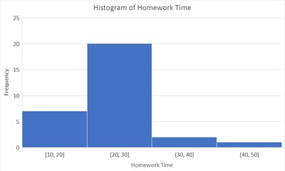
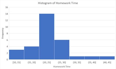
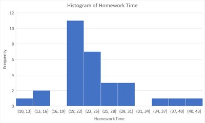
Bin Width: Choice of bin width affects the appearance and interpretability of the histogram.
Homework Time Histogram Examples
Building a Histogram
Lower Class Limit: Smallest value in a class.
Upper Class Limit: Largest value in a class.
Class Width: Difference between consecutive lower class limits.
Formula for Class Width:
Number of Classes: Typically between 5 and 20, depending on data size.
Interpreting Histograms
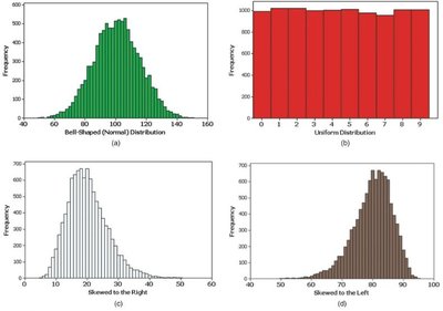
The overall pattern of a histogram is determined by:
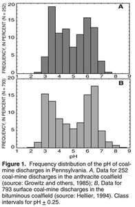
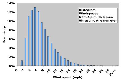
Shape: Number of peaks, symmetry, skewness.
Center: Mean, median, mode.
Spread: Range, interquartile range, variance, standard deviation.
Summary Table: Types of Data and Graphs
Type of Data | Graphical Method | Purpose |
|---|---|---|
Qualitative (Categorical) | Bar Graph, Pie Chart, Pareto Chart | Show frequency or proportion of categories |
Quantitative (Discrete/Continuous) | Stem-and-Leaf, Dotplot, Histogram, Boxplot | Show distribution, spread, and central tendency |
Key Terms and Definitions
Population: The entire group of individuals or cases of interest.
Sample: A subset of the population selected for study.
Parameter: A numerical summary of a population.
Statistic: A numerical summary of a sample.
Bias: Systematic error in sampling or measurement.
Distribution: The way values or categories are spread in a data set.
Conclusion
Understanding statistical thinking, data collection methods, and graphical techniques for describing data is foundational for business statistics. These concepts enable students to critically analyze data, identify patterns, and make informed decisions in business contexts. Additional info: Academic context was added to clarify definitions, examples, and the purpose of graphical methods.
