 Indietro
Chapter 4: Correlation, Regression, and Contingency Tables in Introductory Statistics
Guida di studio - Note intelligenti
 Appunti personalizzati basati sui tuoi materiali, ampliati con definizioni chiave, esempi e contesto.
Scatter Diagrams and Correlation
Univariate vs. Bivariate Data
Statistical analysis often distinguishes between univariate and bivariate data. Univariate data involves a single variable measured for each individual, typically used to describe characteristics. Bivariate data involves two variables measured for each individual, allowing for the study of relationships between them. The explanatory variable (predictor, independent variable) is usually plotted on the x-axis, while the response variable (dependent variable) is plotted on the y-axis.
Univariate: Describes one variable for an individual.
Bivariate: Explains the relationship between two variables for an individual.
Scatter Diagrams (Scatterplots)
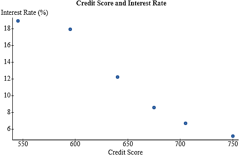
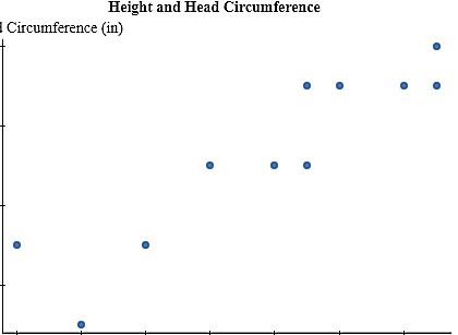
A scatter diagram is a graphical tool used to display the relationship between two quantitative variables. Each point represents an individual, with coordinates (explanatory variable, response variable).
Explanatory variable on x-axis
Response variable on y-axis
Each point: (x, y)
Describing Scatterplots
Scatterplots are described by their strength, direction, and type:
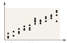
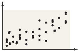
Strength: Tightness of points around a trend (strong, moderate, weak)
Direction: Positive (both variables increase), negative (one increases, other decreases), or no linear relation
Type: Linear or non-linear
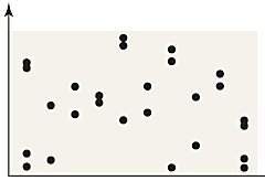
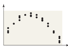
Correlation Coefficient (Pearson's r)
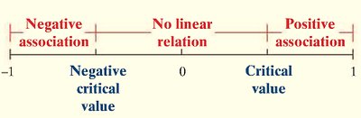
The linear correlation coefficient (r) measures the strength and direction of the linear relationship between two quantitative variables. It is unitless and ranges from -1 to +1.
r = +1: Perfect positive linear relation
r = -1: Perfect negative linear relation
r ≈ 0: No linear relation
Not resistant: Outliers can affect r
Formula:
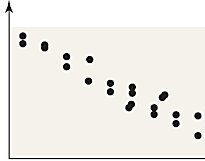
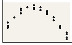
Correlation vs. Causation
Correlation does not imply causation. An observed association may be due to a lurking variable, which affects both explanatory and response variables.
Least-Squares Regression
Regression Line and Residuals
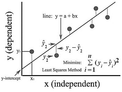
When a linear relationship exists, the least-squares regression line is used to predict values. It minimizes the sum of squared residuals (errors).
Residual: (difference between observed and predicted y)
Positive residual: Observed y above predicted
Negative residual: Observed y below predicted
Equation of the Least-Squares Regression Line
The regression line is given by:
(slope)
(y-intercept)
Interpreting Slope and Y-Intercept
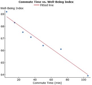
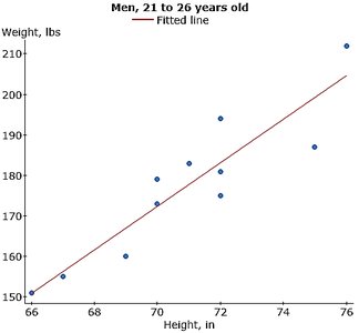
Slope: For each unit increase in x, y changes by the slope value, on average.
Y-intercept: Predicted value of y when x = 0 (only meaningful if x = 0 is reasonable).
Scope of the Model
Predictions should only be made within the range of observed x-values. Extrapolation outside this range is unreliable.

Diagnostics on the Least-Squares Regression Line
Coefficient of Determination (R2)
The coefficient of determination () measures the proportion of variation in the response variable explained by the regression line.
Closer to 1: better explanatory power
Residual Analysis
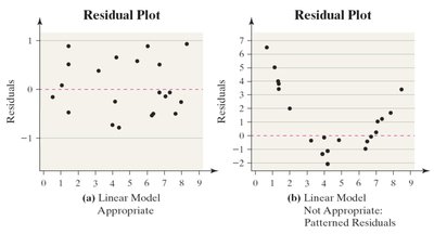
Residual plots help assess the adequacy of the linear model:
Random scatter: Linear model appropriate
Patterned residuals: Linear model not appropriate
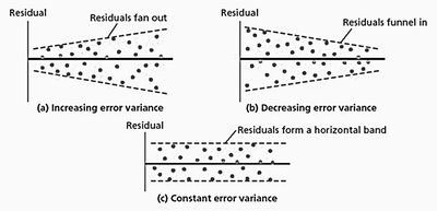
Constant error variance: Required for linear model
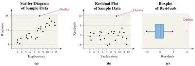
Outliers: Identified via residual plots or boxplots
Influential Observations
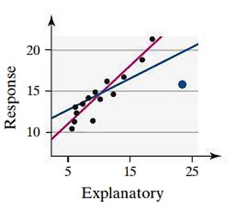
An influential observation significantly affects the slope, y-intercept, or correlation coefficient. These are typically outliers in the explanatory variable.
Contingency Tables and Associations
Contingency Tables
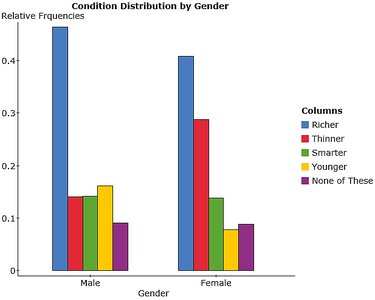
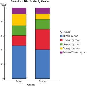
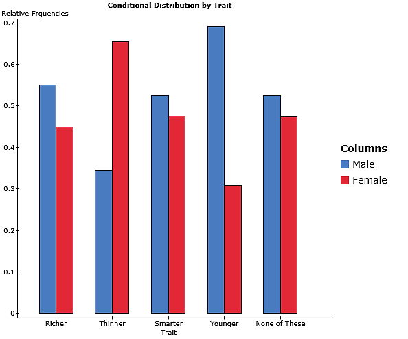
A contingency table (two-way table) relates two qualitative variables, summarizing their joint frequencies.
Gender | Richer | Thinner | Smarter | Younger | None of These |
|---|---|---|---|---|---|
Male | 520 | 158 | 159 | 181 | 102 |
Female | 425 | 300 | 144 | 81 | 92 |
Marginal and Conditional Distributions
Marginal distribution: Frequency or relative frequency of either row or column variable.
Conditional distribution: Relative frequency of each category of the response variable given a specific value of the explanatory variable.
Simpson's Paradox
Simpson's Paradox occurs when an association between two variables reverses or disappears upon introduction of a third variable. This highlights the importance of considering all relevant variables in analysis.
Summary Table: Types of Relationships in Scatterplots
Type | Description |
|---|---|
Strong Positive Linear | Points tightly clustered along an upward-sloping line |
Moderate Positive Linear | Points loosely clustered along an upward-sloping line |
Strong Negative Linear | Points tightly clustered along a downward-sloping line |
No Linear Relation | Points scattered randomly, no discernible trend |
Non-linear Relation | Points follow a curved pattern |
Additional info: Academic context and examples were expanded for clarity and completeness. All included images directly reinforce the statistical concepts discussed.
