 Indietro
Describing Data with Tables and Graphs: Organizing and Displaying Qualitative and Quantitative Data
Guida di studio - Note intelligenti
 Appunti personalizzati basati sui tuoi materiali, ampliati con definizioni chiave, esempi e contesto.
Describing Data with Tables and Graphs
Organizing Qualitative Data
Qualitative data, also known as categorical data, can be organized using tables and graphical displays to summarize and visualize the distribution of categories.
Frequency Distribution: A table that lists each category and the number of occurrences (frequency) in each category.
Relative Frequency Distribution: A table that lists each category and the proportion or percentage of occurrences in each category. The relative frequency is calculated as:
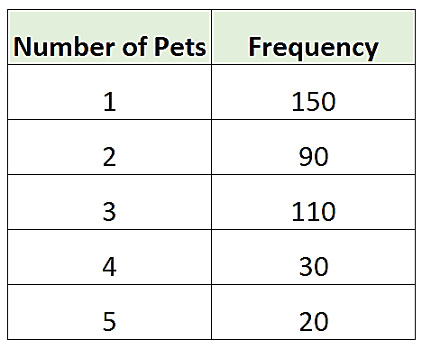
Example Table:
Number of Pets | Frequency |
|---|---|
1 | 150 |
2 | 90 |
3 | 110 |
4 | 30 |
5 | 20 |
Graphical Displays for Qualitative Data
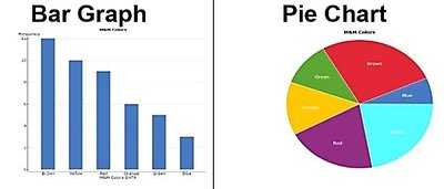
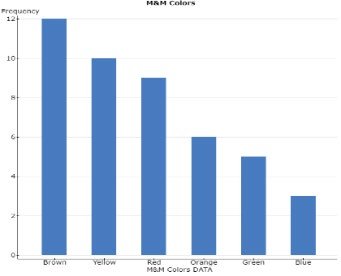
Bar Graph: Each category is represented by a bar. The height (or length) of the bar corresponds to the frequency or relative frequency. Bars are separated by gaps to emphasize the categorical nature of the data.
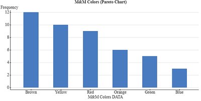
Pareto Chart: A special bar graph where categories are ordered by decreasing frequency or relative frequency. Useful for highlighting the most common categories.
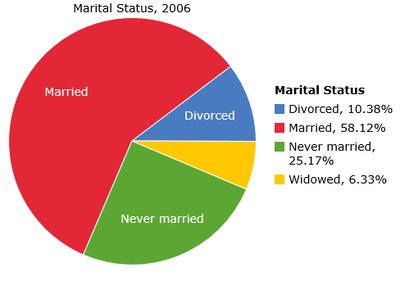
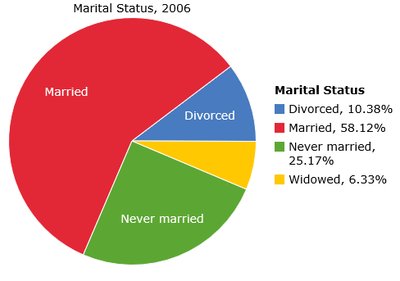
Pie Chart: A circle divided into sectors, where each sector represents a category. The area of each sector is proportional to the category's frequency or relative frequency. Pie charts are best for showing the division of all possible values into parts (the "big picture").
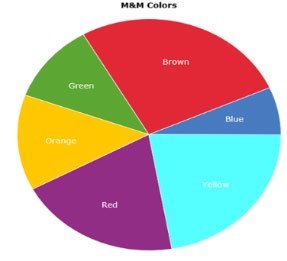
Comparing Graph Types
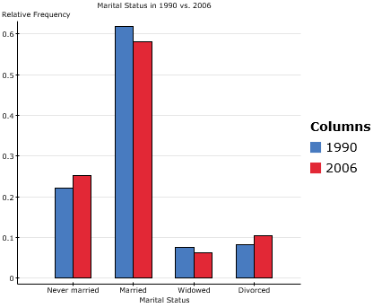
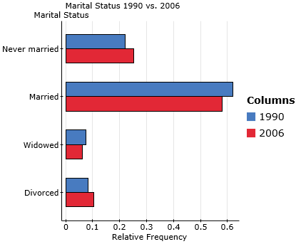
Bar Graphs are better for comparing specific values between categories.
Pie Charts are better for showing how each category relates to the whole.
Side-by-Side Bar Graphs
Side-by-side bar graphs are used to compare two or more data sets across the same categories. Relative frequencies are often used to account for different sample sizes.
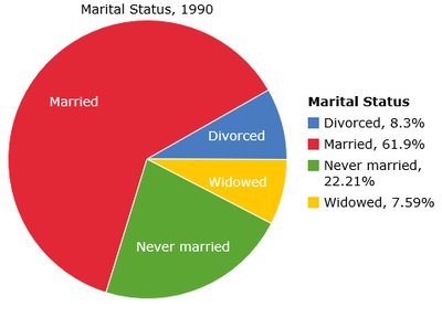
Pie Charts for Multiple Groups
Pie charts can also be used to compare the distribution of a categorical variable across different groups or time periods, but direct comparison is often easier with bar graphs.
Organizing Quantitative Data
Frequency and Relative Frequency Distributions for Discrete Data
Discrete quantitative data can be organized in tables similar to those for qualitative data, listing each value and its frequency or relative frequency.
Histograms
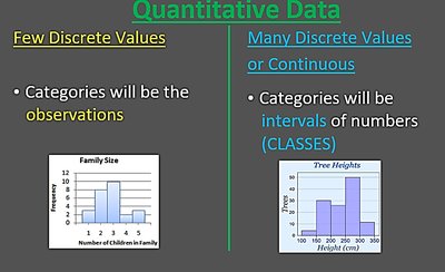
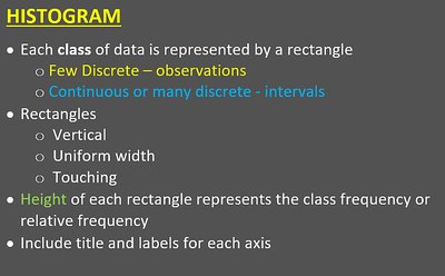
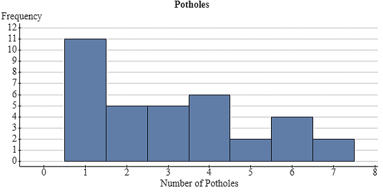
A histogram is a graphical display for quantitative data. Each class (interval) of data is represented by a rectangle. For discrete data, each observation can be a class; for continuous data, classes are intervals.
Rectangles are vertical, of uniform width, and touch each other (no gaps).
The height of each rectangle represents the class frequency or relative frequency.
Histograms are used for both discrete and continuous data, but are especially important for continuous data.
Class Width and Binning
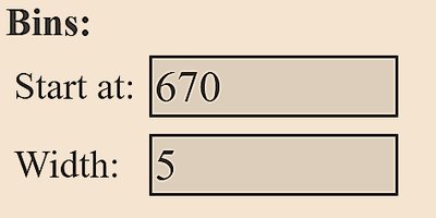
For continuous data, data are grouped into intervals called classes. The class width is the difference between consecutive lower class limits. The choice of class width affects the appearance and interpretability of the histogram.
Class width formula:
Round up to a convenient number.
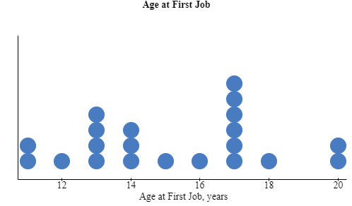
Dot Plots
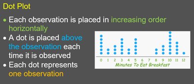
A dot plot is a simple way to display small sets of quantitative data. Each observation is represented by a dot placed above its value on a number line. Dot plots are useful for identifying clusters, gaps, and outliers.
Shapes of Distributions
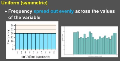
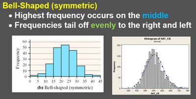
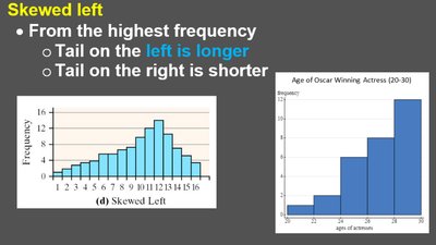
The shape of a distribution describes how data values are spread. Common shapes include:
Uniform (symmetric): Frequencies are spread evenly across values.
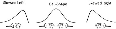
Bell-shaped (symmetric): Highest frequency in the middle, tails off evenly to both sides.
Skewed left: Tail on the left is longer; most data are on the right.
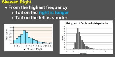
Skewed right: Tail on the right is longer; most data are on the left.
Additional Displays of Quantitative Data
Stem-and-Leaf Plots
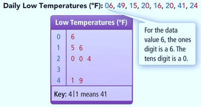
A stem-and-leaf plot is a way to display quantitative data while preserving the original values. The 'stem' consists of all but the rightmost digit; the 'leaf' is the rightmost digit. Stems are listed in a column, and leaves are listed in rows to the right of each stem.
Leaves within each stem are arranged in ascending order.
A legend explains how to read the plot (e.g., 2|2 means 22).
Stem-and-leaf plots are useful for small to moderate data sets.
Frequency Polygons
A frequency polygon is a line graph that uses class midpoints on the x-axis and frequencies on the y-axis. Points are connected by straight lines. Frequency polygons are useful for comparing distributions.
Ogives (Cumulative Frequency Graphs)
An ogive is a graph that displays cumulative frequencies or cumulative relative frequencies. The x-axis shows the upper class boundaries, and the y-axis shows the cumulative frequency. Ogives are useful for determining the number or percentage of observations below a particular value.
Time-Series Plots
A time-series plot displays data collected over time. The x-axis represents time, and the y-axis represents the variable of interest. Time-series plots are useful for identifying trends, cycles, and patterns over time.
Graphical Misrepresentations of Data
Graphs can be misleading if not constructed properly. Common issues include:
Not starting the axis at zero, exaggerating differences.
Comparing frequencies when sample sizes differ (should use relative frequencies).
Inconsistent scales or poorly defined categories.
Using the wrong type of graph for the data (e.g., bar graph for continuous data).
Using 3-D effects that distort perception.
To avoid misrepresentation, keep graphs simple, clear, and properly labeled. If the scale is truncated, indicate this clearly.
Summary Table: When to Use Each Graph Type
Graph Type | Best For |
|---|---|
Bar Graph | Comparing frequencies or relative frequencies of categories (qualitative data) |
Pareto Chart | Highlighting most frequent categories (qualitative data) |
Pie Chart | Showing parts of a whole (qualitative data) |
Histogram | Displaying distribution of quantitative data (discrete or continuous) |
Dot Plot | Small sets of quantitative data |
Stem-and-Leaf Plot | Small to moderate sets of quantitative data, preserving original values |
Frequency Polygon | Comparing distributions of quantitative data |
Ogive | Showing cumulative frequencies |
Time-Series Plot | Data measured over time |
