 Indietro
Describing Data with Tables and Graphs: Frequency Distributions and Histograms
Guida di studio - Note intelligenti
 Appunti personalizzati basati sui tuoi materiali, ampliati con definizioni chiave, esempi e contesto.
Describing Data with Tables and Graphs
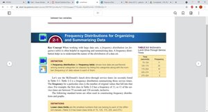
Frequency Distributions for Organizing and Summarizing Data
Frequency distributions are fundamental tools in statistics for organizing and summarizing large data sets. They allow statisticians to see patterns, trends, and the distribution of values within a dataset.
Definition: A frequency distribution is a table that displays the frequency, or count, of each class or category of data.
Purpose: Frequency distributions help to identify the shape, center, and spread of data, and are often the first step in data analysis.
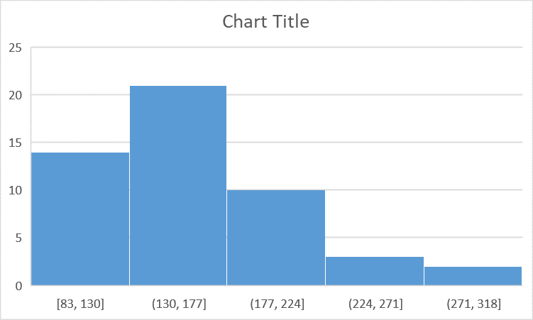
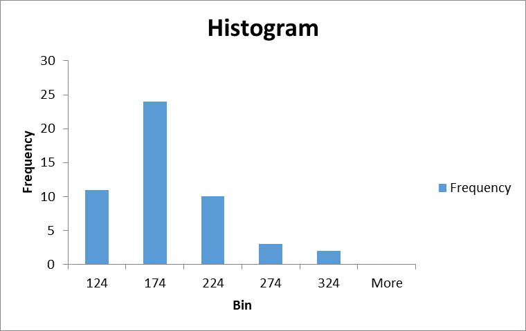
Example: Consider a table showing McDonald's lunch service times grouped into intervals, with the frequency of each interval listed.
Time (seconds) | Frequency |
|---|---|
9.45–124.5 | 11 |
124.5–174.5 | 24 |
174.5–224.5 | 11 |
224.5–274.5 | 3 |
274.5–324.5 | 2 |
Histograms
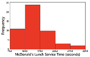
A histogram is a graphical representation of a frequency distribution. It consists of adjacent bars, where each bar represents a class interval and its height corresponds to the frequency of that interval. Histograms are especially useful for visualizing the shape and spread of quantitative data.
Horizontal axis: Represents the classes (intervals) of data values.
Vertical axis: Represents the frequency of each class.
Interpretation: The shape of the histogram reveals important characteristics such as symmetry, skewness, and the presence of outliers.
Example: A histogram of McDonald's lunch service times shows the distribution of service times across intervals.
Relative Frequency Histograms
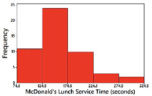
Relative frequency histograms are similar to standard histograms, but the vertical axis represents the relative frequency (proportion) of each class rather than the absolute frequency. This allows for comparison between datasets of different sizes.
Relative frequency: Calculated as the frequency of a class divided by the total number of data points.
Shape: The shape and horizontal scale remain the same as a standard histogram.
Critical Thinking: Interpreting Histograms
Histograms provide insight into several key aspects of a dataset, often summarized by the acronym CVDOT:
Center: The location of the middle value.
Variation: The spread or dispersion of the data.
Distribution: The overall shape (e.g., symmetric, skewed).
Outliers: Unusual values that deviate from the pattern.
Time: If the data are time-based, trends over time can be observed.
Common Distribution Shapes
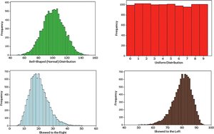
Histograms can display various shapes, each indicating different characteristics of the data distribution:
Bell-shaped (Normal) Distribution: Symmetric, with most values clustered around the center.
Uniform Distribution: All intervals have approximately equal frequencies.
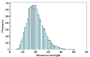
Skewed Right: The tail extends to the right; most values are on the left.
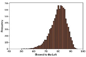
Skewed Left: The tail extends to the left; most values are on the right.
Normal Distribution
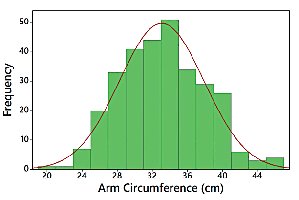
A normal distribution is characterized by a symmetric, bell-shaped histogram. It is a fundamental concept in statistics, as many natural phenomena follow this pattern.
Properties: Mean, median, and mode are equal; data are symmetrically distributed.
Example: Histogram of arm circumference showing a normal distribution.
Skewness
Skewness describes the degree to which a distribution deviates from symmetry. A distribution is skewed if it extends more to one side than the other.
Skewed Left (Negative Skew): The tail is longer on the left side.
Skewed Right (Positive Skew): The tail is longer on the right side.
Detecting Skewness by Comparing the Mean and the Median
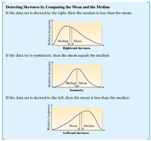
Skewness can also be detected by comparing the mean and median of a dataset:
If the data are skewed right, the mean is greater than the median.
If the data are symmetric, the mean equals the median.
If the data are skewed left, the mean is less than the median.
Constructing Frequency Distributions and Histograms in Excel
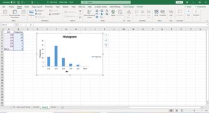
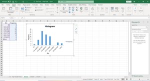
Excel provides tools for constructing frequency distributions and histograms from raw data. The process involves organizing data into bins (intervals), counting frequencies, and using chart tools to visualize the results.
Automatic Bins: Excel can automatically select bin intervals based on the data.
Manual Bins: Users can specify custom bin intervals for more precise analysis.
Steps: Enter data, select histogram chart, adjust bin settings, and interpret the resulting graph.
Summary Table: Distribution Shapes and Their Properties
Shape | Properties |
|---|---|
Normal (Bell-shaped) | Symmetric, mean = median = mode |
Uniform | All intervals have equal frequency |
Skewed Right | Tail extends right, mean > median |
Skewed Left | Tail extends left, mean < median |
Key Formulas
Relative Frequency:
Mean:
Median: The middle value when data are ordered.
Additional info: Academic context was added to clarify the definitions, properties, and applications of frequency distributions and histograms, as well as to explain Excel's role in constructing these graphs.
