 Indietro
Descriptive Statistics: Summarizing and Displaying Data
Guida di studio - Note intelligenti
 Appunti personalizzati basati sui tuoi materiali, ampliati con definizioni chiave, esempi e contesto.
Descriptive Statistics: Summarizing and Displaying Data
Graphing Categorical Data
Descriptive statistics often begin with summarizing categorical data using tables and graphs. These methods help us understand the distribution and frequency of categories within a dataset.
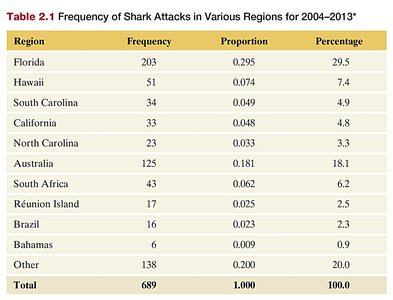
Frequency Table: A frequency table lists possible values for a categorical variable, along with the number of observations (frequency), proportion, and percentage for each value. This is foundational for creating visualizations such as bar charts and pie charts.
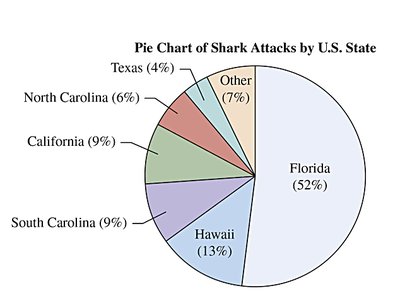
Pie Chart: A pie chart displays the proportion of each category as a slice of a circle. Each wedge is labeled with the category and its percentage, making it easy to compare parts to the whole.
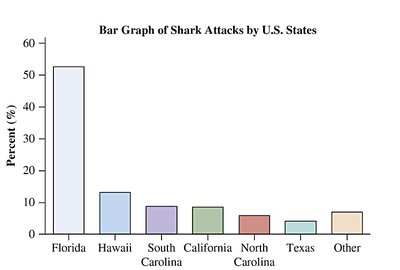
Bar Chart: A bar chart represents the frequency or percentage of each category with bars. Bars are often ordered by frequency for clarity.
Contingency Tables
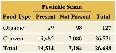
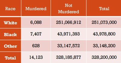
A contingency table displays the frequency distribution of two categorical variables simultaneously. The rows represent categories of one variable, and the columns represent categories of the other. Marginal totals (row and column sums) and the table total are useful for calculating proportions and conditional probabilities.
Example: Murder Statistics by Race
Contingency tables can also be used to summarize more complex categorical data, such as crime statistics by demographic group.
Graphing Numerical Data
Numerical data can be visualized using several types of graphs, each highlighting different aspects of the data's distribution.
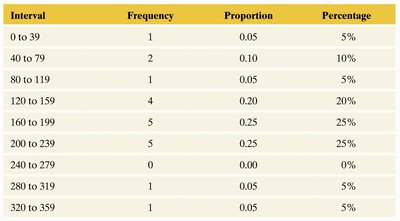
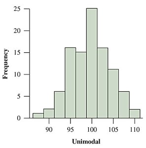
Histogram: A histogram divides the range of a numerical variable into intervals (bins) of equal width and displays the frequency or percentage of observations in each interval. It is useful for visualizing the shape, center, and spread of the data.
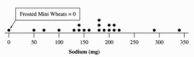
Dot Plot: A dot plot places a dot for each observation above its value on a number line, providing a simple way to see the distribution and identify clusters or gaps.
Distribution Shapes
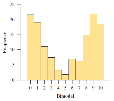
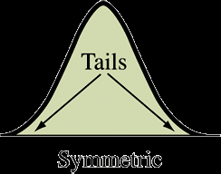
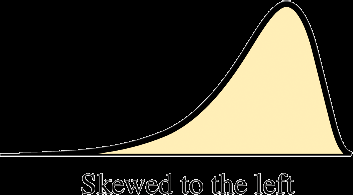
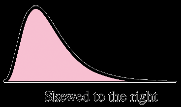
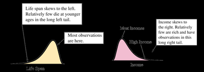
The shape of a distribution can be described as unimodal (one peak), bimodal (two peaks), or multimodal (more than two peaks). Distributions can also be symmetric, skewed to the left (long left tail), or skewed to the right (long right tail).
Symmetric: Both sides of the distribution are mirror images.
Skewed Left: The left tail is longer; most data are concentrated on the right.
Skewed Right: The right tail is longer; most data are concentrated on the left.
Numerical Summaries: Center and Spread
Descriptive statistics also include numerical measures that summarize the center and variability of a dataset.
Measures of Center
Mean (\( \bar{x} \)): The arithmetic average, calculated as , where are the observations and is the number of observations.
Median: The middle value when data are ordered. If is odd, it is the middle observation; if $n$ is even, it is the average of the two middle observations.
Mode: The value that occurs most frequently in the dataset.
Comparing Mean and Median
The mean is sensitive to outliers, while the median is resistant. In symmetric distributions, the mean and median are equal. In skewed distributions, the mean is pulled toward the tail.
Measures of Variability
Range: The difference between the maximum and minimum values.
Interquartile Range (IQR): The range of the middle 50% of the data, calculated as .
Variance (s2): The average squared deviation from the mean.
Standard Deviation (s): The square root of the variance, measuring the typical distance of observations from the mean.
The formulas for variance and standard deviation for a sample are:
Variance:
Standard Deviation:
Five-Number Summary and Box Plots
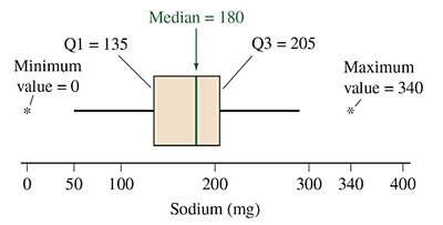
The five-number summary consists of the minimum, first quartile (Q1), median (Q2), third quartile (Q3), and maximum. Box plots visually display this summary, with the box spanning Q1 to Q3 and a line at the median. Whiskers extend to the smallest and largest non-outlier values, and outliers are plotted individually.
Identifying Outliers
An observation is a potential outlier if it falls more than 1.5 × IQR below Q1 or above Q3. Outliers are important to identify as they can affect statistical analyses.
Standardizing Data: Z-Scores
A z-score indicates how many standard deviations an observation is from the mean. It is calculated as:
Z-scores allow for comparison across different distributions and help identify outliers (typically, z-scores less than -3 or greater than +3 are considered outliers in bell-shaped distributions).
Percentiles and Quartiles
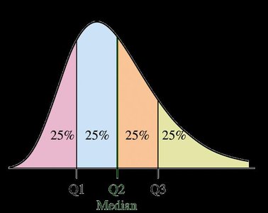
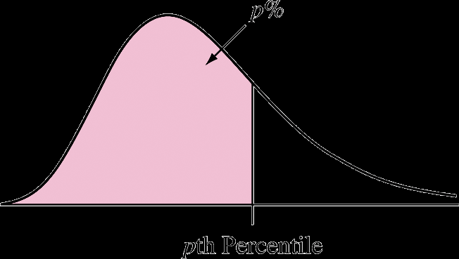
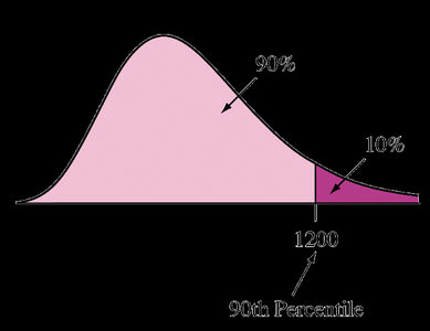
The pth percentile is the value below which p% of the observations fall. Quartiles split the data into four equal parts: Q1 (25th percentile), Q2 (median, 50th percentile), and Q3 (75th percentile).
Summary Table: Frequency Table Example
The following table summarizes the frequency, proportion, and percentage of shark attacks in various regions:
Region | Frequency | Proportion | Percentage |
|---|---|---|---|
Florida | 203 | 0.295 | 29.5 |
Hawaii | 51 | 0.074 | 7.4 |
South Carolina | 34 | 0.049 | 4.9 |
California | 33 | 0.048 | 4.8 |
North Carolina | 23 | 0.033 | 3.3 |
Australia | 125 | 0.181 | 18.1 |
South Africa | 43 | 0.062 | 6.2 |
Réunion Island | 17 | 0.025 | 2.5 |
Brazil | 16 | 0.023 | 2.3 |
Bahamas | 6 | 0.009 | 0.9 |
Other | 138 | 0.200 | 20.0 |
Total | 689 | 1.000 | 100.0 |
Summary Table: Contingency Table Example
Food Type | Present | Not Present | Total |
|---|---|---|---|
Organic | 29 | 98 | 127 |
Conventional | 19,485 | 7,086 | 26,571 |
Total | 19,514 | 7,184 | 26,698 |
Summary Table: Murder Statistics by Race
Race | Murdered | Not Murdered | Total |
|---|---|---|---|
White | 6,088 | 251,066,912 | 251,073,000 |
Black | 7,407 | 43,971,393 | 43,978,800 |
Other | 628 | 33,147,572 | 33,148,200 |
Total | 14,123 | 328,185,877 | 328,200,000 |
Summary Table: Frequency Table for Sodium in Cereals
Interval | Frequency | Proportion | Percentage |
|---|---|---|---|
0 to 39 | 1 | 0.05 | 5% |
40 to 79 | 2 | 0.10 | 10% |
80 to 119 | 1 | 0.05 | 5% |
120 to 159 | 4 | 0.20 | 20% |
160 to 199 | 5 | 0.25 | 25% |
200 to 239 | 5 | 0.25 | 25% |
240 to 279 | 0 | 0.00 | 0% |
280 to 319 | 0 | 0.00 | 0% |
320 to 359 | 1 | 0.05 | 5% |
Key Properties of Measures
Resistant Measures: The median and IQR are resistant to outliers, while the mean, standard deviation, and range are not.
Standardized Variables: Variables transformed to have mean 0 and standard deviation 1 are called standardized variables (z-scores).
Additional info: These notes cover the core concepts of descriptive statistics, including graphical and numerical summaries for both categorical and numerical data, as well as the identification and interpretation of outliers and standardized scores.
