 Indietro
Introductory Statistics: Comprehensive Study Notes and Stata Commands
Guida di studio - Note intelligenti
 Appunti personalizzati basati sui tuoi materiali, ampliati con definizioni chiave, esempi e contesto.
Stata Commands for Introductory Statistics
Graphical Commands
Stata provides several commands for visualizing data, which are essential for understanding distributions and relationships between variables.
quantile var1: Produces a quantile plot for a single variable, useful for assessing normality.
hist var1: Generates a histogram to visualize the distribution of a variable.
scatter var1: Creates a scatterplot to examine relationships between two variables.
Calculation Commands
display (x+y): Acts as a calculator for arithmetic operations.
dis sqrt(x): Computes the square root of x.
dis x^2: Calculates the square of x.
sum var1: Provides summary statistics (mean, standard deviation, min, max) for var1.
sum var1, detail: Gives detailed summary statistics, including variance and percentiles.
Probability Distributions
display binomial(n, k, p): Calculates the binomial probability for k successes in n trials with probability p.
display binomialp(n, k, p): Returns the probability for the binomial distribution.
display normal(z value): Computes the area under the normal curve to the left of z.
display invnormal(p value): Finds the z-score corresponding to a cumulative probability.
display normalden(z): Returns the probability density at z for the standard normal distribution.
Critical Values and Confidence Intervals
di invt(df, p): Finds the critical value from the inverse cumulative t distribution.
di invnormal(1-alpha/2): Finds the critical z value for a given confidence level.
cii means obs mean standard error, level(confidence interval): Generates confidence intervals for means.
P-Values and Hypothesis Testing
di 2*(1 - normal(abs(z))): Calculates the two-tailed p-value for a z-test.
di normal(z): One-tailed left p-value for z.
di 1 - normal(z): One-tailed right p-value for z.
di 2*ttail(df, abs(t)): Two-tailed p-value for a t-test.
di 1-ttail(df, t): One-tailed left p-value for t.
di ttail(df, t): One-tailed right p-value for t.
ttesti obs mean sd val under H0, level(#): Performs a one-sample t-test.
General Commands
clear: Clears data from the editor.
tabulate: Generates frequency tables for categorical variables.
Levels of Measurement
Types of Data
Understanding the level of measurement is crucial for selecting appropriate statistical methods.
Nominal: Categories without any order (e.g., Yes, No, Undecided).
Ordinal: Categories with a logical order but not evenly spaced (e.g., Course grades: A, B, C, D, F).
Interval: Ordered categories with meaningful differences, but no true zero (e.g., Years).
Ratio: Like interval, but with a true zero point (e.g., Heights).
Sampling Methods
Types of Sampling
Simple Random: Every member has an equal chance of selection.
Systematic: Select every k-th element after a random start (e.g., every 3rd car).
Convenience: Data is collected from easily accessible sources.
Stratified: Population divided into groups (strata), and samples are drawn from each group.
Cluster: Population divided into sections, some sections are randomly selected, and all members from those sections are included.
Multistage: Sampling is conducted in multiple stages, often combining several methods.
Observational Studies
Types of Observational Studies
Cross-sectional: Data collected at a single point in time.
Retrospective: Data collected from past records.
Prospective: Data collected in the future from groups sharing common factors.
Describing Data with Tables and Graphs
Frequency Distributions
Frequency distributions organize data into classes or intervals, showing how many data points fall into each class.
Class width:
Class midpoint:
Class limits: The smallest and largest values that can belong to a class.
Class boundaries: Values that separate classes without gaps.
Example Frequency Table
Time (Seconds) | Frequency | Midpoint | Boundaries |
|---|---|---|---|
75-124 | 11 | 99.5 | 74.5 |
125-174 | 24 | 149.5 | 124.5 |
175-224 | 10 | 199.5 | 174.5 |
225-274 | 3 | 249.5 | 274.5 |
275-324 | 2 | 299.5 | 324.5 |
Histograms
To construct a histogram, organize quantitative data into equal intervals (bins), count the frequencies, and draw adjacent bars with heights representing frequencies. There should be no gaps between bars.
Time-Series Graphs
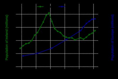
Time-series graphs plot data points at successive time intervals. The x-axis represents time, and the y-axis represents the measured variable. Points are connected with straight lines to show trends over time.
Deceptive Graphs
Nonzero vertical axis: Starting the y-axis above zero can exaggerate differences between groups.
Describing Data Numerically
Measures of Center
Mean: The arithmetic average. For a sample, denoted as ; for a population, .
Median: The middle value when data is ordered. Not affected by outliers.
Mode: The value that occurs most frequently.
Midrange: ; sensitive to outliers.
Weighted Mean Example
Grade | Weight (W) | Data points (x) | W * x |
|---|---|---|---|
A | 3 | 4 | 12 |
A | 4 | 4 | 16 |
B | 3 | 3 | 9 |
C | 3 | 2 | 6 |
F | 1 | 0 | 0 |
Totals | 14 | 43 |
Weighted mean:
Measures of Variation
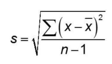
Standard Deviation (s): Measures the average distance of data values from the mean. Sensitive to outliers.
Population standard deviation (\sigma): Used when data represents the entire population.
Sample standard deviation (s): Used when data is a sample from the population.
The formula for sample standard deviation is:
Range Rule of Thumb: Most values lie within 2 standard deviations of the mean.
Z-score: Number of standard deviations a value is from the mean.
Probability
Simple Events and Probability
Simple event: An outcome that cannot be broken down further.
Probability:
Multiplication Rule
General rule:
Events are independent if .
Addition Rule
General rule:
Complementary events:
Independent and Dependent Events
With replacement: Events are independent.
Without replacement: Events are dependent.
Significance in Probability
Significantly high:
Significantly low:
Binomial and Normal Distributions
Binomial Distribution
Requirements: Fixed number of trials, independent trials, two outcomes, constant probability of success.
Mean:
Variance:
Standard deviation:
Normal Distribution
Symmetric, bell-shaped curve.
Standard normal: ,
Area under the curve represents probability.
Finding Probabilities with Z-Scores
Convert data to z-score:
Use z-tables or technology to find probabilities.
Sampling Distributions & Central Limit Theorem
Sampling Distribution
Distribution of a statistic (e.g., mean, proportion) from all possible samples of a given size.
Sample proportions and means tend to be normally distributed for large samples (n > 30).
Standard error:
Central Limit Theorem
For large n, the sampling distribution of the sample mean is approximately normal, regardless of the population's distribution.
Allows calculation of probabilities for sample means.
Confidence Intervals
Constructing Confidence Intervals
Identify sample statistic (mean or proportion).
Determine confidence level (e.g., 95%).
Find critical value (z or t).
Calculate margin of error.
Interval: (point estimate ± margin of error).
Confidence Interval for Proportion
Sample proportion:
Standard error:
Margin of error:
Hypothesis Testing
Steps in Hypothesis Testing
State null and alternative hypotheses.
Gather sample statistics and set significance level (alpha).
Calculate test statistic (z or t).
Find p-value and compare to alpha.
Draw conclusion: reject or fail to reject the null hypothesis.
Type I and Type II Errors
Type I Error: Rejecting a true null hypothesis.
Type II Error: Failing to reject a false null hypothesis.
Regression and Correlation
Scatterplots and Linear Relationships
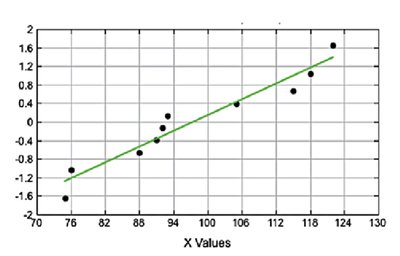
Scatterplots are used to visualize the relationship between two quantitative variables. A line of best fit (regression line) can be added to model the relationship.
Interpreting Scatterplots
A strong linear relationship is indicated when points closely follow a straight line.
Outliers or non-linear patterns suggest a weaker or different relationship.
Additional info: Images 2 and 3 show scatterplots with varying degrees of linearity and spread, which can be used to discuss correlation strength and regression assumptions.
