Comparing Two Means Treating the data as samples from larger populations, test the claim that there is a significant difference between the mean of presidents and the mean of popes.
Ch. 10 - Correlation and Regression
Triola14th EditionElementary StatisticsISBN: 9780137366446Non è quello che usi tu?Cambia libro di testo
Capitolo 10, Problema 13
Testing for a Linear Correlation
In Exercises 13–28, construct a scatterplot, and find the value of the linear correlation coefficient r. Also find the P-value or the critical values of r from Table A-6. Use a significance level of α = 0.05. Determine whether there is sufficient evidence to support a claim of a linear correlation between the two variables. (Save your work because the same data sets will be used in Section 10-2 exercises.)
Powerball Jackpots and Tickets Sold Listed below are the same data from Table 10-1 in the Chapter Problem, but an additional pair of values has been added in the last column. Is there sufficient evidence to conclude that there is a linear correlation between lottery jackpot amounts and numbers of tickets sold? Comment on the effect of the added pair of values in the last column. Compare the results to those obtained in Example 4.
[IMAGE]
Guida verificata passo dopo passo1
Step 1: Construct a scatterplot. Plot the given data points on a graph with the x-axis representing the lottery jackpot amounts and the y-axis representing the number of tickets sold. This visual representation will help identify any potential linear relationship between the two variables.
Step 2: Calculate the linear correlation coefficient (r). Use the formula for r: r = (Σ((x - x̄)(y - ȳ))) / (sqrt(Σ(x - x̄)²) * sqrt(Σ(y - ȳ)²)), where x̄ and ȳ are the means of the x and y values, respectively. This measures the strength and direction of the linear relationship.
Step 3: Determine the critical values of r or the P-value. Refer to Table A-6 for the critical values of r at a significance level of α = 0.05, based on the sample size (n). Alternatively, calculate the P-value using statistical software or a calculator.
Step 4: Compare the calculated r value to the critical values or interpret the P-value. If |r| is greater than the critical value or if the P-value is less than α = 0.05, there is sufficient evidence to support a claim of a linear correlation.
Step 5: Analyze the effect of the added pair of values. Recalculate the correlation coefficient and P-value with the additional data point included. Compare the results to the original analysis to determine how the added pair influences the strength and significance of the correlation.

Risposta video verificata per un problema simile:
Questa soluzione video è stata consigliata dai nostri tutor come utile per risolvere questo problema.
Durata del video:
4mConcetti chiave
Ecco i concetti essenziali che devi comprendere per rispondere correttamente alla domanda.
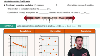
Linear Correlation Coefficient (r)
The linear correlation coefficient, denoted as r, quantifies the strength and direction of a linear relationship between two variables. Its value ranges from -1 to 1, where 1 indicates a perfect positive correlation, -1 indicates a perfect negative correlation, and 0 indicates no correlation. Understanding r is crucial for assessing how closely the data points cluster around a straight line in a scatterplot.
Video consigliato:
Percorso guidato
Correlation Coefficient
P-value
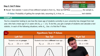
The P-value is a statistical measure that helps determine the significance of results obtained in hypothesis testing. It represents the probability of observing the data, or something more extreme, assuming the null hypothesis is true. In the context of correlation, a low P-value (typically less than 0.05) suggests that there is sufficient evidence to reject the null hypothesis, indicating a significant linear correlation between the variables.
Video consigliato:
Percorso guidato
Step 3: Get P-Value
Scatterplot
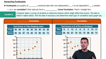
A scatterplot is a graphical representation of two quantitative variables, where each point represents an observation. It is used to visualize the relationship between the variables, helping to identify patterns, trends, or correlations. Constructing a scatterplot is a fundamental step in analyzing data for linear correlation, as it provides a visual context for interpreting the correlation coefficient and the significance of the relationship.
Video consigliato:
Percorso guidato
Scatterplots & Intro to Correlation
Pratica correlata
Domanda del libro di testo
158
views
Domanda del libro di testo
Clusters Refer to the Minitab-generated scatterplot. The four points in the lower left corner are measurements from women, and the four points in the upper right corner are from men.
Find the value of the linear correlation coefficient using all eight points. What does that value suggest about the relationship between x and y?
165
views
Domanda del libro di testo
Exercises 1–10 are based on the following sample data consisting of costs of dinner (dollars) and the amounts of tips (dollars) left by diners. The data were collected by students of the author.
Predictions Repeat the preceding exercise assuming that the linear correlation coefficient is r = 0.132.
123
views