 뒤로
뒤로Describing Data Visually in Business Statistics
스터디 가이드 - 스마트 노트
 자료에 맞춘 맞춤형 노트, 핵심 정의, 예시, 맥락을 확장해 제공합니다.
Describing Data Visually
Introduction to Visual Data Presentation
Presenting data visually is essential in business statistics, as it allows for clearer communication and easier interpretation of information. Effective graphical displays help summarize large data sets, reveal patterns, and support decision-making.
Displaying and Describing Categorical Data
Summary Tables
Summary tables organize categorical data by listing categories and their corresponding frequencies or percentages. This tabular format provides a clear overview of the distribution of qualitative variables.
Key Terms: Frequency (number of occurrences), Percentage (proportion of total).
Example: Investment portfolio by type (Stocks, Bonds, CDs, Savings) with amounts and percentages.
Bar Charts
Bar charts are used to display the frequency or percentage of categories. Each bar represents a category, and its height reflects the value.
Best for comparing different categories.
Bars should be separated to emphasize categorical nature.
Pie Charts
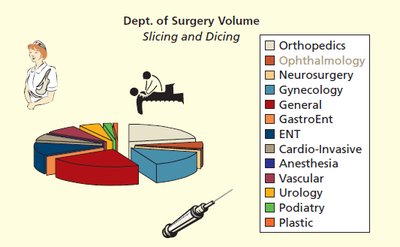
Pie charts show the proportion of each category as a slice of a circle. They are most effective with a small number of categories.
Each slice's size is proportional to its percentage of the total.
Label slices with values or percentages for clarity.
Pareto Diagrams
A Pareto diagram is a bar chart with categories ordered by descending frequency, often combined with a cumulative percentage line. It is used to identify the most significant factors in a data set (the "vital few").
Common in quality management to prioritize issues.
Highlights the principle that a small number of causes often account for a large proportion of the effect.
Displaying and Describing Quantitative Data
Ordered Arrays
An ordered array is a list of data values arranged from smallest to largest. It helps identify the range, central tendency, and potential outliers.
Useful for small data sets.
Shows minimum, maximum, and distribution shape.
Stem-and-Leaf Displays
Stem-and-leaf displays split each data value into a "stem" (leading digits) and a "leaf" (trailing digit), preserving the original data while showing distribution.
Good for small to moderate data sets.
Shows shape, central tendency, and spread.
Dot Plots
Dot plots display individual data points along a number line. Each dot represents one observation, and stacked dots indicate repeated values.
Simple and effective for small data sets.
Shows clusters, gaps, and outliers.
Frequency Distributions and Histograms
Frequency distributions group data into intervals (bins) and count the number of observations in each. Histograms are bar graphs of these frequencies, with adjacent bars touching to indicate continuous data.
Horizontal axis: class boundaries or midpoints.
Vertical axis: frequency, relative frequency, or percentage.
No gaps between bars.
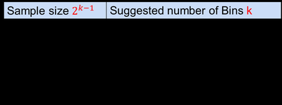
Sturges’ Rule: Suggests the number of bins for a histogram: where is the number of bins and is the sample size.
Histograms in Excel
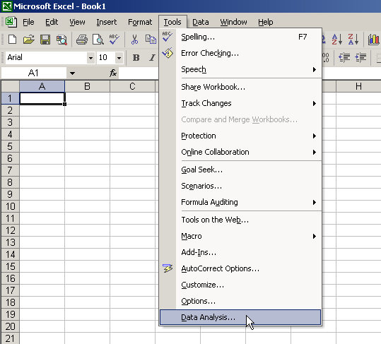
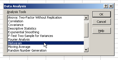
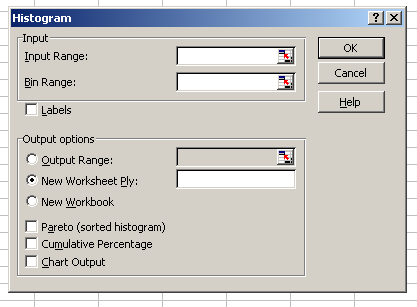
Excel provides tools for creating histograms. The process involves selecting the data analysis tool, choosing the histogram option, and specifying input and bin ranges.
Frequency Polygons and Ogives
A frequency polygon connects the midpoints of histogram bars with straight lines, showing the distribution's shape. An ogive (cumulative percentage polygon) plots cumulative percentages, useful for determining medians and percentiles.
Distribution Shapes
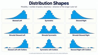
Understanding the shape of a distribution is crucial for interpreting data. Common shapes include:
Symmetric: Both sides are mirror images.
Skewed Right: Tail extends to the right.
Skewed Left: Tail extends to the left.
Bimodal: Two peaks.
With Outliers: Extreme values present.
Graphing Multivariate and Categorical Data
Contingency Tables
Contingency tables display the frequency distribution of variables that are cross-classified. They are useful for examining relationships between two or more categorical variables.
Can show counts or percentages by row, column, or total.
Side-by-Side Bar Charts
Side-by-side bar charts compare the same categories across different groups, making it easy to visualize differences and similarities.
Scatter Plots and Time Series Plots
Scatter Plots
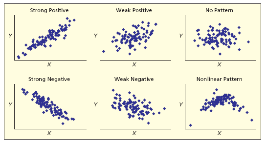
Scatter plots display the relationship between two numerical variables. Each point represents a pair of values.
Patterns may indicate correlation (positive, negative, or none).
Helps identify linear or nonlinear relationships.
Time Series Plots
Time series plots show how a variable changes over time. The horizontal axis represents time, and the vertical axis represents the variable of interest.
Useful for identifying trends, cycles, and seasonal patterns.
Multiple variables can be plotted for comparison.
Principles of Graphical Excellence and Deceptive Graphs
Features of Effective Graphs
Show the data clearly and accurately.
Encourage comparison and focus on substance.
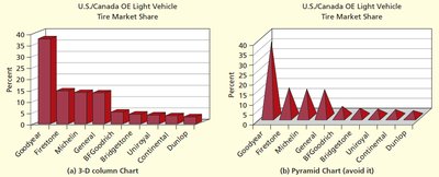
Avoid distortion and unnecessary decoration (chartjunk).
Serve a clear purpose and integrate with statistical analysis.
Common Graphical Distortions
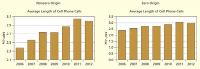
Nonzero Origin: Starting the axis above zero exaggerates trends.
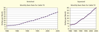
Elastic Proportions: Changing aspect ratios can distort perception.
3D and Novelty Charts: Can mislead by distorting bar heights or volumes.
Area Trick: Increasing both height and width exaggerates differences.
Excel Guide for Graphical Data Analysis
Excel is a powerful tool for creating tables, histograms, and other graphical displays. Familiarity with its data analysis features is essential for business statistics students.
Practice creating tables, converting text to data, and generating histograms using Excel's built-in tools.
Summary Table: Suggested Number of Bins (Sturges’ Rule)
Sample size | Suggested number of Bins |
|---|---|
5–8 | 3 |
9–16 | 4 |
17–32 | 5 |
33–64 | 6 |
65–128 | 7 |
129–256 | 8 |
257–512 | 9 |
513–1024 | 10 |
1025–2048 | 11 |
Conclusion
Visualizing data is a foundational skill in business statistics. Mastery of tables, charts, and graphical principles enables effective communication and accurate interpretation of data, supporting sound business decisions.
