 뒤로
뒤로Displaying Descriptive Statistics: Tables and Graphs in Business Statistics
스터디 가이드 - 스마트 노트
 자료에 맞춘 맞춤형 노트, 핵심 정의, 예시, 맥락을 확장해 제공합니다.
Displaying Descriptive Statistics
Introduction
Descriptive statistics are essential tools in business statistics for summarizing, organizing, and presenting data in a meaningful way. This chapter focuses on methods for displaying both quantitative and qualitative data using tables and graphical representations. Mastery of these techniques enables effective communication of data-driven insights in business contexts.
Displaying Quantitative Data
Frequency Distributions
A frequency distribution is a table that shows the number of data observations that fall into specific intervals or classes. It helps to organize raw data into a more interpretable format.
Class: A range or single value into which data are grouped.
Frequency: The number of observations in each class.
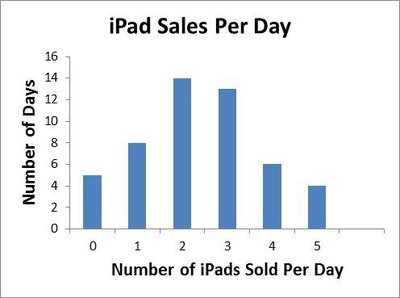
Example: Number of iPads sold per day over 50 days.
# Sold Per Day | Frequency |
|---|---|
0 | 5 |
1 | 8 |
2 | 14 |
3 | 13 |
4 | 6 |
5 | 4 |
Relative and Cumulative Frequency Distributions
Relative Frequency: The proportion of observations in each class, calculated as .
Cumulative Relative Frequency: The sum of relative frequencies for all classes up to and including the current class.
# Sold Per Day | Frequency | Relative Frequency | Cumulative Relative Frequency |
|---|---|---|---|
0 | 5 | 0.10 | 0.10 |
1 | 8 | 0.16 | 0.26 |
2 | 14 | 0.28 | 0.54 |
3 | 13 | 0.26 | 0.80 |
4 | 6 | 0.12 | 0.92 |
5 | 4 | 0.08 | 1.00 |
Histograms
A histogram is a bar graph that displays the frequency or relative frequency of quantitative data grouped into classes. The height of each bar represents the frequency of the class.
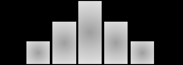
Histograms help visualize the distribution shape (e.g., symmetric, skewed, bimodal).
Polygons and Ogives
Polygon: A line graph connecting the midpoints of each class at heights corresponding to their frequencies.
Ogive: A line graph of cumulative frequencies, useful for determining the proportion of observations below a certain value.
Stem-and-Leaf Displays
A stem-and-leaf display splits each data value into a "stem" (leading digit(s)) and a "leaf" (trailing digit), preserving the original data while showing distribution shape.
All data values are represented, unlike in a histogram.
Scatter Plots and Line Charts
Scatter Plot: Displays the relationship between two quantitative variables. The independent variable is plotted on the x-axis, and the dependent variable on the y-axis.
Line Chart: Connects data points with lines, often used to show trends over time.
Displaying Qualitative Data
Frequency Distributions for Qualitative Data
Qualitative data can be summarized using frequency, relative frequency, and cumulative relative frequency tables.
Grade | Frequency | Relative Frequency | Cumulative Relative Frequency |
|---|---|---|---|
A | 7 | 0.233 | 0.233 |
B | 14 | 0.457 | 0.700 |
C | 6 | 0.200 | 0.900 |
D | 1 | 0.033 | 0.933 |
F | 2 | 0.067 | 1.000 |
Bar Charts
Bar charts are used to display the frequency or relative frequency of qualitative data. Bars can be arranged vertically or horizontally.
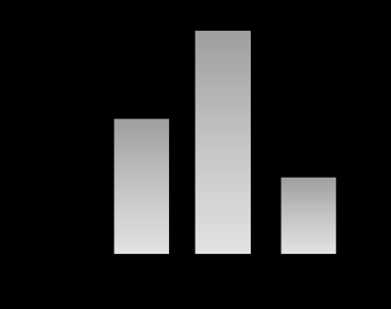
Bar charts are ideal for comparing categories.
Pareto Charts
A Pareto chart is a special bar chart where categories are ordered by frequency, often used in quality control to identify the most significant factors.
Pie Charts
Pie charts display the proportion of each category as a slice of a circle, making it easy to compare parts to the whole.
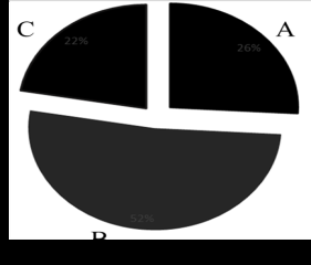
Each slice represents a category's percentage of the total.
Contingency Tables
Contingency tables (cross-tabulations) display the frequency distribution of two qualitative variables simultaneously, showing the relationship between them.
Payment/Gender | Female | Male | Total |
|---|---|---|---|
Cash | 2 | 5 | 7 |
Credit | 7 | 2 | 9 |
Debit | 3 | 1 | 4 |
Total | 12 | 8 | 20 |
Using Excel for Descriptive Statistics
Activating the Data Analysis ToolPak
Microsoft Excel provides built-in tools for statistical analysis and data presentation. To access these, you may need to activate the Analysis ToolPak add-in.
Open Excel and click the File tab.
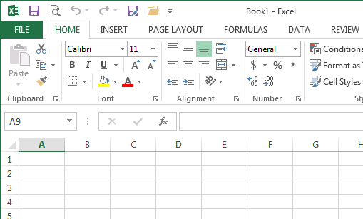
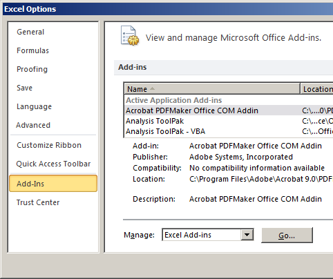
Click Options to open the Excel Options dialog box.
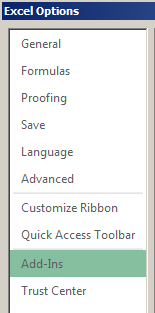
Select Add-Ins in the left margin.
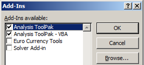
Click Go at the bottom of the screen, check Analysis ToolPak and Analysis ToolPak - VBA, then click OK.
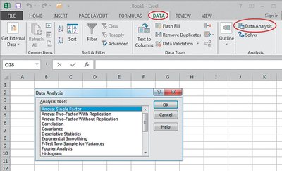
Go to the Data tab and click Data Analysis.
Constructing Frequency Tables and Histograms in Excel
Enter your data and bin values in the worksheet.
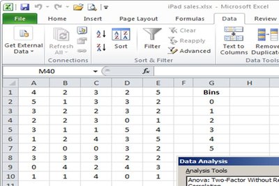
Use the FREQUENCY function to calculate frequencies.
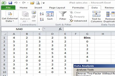
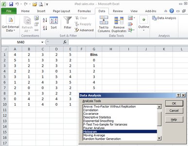
To create a histogram, select Data Analysis → Histogram.
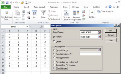
Specify the input and bin ranges, and select output options.
Customize the resulting histogram as needed.
Summary Table: Descriptive Statistics Tools
Statistics Tool | Variable Type | Main Objective |
|---|---|---|
Frequency Tables | Quantitative, Qualitative | Shows frequency, relative frequency, and cumulative relative frequency |
Histogram | Quantitative | Shows frequency and distribution shape |
Scatter Plot | Quantitative | Shows relationship between two variables |
Line Chart | Quantitative | Shows change over time |
Bar Chart | Qualitative | Compares counts or percentages |
Pie Chart | Qualitative | Compares parts to the whole |
Pivot Table | Qualitative | Shows breakdown of values by another variable |
Additional info: These tools are foundational for further topics in business statistics, such as probability distributions, hypothesis testing, and regression analysis.
