 뒤로
뒤로Methods for Describing Sets of Data in Business Statistics
스터디 가이드 - 스마트 노트
 자료에 맞춘 맞춤형 노트, 핵심 정의, 예시, 맥락을 확장해 제공합니다.
Chapter 2: Methods for Describing Sets of Data
Types of Data
In business statistics, data can be classified into two main types: qualitative and quantitative. Understanding these types is essential for selecting appropriate methods of data description and analysis.
Qualitative Data: Measurements that cannot be measured on a numerical scale. They are categorized into groups or classes. Examples: Preference of a presidential candidate, species of fish, gender of a person.
Quantitative Data: Measurements recorded on a naturally occurring numerical scale. Examples: Height of a person, test scores, amount of a sale.
Data can be described using two main methods:
Graphical Methods: Pie charts, bar graphs, histograms, scatterplots, etc.
Numerical Methods: Class frequency, class relative frequency, mean, median, variance, standard deviation, correlation, etc.
Describing Qualitative Data
Qualitative data can be summarized using both numerical and graphical methods. These methods help in understanding the distribution of categories within the data set.
Numerical Methods
Class: A category into which qualitative data can be classified.
Class Frequency: The number of observations in a particular class.
Class Relative Frequency: The class frequency divided by the total number of observations:
Class Percentage: The class relative frequency multiplied by 100:
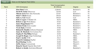
Example: The table below shows the frequency distribution of degrees held by the 20 highest paid CEOs:
Degree | Class Frequency | Class Relative Frequency | Class Percentage |
|---|---|---|---|
Bachelor’s | 9 | 0.45 | 45 |
Law | 2 | 0.10 | 10 |
MBA | 6 | 0.30 | 30 |
Master’s | 2 | 0.10 | 10 |
None | 1 | 0.05 | 5 |
PhD | 0 | 0 | 0 |
Graphical Methods
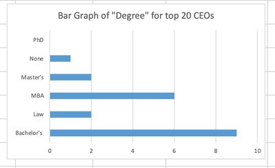
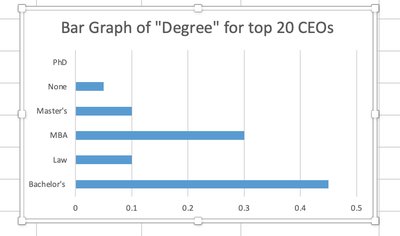
Bar Graph: Represents categories as bars, with the height corresponding to class frequency, relative frequency, or percentage.
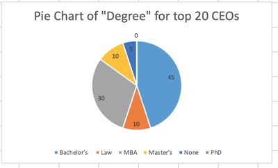
Pie Chart: Represents categories as slices of a pie, with the angle proportional to the class relative frequency.
Describing Quantitative Data
Quantitative data is described using both graphical and numerical methods to summarize and interpret the distribution and central tendency of the data.
Graphical Method: Histogram
Numerical Methods: Mean, standard deviation, percentiles, z-scores
Describing Quantitative Data Using Histograms
A histogram is a graphical representation where the range of data is divided into intervals (bins), and the frequency or relative frequency of data within each interval is depicted by the height of the bar.
Class intervals should have equal width.
The horizontal axis represents the intervals, and the vertical axis represents frequency or relative frequency.
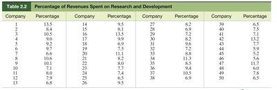
Example: The table below shows the percentage of revenues spent on research and development by 50 high-technology firms:
Frequency and Relative Frequency Histograms
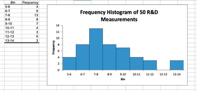
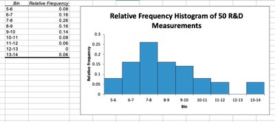
Histograms can be constructed using either frequency or relative frequency. The steps to create a histogram in Excel include determining the minimum and maximum values, setting class intervals, and using the Data Analysis tool to generate the chart.
Numerical Methods to Describe Quantitative Data
Numerical measures provide concise summaries of the data set, focusing on central tendency, variability, and relative standing.
Central Tendency: The tendency of data to cluster around certain values (mean, median).
Variability: The spread or dispersion of the data (variance, standard deviation).
Relative Standing: The position of a value relative to the rest of the data (percentiles, z-scores).
Notations and Summation
Let be the measurements in a data set.
The sum of measurements is denoted as .
Measures of Central Tendency
Mean (Arithmetic Mean): The sum of all measurements divided by the number of measurements.
Median: The middle value when data is ordered. If is odd, it is the middle number; if is even, it is the average of the two middle numbers.
Example: For the sample 5, 7, 4, 5, 20, 6, 2 (n = 7):
Mean:
Median: Arrange data (2, 4, 5, 5, 6, 7, 20). Median is 5.
If the last measurement (2) is removed (n = 6): Data is (4, 5, 5, 6, 7, 20). Median is
Excel Functions:
Mean: =average(data)
Median: =median(data)
Comparing Mean and Median: Sensitivity and Skewness
The mean is sensitive to extreme values (outliers), while the median is less affected.
A data set is skewed if one tail of the distribution has more extreme observations than the other.
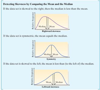
Skewness Detection:
If the data set is skewed to the right (positively skewed), the mean is greater than the median.
If the data set is symmetric, the mean equals the median.
If the data set is skewed to the left (negatively skewed), the mean is less than the median.
