 뒤로
뒤로Guided Review for Math 1332 Final – Statistics, Data Analysis, and Logic
스터디 가이드 - 스마트 노트
 자료에 맞춘 맞춤형 노트, 핵심 정의, 예시, 맥락을 확장해 제공합니다.
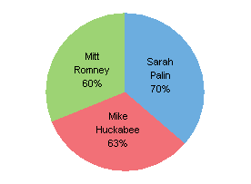
Q2. What is wrong with the pie chart below?
Background
Topic: Data Visualization – Pie Charts
This question tests your ability to critically evaluate pie charts for accuracy and proper representation of data.
Key Terms:
Pie Chart: A circular graph divided into slices to illustrate numerical proportions.
Percentages: The sum of all slices should equal 100% in a valid pie chart.
Step-by-Step Guidance
Examine the percentages shown for each section of the pie chart.
Add the percentages together to check if they sum to 100%.
Consider whether the chart visually matches the proportions indicated by the percentages.
Think about what a pie chart is supposed to represent and whether this chart meets those criteria.
Try solving on your own before revealing the answer!
Final Answer:
The sum of the percentages (60% + 70% + 63%) is 193%, which is much greater than 100%. A pie chart should always total 100%, so this chart is incorrect and misleading.
This error makes the chart invalid for representing proportions.
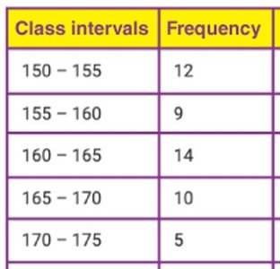
Q3. Use each chart to answer the questions below about the Number of Birds at a Watering Hole Each Hour.
Background
Topic: Frequency Distribution and Statistical Analysis
This question tests your ability to interpret frequency tables and histograms, including concepts like modal class, class width, class mark, and identifying data points.
Key Terms and Formulas:
Modal Class: The class interval with the highest frequency.
Class Width: The difference between the upper and lower boundaries of a class interval.
Class Mark: The midpoint of a class interval, calculated as .
Frequency: The number of data points in each class interval.
Step-by-Step Guidance
Identify the modal class by finding the class interval with the highest frequency in the table.
Calculate the class width for the 3rd class by subtracting the lower boundary from the upper boundary.
Find the class mark for the 4th class using the formula: .
Determine the most common data point by looking for the highest frequency.
Identify the largest and smallest number of birds by checking the class intervals and their frequencies.
Try solving on your own before revealing the answer!
Final Answer:
Modal class: 160–165 (frequency 14)
Class width of 3rd class:
Class mark of 4th class:
Most common data point: 160–165 interval
Largest number of birds: 14 (in 160–165 interval), Smallest: 5 (in 170–175 interval)
Q12. Consider each histogram below.
Background
Topic: Standard Deviation and Data Distribution
This question tests your understanding of how the spread of data affects standard deviation, using histograms as visual aids.
Key Terms:
Standard Deviation: A measure of how spread out numbers are in a data set.
Histogram: A graphical representation of the distribution of numerical data.
Step-by-Step Guidance
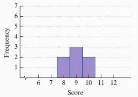
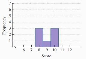
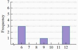
Examine each histogram to see how the data is distributed—are the values clustered or spread out?
Recall that a higher standard deviation means data is more spread out from the mean.
Identify which histogram has the widest spread and which has the most concentrated data.
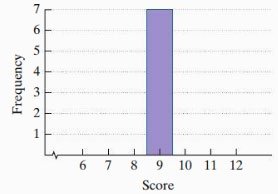
Consider if any histogram shows all data points at a single value, which would result in a standard deviation of 0.
Try solving on your own before revealing the answer!
Final Answer:
Highest standard deviation: Histogram D (image_6), because the data is most spread out.
Lowest non-zero standard deviation: Histogram B (image_4), as the data is clustered but not all at one value.
Standard deviation of 0: Histogram A (image_3), since all data points are at the same value (score 9).
Standard deviation increases as data points are further from the mean.
