 뒤로
뒤로Population Ecology and the Distribution of Organisms – Study Guide Walkthrough
스터디 가이드 - 스마트 노트
 자료에 맞춘 맞춤형 노트, 핵심 정의, 예시, 맥락을 확장해 제공합니다.
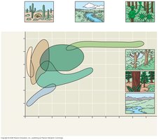
Q11. Label the axes of this figure, and identify each biome shown here. Try to do this based on your understanding of the figure, and then use the text to check your answers. You will use these biomes: temperate grassland, temperate broadleaf forest, tropical forest, northern coniferous forest, desert, tundra.
Background
Topic: Biomes and Abiotic Factors
This question is testing your understanding of how biomes are distributed based on abiotic factors, specifically temperature and precipitation. You are also being asked to interpret a climograph, which is a graphical representation of climate data for different biomes.
Key Terms and Concepts:
Biome: A major ecological community type, such as a forest or desert, characterized by distinctive plant and animal species and maintained under the climatic conditions of the region.
Climograph: A plot of the annual mean temperature and precipitation in a particular region.
Abiotic Factors: Non-living chemical and physical parts of the environment that affect living organisms and the functioning of ecosystems (e.g., temperature, precipitation).
Step-by-Step Guidance
Examine the axes of the climograph. Typically, the x-axis represents annual mean temperature (°C), and the y-axis represents annual mean precipitation (cm or mm).
Look at the position and shape of each colored region on the graph. Each region corresponds to a different biome, based on its typical temperature and precipitation range.
Use your knowledge of biomes to match each region to the correct biome name. For example, deserts are usually found in areas with low precipitation and can have a wide range of temperatures.
Refer to the images associated with each region for visual clues about the vegetation and landscape typical of each biome.
Label each region on the graph with the appropriate biome name, using the list provided: temperate grassland, temperate broadleaf forest, tropical forest, northern coniferous forest, desert, tundra.
Try solving on your own before revealing the answer!
Final Answer:
Axes: The x-axis is labeled "Annual Mean Temperature (°C)", and the y-axis is labeled "Annual Mean Precipitation (cm)".
Biomes (from left to right, bottom to top):
Tundra: Low temperature, low precipitation (bottom left, blue region).
Desert: Wide range of temperature, very low precipitation (tan region, left side).
Temperate Grassland: Moderate temperature, moderate precipitation (light green region, middle).
Northern Coniferous Forest (Taiga): Low to moderate temperature, moderate precipitation (dark green region, above grassland).
Temperate Broadleaf Forest: Moderate to high temperature, moderate to high precipitation (green region, right middle).
Tropical Forest: High temperature, high precipitation (far right, top green region).
This climograph visually demonstrates how temperature and precipitation are the primary abiotic factors determining the distribution of major terrestrial biomes.
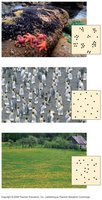
Q24. Label the dispersion pattern shown by each population in the figure below. Second, and most important, what do the dispersion patterns tell us about the population and its interactions?
Background
Topic: Population Dispersion Patterns
This question is testing your ability to recognize and interpret the three main types of population dispersion: clumped, uniform, and random. It also asks you to consider what these patterns reveal about the underlying ecological interactions.
Key Terms:
Clumped Dispersion: Individuals are aggregated in patches, often due to resource availability or social behavior.
Uniform Dispersion: Individuals are evenly spaced, often due to territoriality or competition.
Random Dispersion: The position of each individual is independent of others, often occurring in homogeneous environments.
Step-by-Step Guidance
Observe each image and the corresponding diagram showing the spatial arrangement of individuals.
Identify which pattern is being shown: clumped (grouped together), uniform (evenly spaced), or random (no predictable pattern).
Consider what ecological factors might lead to each pattern. For example, clumped patterns may result from patchy resources or social behavior, while uniform patterns may result from competition for resources.
Think about what these patterns suggest about the interactions within the population, such as competition, cooperation, or environmental heterogeneity.
Try solving on your own before revealing the answer!
Final Answer:
Top image: Clumped dispersion – individuals are grouped together, often due to resource patchiness or social behavior.
Middle image: Uniform dispersion – individuals are evenly spaced, often due to territoriality or competition.
Bottom image: Random dispersion – individuals are distributed unpredictably, often in homogeneous environments with little interaction.
These patterns reveal how resources, social interactions, and competition shape the spatial arrangement of individuals within a population.
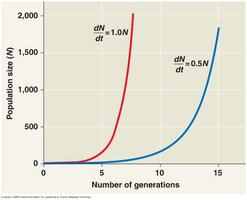
Q33. In the graph below, explain why the line with the value of 1.0 shows a steeper slope that reaches exponential growth more quickly than does the line with the value of 0.5. On this graph, add a third line that approximates a population with an exponential value of 1.25.
Background
Topic: Exponential Population Growth
This question is testing your understanding of exponential growth in populations and how the intrinsic rate of increase (r) affects the growth curve.
Key Formula:
= population size
= intrinsic rate of increase (per capita growth rate)
= time (or generations)
Step-by-Step Guidance
Examine the graph, noting that the y-axis represents population size () and the x-axis represents the number of generations.
Understand that a higher value of (e.g., 1.0) means the population grows faster each generation compared to a lower value (e.g., 0.5).
Recognize that the line with is steeper because the population is increasing at a faster rate per generation than the line with .
To add a third line for , consider that this line would be even steeper than the line, showing even more rapid population growth.
Set up the exponential growth equation for and think about how the curve would look compared to the other two lines.
Try solving on your own before revealing the answer!
Final Answer:
The line with is steeper than the line with because a higher intrinsic rate of increase causes the population to double more quickly each generation. If you add a third line for , it would be even steeper, showing the fastest exponential growth among the three. The equation can be used to plot these curves, with the $r = 1.25$ line rising most rapidly.
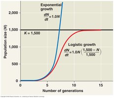
Q39. In the graph below, explain why the logistic model predicts a sigmoid (S-shaped) growth curve when the population density is plotted over time. Hint: The critical part of this answer concerns why growth slows as N approaches K.
Background
Topic: Logistic Population Growth
This question is testing your understanding of the logistic growth model and how carrying capacity () limits population growth, resulting in an S-shaped curve.
Key Formula:
= population size
= intrinsic rate of increase
= carrying capacity
Step-by-Step Guidance
Examine the graph, noting the S-shaped (sigmoid) curve for logistic growth and the straight exponential curve for comparison.
Understand that at low population sizes ( much less than ), the term is close to 1, so the population grows nearly exponentially.
As increases and approaches , the term decreases, reducing the growth rate.
When is close to , population growth slows dramatically, causing the curve to level off.
Think about how resource limitation and increased competition at high densities contribute to this slowing of growth.
Try solving on your own before revealing the answer!
Final Answer:
The logistic model predicts a sigmoid (S-shaped) growth curve because as the population size () approaches the carrying capacity (), the growth rate slows due to limited resources and increased competition. The term approaches zero, causing the population growth to level off at $K$. This results in the characteristic S-shaped curve, with rapid growth at first, slowing as resources become limiting, and finally stabilizing at the carrying capacity.
