Skip to main content
Statistics for Business
나의 코스
배우기
시험 준비
AI 튜터
학습 가이드
플래시카드
탐험해 보세요
앱을 사용해 보세요
나의 코스
배우기
시험 준비
AI 튜터
학습 가이드
플래시카드
탐험해 보세요
앱을 사용해 보세요
뒤로
Boxplots quiz
카드를 뒤집기 위해 탭할 수 있습니다.
What is a boxplot used for in statistics?
카드를 뒤집기 위해 탭할 수 있습니다.
👆
What is a boxplot used for in statistics?
A boxplot is used to visually display the distribution, spread, and skewness of a dataset.
진행 상황 추적
컨트롤 버튼이 '내비게이션' 모드로 변경되었습니다.
1/15
관련 플래시카드
관련 실천
추천 영상
Boxplots definitions
Boxplots
12 용어
Boxplots
3. Describing Data Numerically
5 문제점
주제
Ernest
3. Describing Data Numerically
8 주제
19 문제점
장
Jonathan
VideoThumbView.guidedCourse
01:52
Boxplots Example 1
286
views
1
rank
VideoThumbView.guidedCourse
03:54
Boxplots ("Box and Whisker Plots")
360
views
2
rank
VideoThumbView.guidedCourse
02:48
Boxplots Example 2
250
views
4
rank
이 집합의 용어 (15)
하이드의 정의
What is a boxplot used for in statistics?
A boxplot is used to visually display the distribution, spread, and skewness of a dataset.
What five-number summary does a boxplot represent?
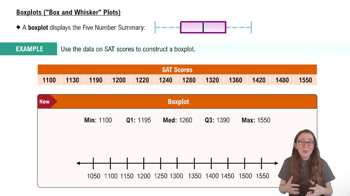
A boxplot represents the minimum, first quartile (Q1), median, third quartile (Q3), and maximum.
What does the box in a boxplot indicate?
The box shows the interquartile range (IQR), which is the distance between Q1 and Q3.
How is the median shown in a boxplot?
The median is represented by a line inside the box.
What do the 'whiskers' in a boxplot represent?
The whiskers extend from the box to the minimum and maximum values, excluding outliers.
How are outliers depicted in a boxplot?
Outliers are shown as individual points outside the whiskers.
What is the interquartile range (IQR) and how is it calculated?
The IQR is the difference between the third quartile (Q3) and the first quartile (Q1).
How can you identify skewness in a boxplot?
Skewness is indicated by the position of the median and the length of the whiskers; longer whiskers or a shifted median suggest skew.
What does it mean if the median is closer to the bottom of the box?
It suggests the data is skewed towards higher values (right-skewed).
What does it mean if the median is closer to the top of the box?
It suggests the data is skewed towards lower values (left-skewed).
How can boxplots be used to compare multiple datasets?
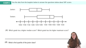
Boxplots allow visual comparison of medians, spreads, and outliers across different datasets.
What is the purpose of using boxplots instead of histograms?
Boxplots provide a concise summary of distribution and are useful for comparing groups, while histograms show frequency distributions.
What is considered an outlier in a boxplot?
An outlier is a data point that lies more than 1.5 times the IQR above Q3 or below Q1.
Why is the boxplot called a 'box-and-whisker' plot?
Because it consists of a box (showing the IQR) and whiskers (showing the range), resembling a box with lines extending from it.
What information about variability does a boxplot provide?
A boxplot shows the spread of the data through the IQR and the overall range, highlighting variability and potential outliers.
 뒤로뒤로
뒤로뒤로

 01:52
01:52