뒤로
뒤로Describing Data: Tables, Graphs, and Numerical Measures in Business Statistics
스터디 가이드 - 스마트 노트
 자료에 맞춘 맞춤형 노트, 핵심 정의, 예시, 맥락을 확장해 제공합니다.
Describing Qualitative Data
Key Concepts and Definitions
Qualitative data, also known as categorical data, are variables that can be divided into categories but not measured numerically. Understanding how to summarize and visualize qualitative data is essential for business decision-making.
Class: A category into which qualitative data can be classified.
Class Frequency: The number of observations in a data set falling into a particular class.
Class Relative Frequency: The class frequency divided by the total number of observations.
Class Percentage: The class relative frequency multiplied by 100.
Summary Table
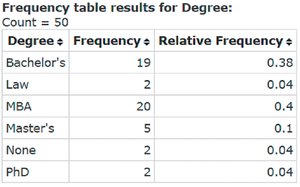
A summary table lists categories and the number of elements in each category. It may show frequencies (counts), percentages, or both.
Degree | Frequency | Relative Frequency |
|---|---|---|
Bachelor's | 19 | 0.38 |
Law | 2 | 0.04 |
MBA | 20 | 0.40 |
Master's | 5 | 0.10 |
None | 2 | 0.04 |
PhD | 2 | 0.04 |
Graphical Methods for Qualitative Data
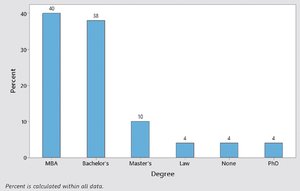
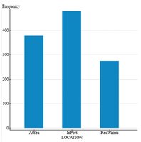
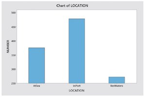
Bar Graph: Uses vertical bars to represent categories. The height of each bar shows frequency or percentage. Bars have equal width and start at zero.
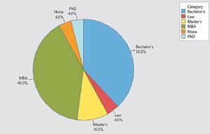
Pie Chart: Shows the breakdown of a total quantity into categories. Each slice's angle is proportional to the class percentage.
Pareto Diagram: A bar graph with categories arranged in descending order of frequency or percentage.

Graphical Methods for Describing Quantitative Data
Dot Plot
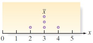
A dot plot displays each data value as a dot above its position on a number line. When values repeat, dots are stacked vertically.

Stem-and-Leaf Display
Each observation is split into a "stem" (all but the final digit) and a "leaf" (the final digit). Stems are listed in order, and leaves are placed in corresponding rows. This method preserves the original data values and shows distribution shape.
Histogram
A histogram partitions the range of a quantitative variable into equal-width intervals (classes). The height of each bar represents the frequency or relative frequency of observations in each interval. Bars touch to indicate continuous data.
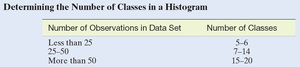
Choosing the number of classes is important for clarity and accuracy.
Number of Observations in Data Set | Number of Classes |
|---|---|
Less than 25 | 5–6 |
25–50 | 7–14 |
More than 50 | 15–20 |
Numerical Measures of Central Tendency
Central Tendency
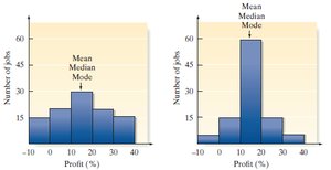
Central tendency refers to the tendency of data to cluster around certain values. The three main measures are:
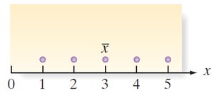
Mean (\( \bar{x} \) or \( \mu \)): The arithmetic average of the data set.
Median (m): The middle value when data are ordered. If the number of observations is even, the median is the average of the two middle values.
Mode: The value that occurs most frequently in the data set.
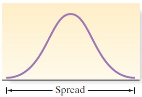
Numerical Measures of Variability
Range
The range is the difference between the largest and smallest values in the data set:
Variance and Standard Deviation
Sample Variance (\( s^2 \)): Measures the average squared deviation from the mean.
Sample Standard Deviation (\( s \)): The positive square root of the variance.
Population Variance (\( \sigma^2 \)) and Standard Deviation (\( \sigma \)): Analogous measures for the entire population.
Using the Mean and Standard Deviation to Describe Data
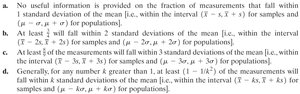
Chebyshev’s Rule
Chebyshev’s Rule applies to any data set, regardless of distribution shape. It provides minimum proportions of data within k standard deviations of the mean:
At least of the data lies within k standard deviations of the mean, for .
Empirical Rule
The Empirical Rule applies to mound-shaped, symmetric distributions (approximately normal):
About 68% of data within 1 standard deviation of the mean
About 95% within 2 standard deviations
About 99.7% within 3 standard deviations
Numerical Measures of Relative Standing
Percentiles and Quartiles
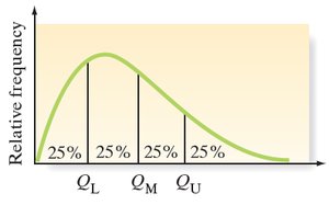
Percentiles indicate the relative position of a value within a data set. Quartiles divide data into four equal parts:
Lower Quartile (\( Q_L \)): 25th percentile
Median (\( Q_M \)): 50th percentile
Upper Quartile (\( Q_U \)): 75th percentile
z-Score
The z-score measures how many standard deviations a value is from the mean:
(sample) (population)
z-scores help identify unusual values and compare data from different distributions.
Methods for Detecting Outliers: Box Plots and z-Scores
Box Plots
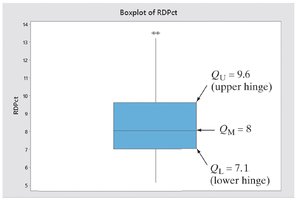
A box plot is a graphical summary based on quartiles and the interquartile range (IQR):
IQR = Q_U - Q_L
Box drawn from Q_L to Q_U, with a line at the median (Q_M)
Whiskers extend to the most extreme values within 1.5 × IQR from the quartiles
Points beyond the whiskers are considered outliers
Graphing Bivariate Relationships
Scatterplot
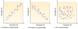
A scatterplot displays the relationship between two quantitative variables. Patterns may indicate positive, negative, or no relationship.
The Time Series Plot
Time Series Data
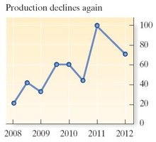
Time series plots are used to display data collected over time. The horizontal axis represents time, and the vertical axis represents the variable of interest. Points are connected by lines to show trends and patterns.
Distorting the Truth with Descriptive Statistics
Graphical Distortions
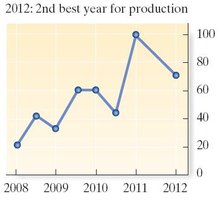
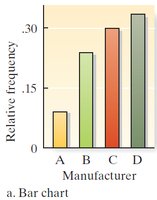
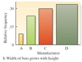
Misleading graphs can result from manipulating axis scales, bar widths, or titles. Always check for consistent scales and clear labeling to avoid misinterpretation.
Importance of Variability
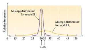
Knowing only the central tendency (mean, median, or mode) can be misleading. Variability measures (such as standard deviation) provide essential context for interpreting data distributions.