 뒤로
뒤로Exploring Data with Tables and Graphs: Frequency Distributions, Histograms, and Data Visualization
스터디 가이드 - 스마트 노트
 자료에 맞춘 맞춤형 노트, 핵심 정의, 예시, 맥락을 확장해 제공합니다.
Exploring Data with Tables and Graphs
Introduction
Organizing and summarizing data is a foundational skill in statistics. This chapter focuses on frequency distributions, histograms, and related graphical methods for visualizing and interpreting quantitative data. These tools help reveal patterns, trends, and important characteristics of datasets, making complex information more accessible and meaningful.
Frequency Distributions
Definition and Purpose
Frequency Distribution (Frequency Table): A table that displays how data are partitioned among several categories (or classes) by listing each category along with the number (frequency) of data values in each.
Helps organize and summarize data, making it easier to visualize the distribution.
Especially useful for large datasets or continuous data, where listing every value is impractical.
Constructing a Frequency Distribution
Select the number of classes (usually between 5 and 20).
Calculate the class width: Round up to a convenient number.
Choose the first lower class limit (often the minimum value or a convenient value below it).
List the lower class limits, adding the class width each time.
Determine the upper class limits for each class.
Tally each data value into the appropriate class and count the frequencies.
Key Terms
Lower Class Limit: The smallest value that can belong to a class.
Upper Class Limit: The largest value that can belong to a class.
Class Midpoint: The value halfway between the lower and upper class limits.
Class Boundaries: Values that separate classes without gaps.
Class Width: The difference between two consecutive lower class limits.
Example: Minimum Time to Get Ready
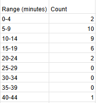
Suppose we collect data on the minimum amount of time (in minutes) it takes students to get ready in a rush. The raw data can be organized into a frequency distribution as shown below:
Range (minutes) | Count |
|---|---|
0-4 | 2 |
5-9 | 10 |
10-14 | 9 |
15-19 | 6 |
20-24 | 2 |
25-29 | 0 |
30-34 | 0 |
35-39 | 0 |
40-44 | 1 |
Relative and Cumulative Frequency Distributions
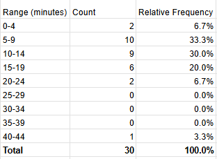
Relative Frequency Distribution
Shows the proportion or percentage of data values in each class.
Useful for comparing distributions with different sample sizes.
Calculated as:
Range (minutes) | Count | Relative Frequency |
|---|---|---|
0-4 | 2 | 6.7% |
5-9 | 10 | 33.3% |
10-14 | 9 | 30.0% |
15-19 | 6 | 20.0% |
20-24 | 2 | 6.7% |
25-29 | 0 | 0.0% |
30-34 | 0 | 0.0% |
35-39 | 0 | 0.0% |
40-44 | 1 | 3.3% |
Total | 30 | 100.0% |
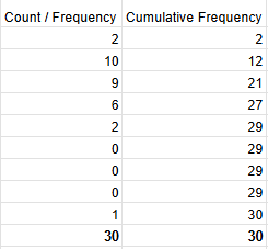
Cumulative Frequency Distribution
Shows the sum of the frequencies for that class and all previous classes.
Useful for determining how many data values are below a particular value.
Count / Frequency | Cumulative Frequency |
|---|---|
2 | 2 |
10 | 12 |
9 | 21 |
6 | 27 |
2 | 29 |
0 | 29 |
0 | 29 |
0 | 29 |
1 | 30 |
30 | 30 |
Histograms
Definition and Interpretation
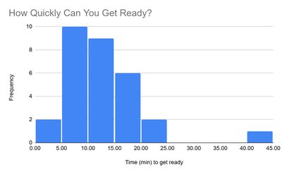
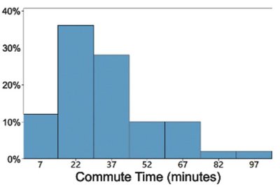
Histogram: A bar graph representing the frequency distribution of a dataset. Bars are adjacent for continuous data, and their heights correspond to class frequencies.
Histograms visually display the shape, center, spread, and outliers of the data.
Relative Frequency Histogram
Similar to a histogram, but the vertical axis shows relative frequencies (proportions or percentages) instead of counts.
Interpreting Histograms
Analyze the histogram for the following characteristics (CVDOT):
Center: Where the middle of the data lies.
Variation: The spread or dispersion of the data.
Distribution: The overall shape (e.g., symmetric, skewed).
Outliers: Unusual values that differ significantly from others.
Time: Any changes over time (if applicable).
Common Distribution Shapes
Types of Distributions
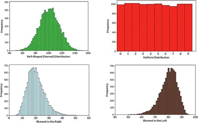
Normal (Bell-Shaped) Distribution: Symmetric, with most data clustered around the center.
Uniform Distribution: All values are equally likely; the histogram is flat.
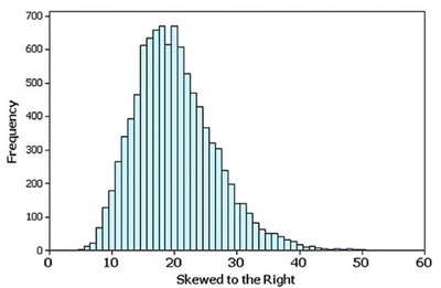
Skewed Right (Positively Skewed): Longer tail on the right; most data are on the left.
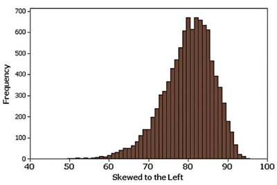
Skewed Left (Negatively Skewed): Longer tail on the left; most data are on the right.
Normal Distribution Example
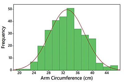
A histogram that is roughly bell-shaped is said to have a normal distribution.
Skewness
A distribution is skewed if it is not symmetric and extends more to one side.
Right (positive) skew: Longer right tail.
Left (negative) skew: Longer left tail.
Assessing Normality with Normal Quantile Plots
Normal Quantile (Q-Q) Plots
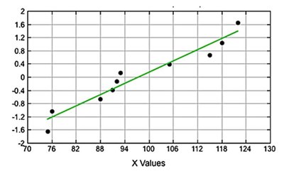
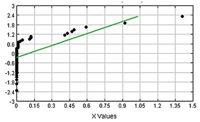
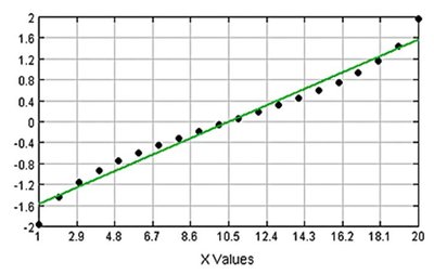
Used to assess whether data follow a normal distribution.
If the points in the plot are reasonably close to a straight line, the data are approximately normal.
Systematic deviations from a straight line indicate non-normality.
Gaps and Clusters in Data
Gaps
The presence of gaps in a frequency distribution can indicate that the data come from two or more different populations.
However, the absence of gaps does not guarantee a single population.
Clusters
Clusters of observations may reflect underlying subgroups within the data (e.g., pennies made before and after a certain year).
Summary
Frequency distributions and histograms are essential tools for summarizing and visualizing data.
Relative and cumulative frequencies provide additional perspectives for comparison and interpretation.
Understanding the shape of a distribution (normal, skewed, uniform) is crucial for further statistical analysis.
Normal quantile plots help assess the normality of data, which is important for many statistical methods.
