 뒤로
뒤로Exploring Data with Tables and Graphs: Introductory Statistics CHAP 2
스터디 가이드 - 스마트 노트
 자료에 맞춘 맞춤형 노트, 핵심 정의, 예시, 맥락을 확장해 제공합니다.
Exploring Data with Tables and Graphs
Frequency Distributions for Organizing and Summarizing Data
Frequency distributions are essential tools for organizing and summarizing large data sets. They help reveal the nature and structure of the data by grouping values into classes and showing their frequencies.
Frequency Distribution (or Frequency Table): Lists classes (categories) alongside the number of data values in each class.
Lower Class Limits: Smallest values that can belong to each class.
Upper Class Limits: Largest values that can belong to each class.
Class Boundaries: Values used to separate classes without gaps.
Class Midpoints: Calculated as the average of the lower and upper class limits for each class.
Class Width: The difference between consecutive lower class limits.
Procedure for Constructing a Frequency Distribution:
Select the number of classes (typically 5–20).
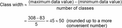
Calculate class width using the formula:
Example calculation:
Choose the first lower class limit (often a convenient value below the minimum).
List other lower class limits by adding the class width successively.
Determine upper class limits for each class.
Assign each data value to a class and tally frequencies.
Example Frequency Distribution Table:
Time (Seconds) | Frequency |
|---|---|
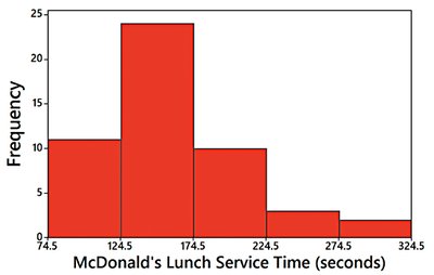
75-124 | 11 |
125-174 | 24 |
175-224 | 10 |
225-274 | 3 |
275-324 | 2 |
Relative Frequency Distribution: Each class frequency is replaced by a proportion or percentage. The sum of percentages should be close to 100%.
Cumulative Frequency Distribution: The frequency for each class is the sum of that class and all previous classes.
Time (Seconds) | Cumulative Frequency |
|---|---|
Less than 125 | 11 |
Less than 175 | 35 |
Less than 225 | 45 |
Less than 275 | 48 |
Less than 325 | 50 |
Histograms
A histogram is a graphical representation of a frequency distribution using bars of equal width. The horizontal axis shows classes of quantitative data, and the vertical axis shows frequencies.
Uses: Displays the shape, center, spread, and outliers of the data.
Relative Frequency Histogram: Uses proportions or percentages on the vertical axis instead of frequencies.
Distribution Shapes
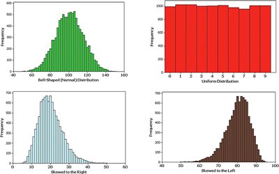
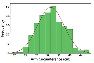
Histograms can reveal the shape of a data distribution, which is important for statistical analysis.
Normal Distribution: Bell-shaped and symmetric.
Uniform Distribution: All classes have similar frequencies.
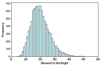
Skewed Right (Positively Skewed): Longer tail on the right.
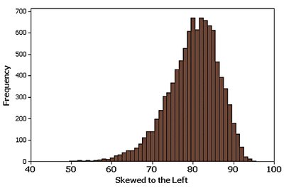
Skewed Left (Negatively Skewed): Longer tail on the left.
Graphs that Enlighten: Dotplots
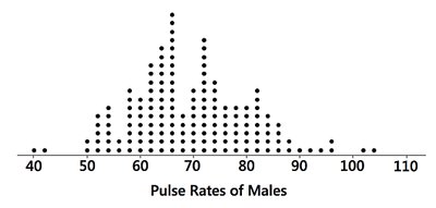
Dotplots are simple graphs where each data value is represented as a dot above a horizontal scale. Dots for equal values are stacked.
Displays the shape of the distribution.
Allows reconstruction of the original data values.
Stemplots (Stem-and-Leaf Plots)
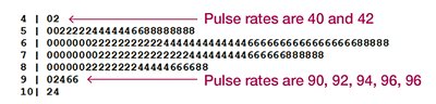
Stemplots separate each data value into a stem (leftmost digit) and a leaf (rightmost digit). They retain original data values and show the distribution shape.
Useful for small to moderate data sets.
Data are sorted and easily interpreted.
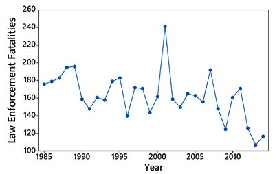
Time-Series Graphs
Time-series graphs plot quantitative data collected at different points in time, revealing trends and patterns over time.
Useful for analyzing changes and trends.
Bar Graphs
Bar graphs use bars of equal width to show frequencies of categories for categorical (qualitative) data. Bars may be separated by gaps.
Facilitate comparison of different categories.
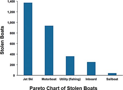
Pareto Charts
Pareto charts are bar graphs for categorical data, with bars arranged in descending order of frequency. They highlight the most important categories.
Draws attention to key categories.
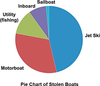
Pie Charts
Pie charts depict categorical data as slices of a circle, with each slice proportional to the frequency of the category.
Commonly used for showing distribution of categories.
Graphs That Deceive
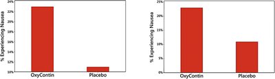
Some graphs can be misleading, such as those with nonzero vertical axes or pictographs. Always examine graphs carefully for exaggeration or distortion.
Nonzero Vertical Axis: Starting the axis above zero exaggerates differences.
Pictographs: Using images instead of bars can distort perception due to area or volume scaling.
Scatterplots, Correlation, and Regression
Scatterplots display paired quantitative data (x, y) and are used to investigate relationships between variables. Correlation measures the strength and direction of association, while regression models the relationship.
Correlation: Exists when values of one variable are associated with another.
Linear Correlation: Points form a pattern approximated by a straight line.
Scatterplot: Plots paired data to visualize correlation.
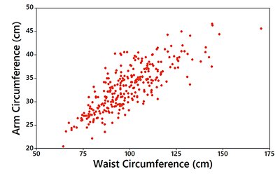
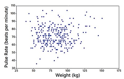
Linear Correlation Coefficient (r): Measures strength of linear association. ; values near -1 or 1 indicate strong correlation, near 0 indicate weak or no correlation.
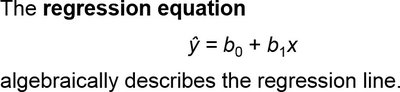
Regression: The regression line (line of best fit) models the relationship between two variables. The regression equation is:
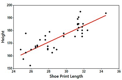
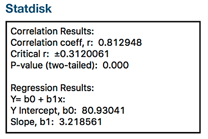
Example: Height = 80.9 + 3.22 × (Shoe Print Length)
Statdisk Output: Correlation coefficient r = 0.812948, Y Intercept b0 = 80.93041, Slope b1 = 3.218561.
Summary Table: Types of Graphs and Their Uses
Graph Type | Data Type | Main Purpose |
|---|---|---|
Histogram | Quantitative | Shape, center, spread, outliers |
Dotplot | Quantitative | Distribution shape, original values |
Stemplot | Quantitative | Distribution shape, sorted values |
Time-Series | Quantitative (over time) | Trends and changes |
Bar Graph | Categorical | Compare categories |
Pareto Chart | Categorical | Highlight important categories |
Pie Chart | Categorical | Show proportions |
Scatterplot | Paired Quantitative | Visualize correlation |
Additional info: These notes expand on brief points with academic context, definitions, and examples to ensure completeness and clarity for exam preparation.
