 뒤로
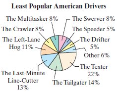
뒤로Interpreting a Pie Chart: Least Popular American Drivers
스터디 가이드 - 스마트 노트
 자료에 맞춘 맞춤형 노트, 핵심 정의, 예시, 맥락을 확장해 제공합니다.
Q: Give three observations that can be made from the graph.
Background
Topic: Data Interpretation – Pie Charts
This question tests your ability to read and interpret categorical data displayed in a pie chart. Pie charts are used to show how a whole is divided into categories, with each slice representing a proportion of the total.
Key Terms and Concepts:
Pie Chart: A circular graph divided into slices to illustrate numerical proportions.
Category Proportion: The percentage of the whole represented by each slice.
Most/Least Popular: The largest and smallest slices indicate the most and least common responses.
Step-by-Step Guidance
Examine the pie chart and identify which category has the largest slice. This represents the most unpopular driver type according to the survey.
Look for categories with equal-sized slices. If two or more categories have the same percentage, note this as an observation about their relative unpopularity.
Compare the sizes of other slices to determine which driver types are more or less unpopular than others. For example, see if one category is noticeably larger or smaller than another.
Consider the "Other" category and how it compares to the named categories. Is it larger or smaller than most?
Try solving on your own before revealing the answer!
Sample Observations:
The Texter is the most unpopular driver (largest slice at 22%).
The Speeder and the Drifter have the same unpopularity (both at 5%).
The Left-Lane Hog is more unpopular than the Crawler (11% vs. 8%).
These observations are based on comparing the percentages and relative sizes of the slices in the pie chart.
