 뒤로
뒤로Introductory Statistics Study Guide: Data, Graphs, and Analysis
스터디 가이드 - 스마트 노트
 자료에 맞춘 맞춤형 노트, 핵심 정의, 예시, 맥락을 확장해 제공합니다.
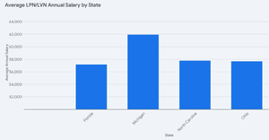
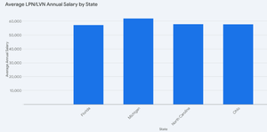
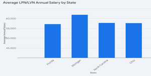
Q12. Compare and contrast the 3 graphs. Is one graph better than the others? Why?
Background
Topic: Data Visualization and Graph Interpretation
This question tests your ability to analyze and interpret different types of bar graphs, focusing on their effectiveness in representing data and potential issues such as misleading scales or clarity.
Key Terms:
Bar Graph: A chart with rectangular bars representing data values for categories.
Scale: The range and intervals used on the axes, which can affect interpretation.
Clarity: How easily the graph communicates the data.
Misleading Graphs: Graphs that distort data through inappropriate scales or visual tricks.
Step-by-Step Guidance
Examine each graph for its scale and axis labels. Are the axes clearly labeled and do the scales make sense for the data?
Compare the heights of the bars for each state. Do the differences between states appear exaggerated or minimized in any graph?
Check for consistency in the y-axis range across the graphs. Does one graph use a different starting point or interval that could mislead viewers?
Assess the overall clarity and readability. Is one graph easier to interpret or more visually appealing?
Consider which graph most accurately and fairly represents the data without distortion.
Try solving on your own before revealing the answer!
Final Answer:
One graph may be better than the others if it uses a consistent scale, clear axis labels, and accurately represents the differences between states without exaggeration or distortion. For example, a graph with a y-axis starting at zero and equal intervals is less likely to mislead viewers. If a graph uses a truncated y-axis or inconsistent intervals, it can exaggerate differences and be considered a "bad graph." The best graph is the one that most clearly and honestly communicates the data.
