 뒤로
뒤로Measures of Relative Standing and Boxplots: Study Notes for Introductory Statistics
스터디 가이드 - 스마트 노트
 자료에 맞춘 맞춤형 노트, 핵심 정의, 예시, 맥락을 확장해 제공합니다.
Measures of Relative Standing and Boxplots
Standardized Scores (z-scores)
Standardized scores, or z-scores, are used to describe the position of a data value relative to the mean of a data set, measured in terms of standard deviations. This allows for comparison of values from different distributions, regardless of their original units.
Definition: The z-score for a value x is the number of standard deviations x is above or below the mean.
Formula (Sample):
Formula (Population):
Properties:
A negative z-score indicates a value below the mean.
A positive z-score indicates a value above the mean.
Z-scores are unitless, making them ideal for comparison across different data sets.
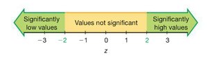
Values with z-scores less than or equal to -2 are considered significantly low; values with z-scores greater than or equal to 2 are considered significantly high.
Example: If the mean ACT score is 22 with a standard deviation of 5, the z-score for a score of 28 is .
Application: Comparing z-scores from different tests (e.g., ACT and SAT) allows you to determine on which test you performed better relative to the test population.
Percentiles and Ranks
Percentiles indicate the relative standing of a value within a data set. The kth percentile is the value below which k percent of the data fall.
Percentiles: Divide data into 100 equal parts (P1, P2, ..., P99).
Quartiles: Special percentiles dividing data into four equal parts:
Q1 (25th percentile)
Q2 (50th percentile, or median)
Q3 (75th percentile)
Finding the Percentile of a Value:
Order the data from smallest to largest.
Count the number of values less than x, divide by the sample size, and multiply by 100.
Converting from Percentile to Data Value:
Multiply the percentile (as a decimal) by n (sample size).
If the result is a decimal, round up to the next integer; that position is the percentile value.
If the result is a whole number, average the value at that position and the next.
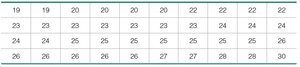
Example: In a class of 34 students, if you have the third highest score, your percentile is percentile (since 31 students scored less than you).
Quartiles and the Five-Number Summary
Quartiles divide the data into four equal parts and are used to summarize the distribution. The five-number summary consists of the minimum, Q1, median (Q2), Q3, and maximum.
Five-number summary: min, Q1, median, Q3, max
Example: For the data set 120, 120, 125, 130, 130, 130, 130, 135, 138, 140, 140, 143, 144, the five-number summary would be calculated by ordering the data and finding the quartiles.
Other Measures of Spread
Additional measures of spread help describe the variability in a data set.
Interquartile Range (IQR):
Semi-interquartile Range:
Midquartile:
10-90 Percentile Range:
Boxplots (Box-and-Whisker Plots)
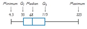
A boxplot is a graphical representation of the five-number summary. It displays the distribution, center, and spread of the data, and can help identify outliers.
The box extends from Q1 to Q3, with a line at the median (Q2).
Whiskers extend from the box to the minimum and maximum values.
Boxplots are useful for comparing distributions and identifying skewness and outliers.
Outliers
Outliers are data values that are significantly different from the rest of the data. They can affect measures of center and spread, and may indicate variability, errors, or interesting phenomena.
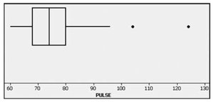
Outliers can be identified using boxplots, especially modified boxplots.
A value is considered an outlier if it is below or above .
Modified boxplots display outliers as individual points.
Boxplot Construction Steps
Find the five-number summary (min, Q1, median, Q3, max).
Draw a scale that includes the minimum and maximum values.
Draw a box from Q1 to Q3, with a line at the median.
Draw whiskers from the box to the minimum and maximum (or to the nearest non-outlier values for modified boxplots).
Summary: Describing Data Distributions
Make a histogram to determine the distribution shape (symmetric, skewed, uniform).
Record the appropriate measure of center (mean or median).
Record the appropriate measure of variation (standard deviation or IQR).
If using the mean, report the standard deviation; if using the median, report the IQR.
Discuss any outliers or gaps in the distribution.
All Together Example
For the data set: 17, 18, 21, 17, 18, 20, 18, 19, 20, 20, 21, calculate the following:
Mean, median, mode
Range, standard deviation, variance
Coefficient of variation
Significantly low and high values (using z-scores)
Q1 and Q3
Construct a modified boxplot
Note: Calculations for these statistics follow the formulas and procedures outlined above.
