뒤로
뒤로Numerically Summarizing Data: Measures of Central Tendency, Dispersion, and Position
스터디 가이드 - 스마트 노트
 자료에 맞춘 맞춤형 노트, 핵심 정의, 예시, 맥락을 확장해 제공합니다.
Chapter 3: Numerically Summarizing Data
Section 3.1: Measures of Central Tendency
Measures of central tendency are statistical values that describe the center or typical value of a data set. The three main measures are the mean, median, and mode. Each measure provides a different perspective on what is considered 'average' and is appropriate in different contexts depending on the data's characteristics.
Mean: The arithmetic mean is the sum of all data values divided by the number of observations. It is sensitive to extreme values (outliers) and is best used for quantitative data that is symmetrically distributed.
Median: The median is the middle value when the data is ordered. It is resistant to outliers and is preferred when the data is skewed.
Mode: The mode is the most frequently occurring value in the data set. It can be used for both qualitative and quantitative data and is the only measure suitable for nominal data.
Formulas:
Population Mean:
Sample Mean:
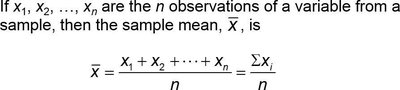
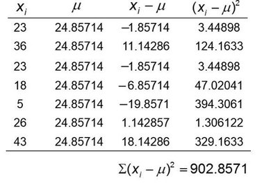
Example: For the data set 23, 36, 23, 18, 5, 26, 43, the population mean is calculated by summing all values and dividing by 7.
The mean is not always a value present in the data set and is affected by extreme values. The median is found by ordering the data and selecting the middle value (or averaging the two middle values if the number of observations is even). The mode is simply the value(s) that appear most frequently.
Relation Between Mean, Median, and Distribution Shape
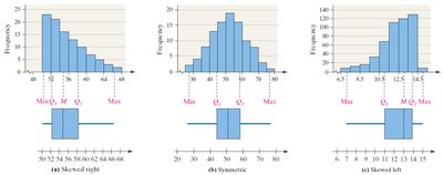
The relationship between the mean and median provides insight into the shape of the data distribution:
Skewed Left: Mean < Median
Symmetric: Mean ≈ Median
Skewed Right: Mean > Median
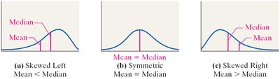
The median is preferred for skewed distributions because it is resistant to outliers.
Mode and Frequency Tables
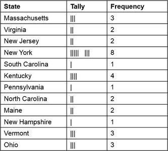
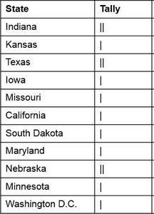
The mode can be identified using frequency tables or tally charts. For example, the mode of the state of birth for U.S. Vice Presidents can be found by identifying the state with the highest frequency in the table below:
State | Tally | Frequency |
|---|---|---|
Massachusetts | ||| | 3 |
Virginia | || | 2 |
New Jersey | || | 2 |
New York | |||| |||| | 8 |
South Carolina | | | 1 |
Kentucky | |||| | 4 |
Pennsylvania | | | 1 |
North Carolina | || | 2 |
Maine | || | 2 |
New Hampshire | | | 1 |
Vermont | ||| | 3 |
Ohio | ||| | 3 |
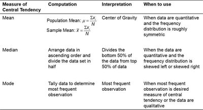
Summary Table: Measures of Central Tendency
Measure | Computation | Interpretation | When to Use |
|---|---|---|---|
Mean | Population Mean: Sample Mean: | Center of Gravity | Quantitative data, symmetric distribution |
Median | Arrange data in order, divide in half | Divides bottom 50% from top 50% | Quantitative data, skewed distribution |
Mode | Tally most frequent observation | Most frequent observation | Qualitative or when most frequent value is desired |
Section 3.2: Measures of Dispersion
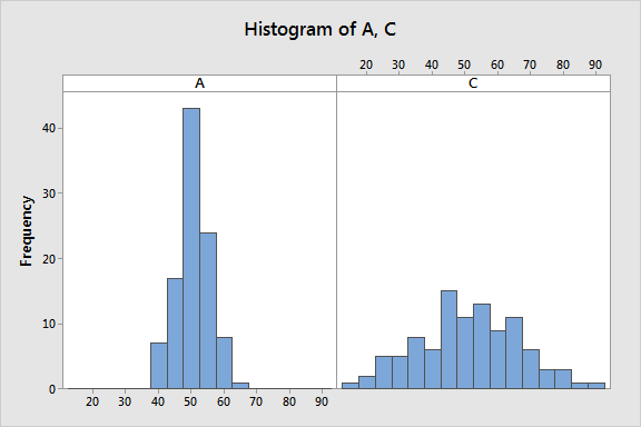
Measures of dispersion describe the spread or variability of a data set. They help us understand how much the data values differ from the center.
Range (R): The difference between the largest and smallest values.
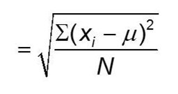
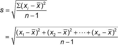
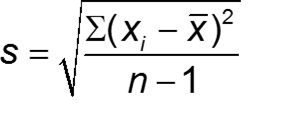
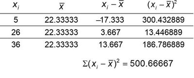
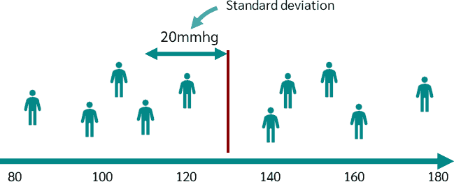
Standard Deviation (σ for population, s for sample): Measures the average distance of data values from the mean. A larger standard deviation indicates more spread.
Variance (σ² for population, s² for sample): The square of the standard deviation.
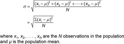
Standard Deviation Formulas
Population Standard Deviation:
Sample Standard Deviation:
Application of Standard Deviation
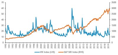
Standard deviation is widely used in finance to measure the volatility of stock prices. A higher standard deviation indicates greater risk due to more variability in returns.
The Empirical Rule
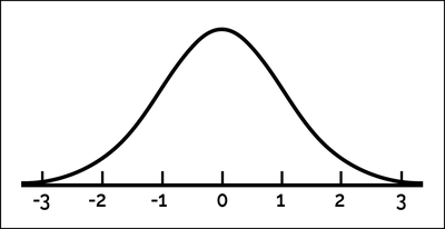
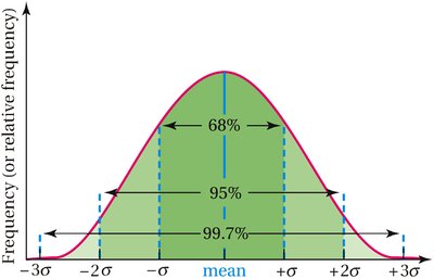
For bell-shaped (normal) distributions, the Empirical Rule states:
About 68% of data falls within 1 standard deviation of the mean
About 95% within 2 standard deviations
About 99.7% within 3 standard deviations
Section 3.4: Measures of Position and Outliers
Measures of position describe the relative standing of a data value within a data set. Common measures include z-scores, percentiles, and quartiles. Outliers are extreme values that may indicate variability in measurement, experimental errors, or novelty.
Z-scores
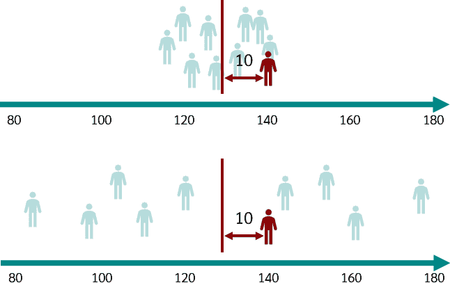
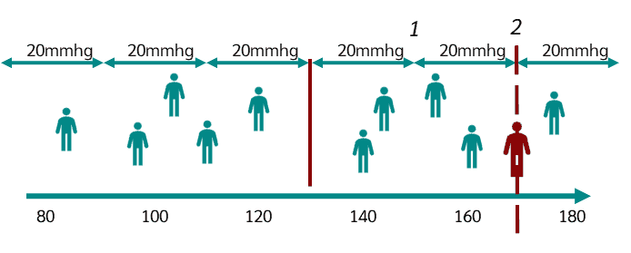
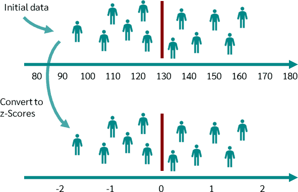
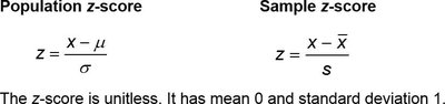
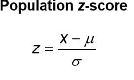
The z-score indicates how many standard deviations a value is from the mean. It allows for comparison across different data sets.
Population z-score:
Sample z-score:
Percentiles and Quartiles
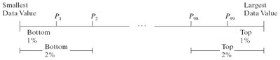
Percentiles divide data into 100 equal parts. The kth percentile is the value below which k% of the data falls. Quartiles divide data into four equal parts:
Q1: 25th percentile
Q2: 50th percentile (median)
Q3: 75th percentile


Interquartile Range (IQR) and Outliers
The interquartile range (IQR) measures the spread of the middle 50% of data and is calculated as . Outliers are identified as values below Q1 - 1.5(IQR) or above Q3 + 1.5(IQR).
Section 3.5: Five-Number Summary and Boxplots
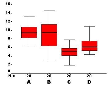
The five-number summary provides a concise description of a data set using the minimum, Q1, median, Q3, and maximum. Boxplots are graphical representations of the five-number summary and are useful for visualizing the distribution, spread, and potential outliers in the data.
Five-number summary: Minimum, Q1, Median, Q3, Maximum
Boxplot: A box from Q1 to Q3 with a line at the median, and 'whiskers' extending to the minimum and maximum values within the fences. Outliers are plotted individually.


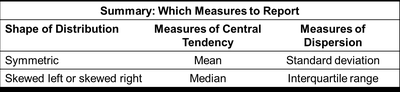
Summary Table: Which Measures to Report
Shape of Distribution | Measures of Central Tendency | Measures of Dispersion |
|---|---|---|
Symmetric | Mean | Standard deviation |
Skewed left or right | Median | Interquartile range |