 뒤로
뒤로Relationships Between Categorical Variables: Contingency Tables and Graphical Displays
스터디 가이드 - 스마트 노트
 자료에 맞춘 맞춤형 노트, 핵심 정의, 예시, 맥락을 확장해 제공합니다.
Relationships Between Categorical Variables
Introduction
Understanding the relationship between two categorical variables is a fundamental aspect of introductory statistics. This chapter explores how to organize, summarize, and visualize bivariate categorical data using contingency tables and various graphical displays.
Types of Bivariate Categorical Data Displays
Contingency Tables
Side by Side Pie Charts
Segmented Bar Charts
Mosaic Plots
Contingency Tables
Definition and Structure
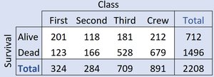
A contingency table (also called a two-way table) is a tabular method for displaying the frequency distribution of two categorical variables simultaneously. Each cell in the table shows the count for a specific combination of categories.
Rows typically represent one categorical variable (e.g., Survival: Alive or Dead).
Columns represent the other categorical variable (e.g., Class: First, Second, Third, Crew).
Marginal totals (row and column sums) show the frequency distribution for each variable separately.
Example: The table below shows the relationship between ticket class and survival on the Titanic.
Survival \ Class | First | Second | Third | Crew | Total |
|---|---|---|---|---|---|
Alive | 201 | 118 | 181 | 212 | 712 |
Dead | 123 | 166 | 528 | 679 | 1496 |
Total | 324 | 284 | 709 | 891 | 2208 |
Marginal Distributions
The marginal distribution of a variable is obtained by summing across the rows or columns of a contingency table. It shows the distribution of a single variable, ignoring the other.
Marginal distribution of Survival: Alive (712), Dead (1496)
Marginal distribution of Class: First (324), Second (284), Third (709), Crew (891)
Conditional Distributions
Definition and Calculation
A conditional distribution describes the distribution of one variable for individuals who satisfy a specific condition on another variable. It is calculated by dividing the cell counts by the total for the conditioning category.
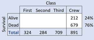
Example: The conditional distribution of Survival, given Crew status:
Survival \ Class | Crew | Percent |
|---|---|---|
Alive | 212 | 24% |
Dead | 679 | 76% |
Total | 891 | 100% |
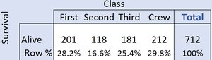
Conditional distribution of Class, given Survival (Alive):
Class | First | Second | Third | Crew | Total |
|---|---|---|---|---|---|
Alive | 201 | 118 | 181 | 212 | 712 |
Row % | 28.2% | 16.6% | 25.4% | 29.8% | 100% |
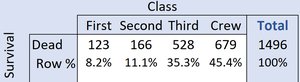
Conditional distribution of Class, given Survival (Dead):
Class | First | Second | Third | Crew | Total |
|---|---|---|---|---|---|
Dead | 123 | 166 | 528 | 679 | 1496 |
Row % | 8.2% | 11.1% | 35.3% | 45.4% | 100% |
Interpretation: Independence vs. Association
If the conditional distributions of one variable are the same across all categories of the other variable, the variables are independent. If they differ, the variables are associated (not independent).
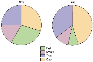
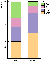
In the Titanic example, the distribution of Class among survivors is different from that among nonsurvivors, indicating an association between Class and Survival.
Graphical Displays for Categorical Data
Side by Side Pie Charts
Side by side pie charts visually compare the conditional distributions of a categorical variable across the categories of another variable. Each pie chart represents a different group (e.g., survivors vs. nonsurvivors), and the slices show the proportion in each category (e.g., ticket class).
Segmented Bar Charts
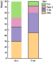
A segmented bar chart (also called a stacked bar chart) displays the same information as side by side pie charts, but uses bars divided into segments proportional to the counts or percentages in each category. This makes it easier to compare proportions across groups.
Mosaic Plots
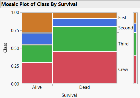
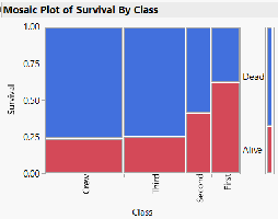
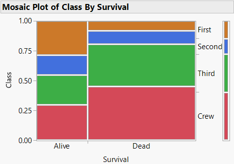
A mosaic plot is a graphical display similar to a segmented bar chart, but the width of each bar is proportional to the frequency of the category on the horizontal axis. The height of each segment within a bar represents the conditional proportion of the second variable.
Mosaic plots are useful for visualizing associations between two categorical variables.
In the Titanic example, the plot shows that survival rates differ by class.
Segmented Bar Chart vs. Mosaic Plot
Both segmented bar charts and mosaic plots display conditional distributions, but mosaic plots also encode the marginal distribution of the variable on the horizontal axis by varying bar widths. This provides more information about the joint distribution of the two variables.
Choice of X and Y Variables
When creating contingency tables or mosaic plots, the choice of which variable is placed on the horizontal (X) or vertical (Y) axis can affect the clarity of the visualization. However, the statistical relationship between the variables does not depend on this choice.
Another Example: Classroom Seating and Gender
Survey Data
Suppose a survey of 100 randomly selected students records their gender (0 = female, 1 = male) and where they prefer to sit in a classroom (1 = front, 2 = middle, 3 = back, 4 = no preference). The data can be summarized in a contingency table and visualized with a mosaic plot.
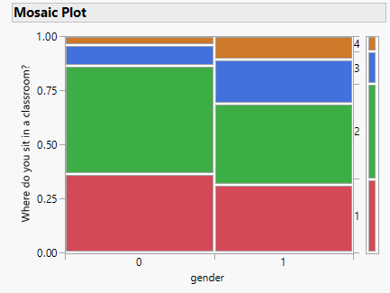
By comparing the conditional distributions, we can assess whether gender and seating preference are independent or associated.
Summary
Contingency tables organize and summarize the relationship between two categorical variables.
Marginal and conditional distributions help describe associations and independence.
Graphical displays such as side by side pie charts, segmented bar charts, and mosaic plots provide visual insights into the data.
Understanding these tools is essential for analyzing categorical data in statistics.
