 뒤로
뒤로Study Notes: Two Variable Relationships in Introductory Statistics
스터디 가이드 - 스마트 노트
 자료에 맞춘 맞춤형 노트, 핵심 정의, 예시, 맥락을 확장해 제공합니다.
Two Variable Relationships
Introduction
Understanding relationships between two variables is a fundamental aspect of statistics. Two variables are considered associated if knowing the value of one provides information about the other beyond what summary statistics alone can offer. Associations can occur between categorical variables, between a categorical and a quantitative variable, or between two quantitative variables.
Associations Between Two Categorical Variables
Detecting Associations
To determine if two categorical variables are associated, examine column proportions in a contingency table. If proportions differ across rows or columns, an association exists.
No Association: Proportions are similar across categories; knowing one variable does not help predict the other.
Example: If 28% of people agree with a statement and 28% of people with a high school education agree, education does not provide additional information about agreement.
Associations Between a Categorical and a Quantitative Variable
Descriptive Statistics and Graphs
To explore relationships between a categorical and a quantitative variable, use side-by-side dotplots, histograms, or boxplots. Boxplots are often preferred for clarity.
Compare typical values (mean or median) across categories.
Examine quartiles and outliers for differences.
No Association: Centers, quartiles, and outliers are similar across groups.
Association: Differences in these statistics indicate an association.
Describe differences using summary statistics and visual comparisons.
Example: ICU Survival and Blood Pressure
50% of patients who died had blood pressure > 126; 50% who lived had BP > 132.
Low blood pressure (< 80) was much more common among those who died (22.5%) than those who lived (1.25%).
A patient with BP ≤ 80 is 18 times more likely to die than to live.
Difference in Means: For two groups, calculate the difference in means (e.g., men watch 2.383 more hours of TV per week than women).
Multiple Groups: Compute pairwise differences; later, methods like ANOVA can detect overall differences.
Associations Between Two Quantitative Variables
Linear and Nonlinear Relationships
When both variables are quantitative, associations can be linear or nonlinear. A linear association is characterized by a constant rate of change (slope).
Linear Association: The change in y with respect to x is constant.
Nonlinear Association: The pattern shows a pronounced curve or piecewise linear segments.
No Association: y values are scattered equally above and below the mean of y, or x values are scattered equally around the mean of x.
Steps to Determine Relationship Type
Rule out no association.
Rule out nonlinear association.
If neither, conclude linear association.
Examples
Linear: Birth rate vs. life expectancy (countries with low birth rates tend to have longer life expectancies).
Nonlinear: Enrollment vs. Faculty Salary (curved pattern).
Piecewise Linear: Heavy Drinkers vs. Smokers (distinct linear segments).
Scatterplots are used to visually assess the form of the relationship.
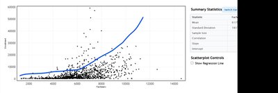
Characterizing Relationships: Form, Direction, and Strength
Form
The form describes whether the relationship is linear or nonlinear.
Direction
The direction can be positive or negative:
Positive: As x increases, y increases.
Negative: As x increases, y decreases.
To detect direction, draw vertical and horizontal lines at the means of x and y, forming four quadrants. If most points are in the lower left and upper right, the direction is positive; if in the upper left and lower right, the direction is negative.
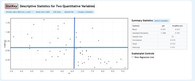
Correlation
Correlation quantifies the strength and direction of a linear relationship between two quantitative variables.
Sample correlation:
Population correlation: (rho)
Range:
Sign indicates direction (+ for positive, - for negative)
Values near +1 or -1 indicate strong linear relationships; values near 0 indicate weak or no linear relationship.
Correlation is unitless and does not change if x and y are switched.
Strength of Association
Strength describes how closely the data follow the form (linear or nonlinear). For linear relationships, use the absolute value of correlation:
Strong:
Moderate:
Weak:
No Association: (check scatterplot to confirm)
Summary Table: Types of Associations
Type of Variables | Method | Key Indicators | Example |
|---|---|---|---|
Two Categorical | Contingency Table, Column Proportions | Different proportions across categories | Agreement vs. Education Level |
Categorical & Quantitative | Boxplots, Dotplots, Summary Statistics | Differences in means, medians, quartiles, outliers | ICU Survival vs. Blood Pressure |
Two Quantitative | Scatterplot, Correlation | Form, direction, strength (r value) | Birth Rate vs. Life Expectancy |
