 뒤로
뒤로Summarizing and Graphing Data (Introductory Statistics Ch. 2)
스터디 가이드 - 스마트 노트
 자료에 맞춘 맞춤형 노트, 핵심 정의, 예시, 맥락을 확장해 제공합니다.
Summarizing and Graphing Data
Introduction to Summarizing and Graphing Data
Summarizing and graphing data are essential steps in statistics that help us understand, interpret, and communicate information from raw data sets. This chapter focuses on organizing data into tables and visual representations to reveal patterns, trends, and distributions.
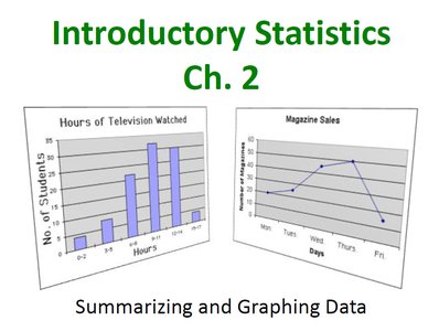
Frequency Distributions
Definition and Purpose
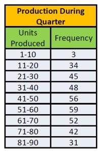
A frequency distribution is a table that displays how a data set is partitioned among several classes (intervals), listing all classes and the number of values in each class. Frequency distributions do not maintain the original data values but make it easier to analyze patterns and trends.
Class: A category or interval into which data values are grouped.
Frequency: The number of data values that fall into each class.
Parts of a Frequency Distribution
Lower Class Limit: The smallest number that can belong to a class.
Upper Class Limit: The largest number that can belong to a class.
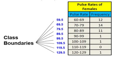
Class Boundaries: Numbers used to separate classes without gaps between them.
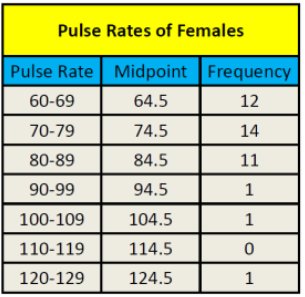
Class Midpoint: The value in the middle of a class, calculated as the average of the lower and upper class limits.
Class Width: The difference between two consecutive lower (or upper) class limits. All classes should have the same width.
Constructing a Frequency Distribution
Sort the data and determine the number of classes (usually between 5 and 20).
Calculate the class width using the formula:
Choose the minimum data value as the first lower class limit.
List all lower and upper class limits using the class width.
Count the frequency for each class.
Include titles, labels, and optionally midpoints and relative frequencies.
Example: Frequency Distribution
The following table shows the weights of wild bears grouped into classes:
Weight (lbs) | Frequency |
|---|---|
26-95 | 5 |
96-165 | 6 |
166-235 | 7 |
236-305 | 1 |
306-375 | 4 |
376-445 | 2 |

Relative and Cumulative Frequency Distributions
Relative Frequency Distribution
A relative frequency distribution shows the proportion (or percentage) of data values in each class. It is calculated as:
Cumulative Frequency Distribution
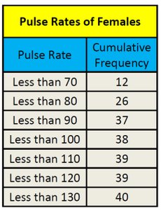
A cumulative frequency distribution displays the sum of the frequencies for that class and all previous classes. It helps to determine how many data values are below a particular upper class boundary.
Pulse Rate | Cumulative Frequency |
|---|---|
Less than 70 | 12 |
Less than 80 | 26 |
Less than 90 | 37 |
Less than 100 | 38 |
Less than 110 | 39 |
Less than 120 | 39 |
Less than 130 | 40 |
Graphical Representations of Data
Dot Plots
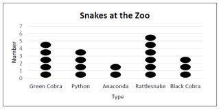
A dot plot is a simple graph that displays individual data values as dots above a number line. Dots representing equal values are stacked. Dot plots are useful for both quantitative and categorical data.
Histograms
A histogram is a bar graph representing the frequency distribution of quantitative data. The horizontal axis shows the classes, and the vertical axis shows the frequencies. Histograms do not retain the original data values but are useful for visualizing the shape of the data distribution.
Relative Frequency Histogram
Similar to a histogram, but the vertical axis represents relative frequencies (percentages) instead of raw counts.
Frequency Polygon
A frequency polygon uses line segments connected to points directly above the class midpoints. It can also be constructed using relative frequencies.
Ogive
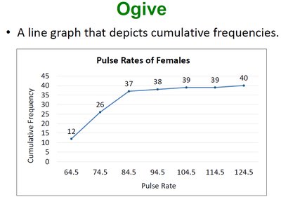
An ogive is a line graph that depicts cumulative frequencies, helping to visualize how many data values are below a certain value.
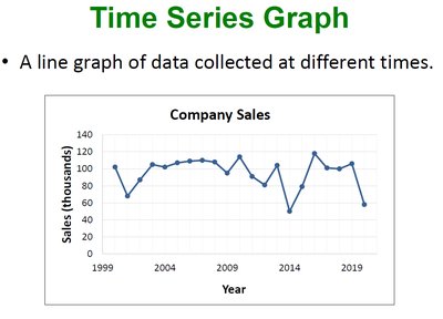
Time Series Graph
A time series graph is a line graph of data collected at different points in time, useful for identifying trends over time.
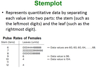
Stemplot (Stem-and-Leaf Plot)
A stemplot represents quantitative data by separating each value into two parts: the stem (such as the leftmost digits) and the leaf (the rightmost digit). Stemplots retain the original data values and are useful for small to moderate-sized data sets.
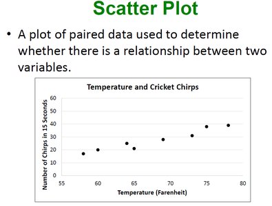
Scatter Plot
A scatter plot is a graph of paired data used to determine whether there is a relationship between two variables. Each point represents a pair of values.
Analyzing Graphs
Shape of Distributions
When analyzing histograms and other graphs, it is important to consider the shape of the distribution:
Symmetric: The left and right sides of the graph are approximately mirror images.
Skewed: The graph is not symmetric; it may be skewed left (tail on the left) or right (tail on the right).
Graph Construction Errors
Common errors in graph construction include using inappropriate graph types, incomplete labeling, or poor communication of data. All graphs should be clearly labeled with titles and axes to ensure accurate interpretation.
Summary Table: Types of Graphs and Their Uses
Graph Type | Best For | Data Type |
|---|---|---|
Frequency Distribution | Summarizing data in classes | Quantitative |
Dot Plot | Displaying individual values | Quantitative/Categorical |
Histogram | Visualizing distribution shape | Quantitative |
Relative Frequency Histogram | Comparing proportions | Quantitative |
Frequency Polygon | Comparing distributions | Quantitative |
Ogive | Cumulative frequencies | Quantitative |
Time Series Graph | Trends over time | Quantitative (over time) |
Stemplot | Retaining original values | Quantitative |
Scatter Plot | Relationships between variables | Quantitative (paired) |
Additional info: This guide covers the main methods for organizing and visualizing data in introductory statistics, including frequency tables, histograms, polygons, ogives, dot plots, stemplots, and scatter plots. Understanding these tools is foundational for further statistical analysis.
