 뒤로
뒤로Variables and Graphs: Describing Data with Tables and Graphs
스터디 가이드 - 스마트 노트
 자료에 맞춘 맞춤형 노트, 핵심 정의, 예시, 맥락을 확장해 제공합니다.
Variables and Types of Data
Definition of Variables
A variable is a characteristic or property that can take on different values for different individuals in a population. Variables are fundamental in statistics as they are the focus of data collection and analysis.
Example: Height, age, color, income, number of siblings.
Qualitative vs. Quantitative Data
Data can be classified into two main types: qualitative (categorical) and quantitative (numerical).
Qualitative Data: Consist of labels or descriptions of traits. Examples include gender, color, or type of housing.
Quantitative Data: Consist of counts or measurements. Examples include height, weight, or number of students.
Comparison Table
Type | Description | Examples |
|---|---|---|
Qualitative | Labels, categories | Gender, color, housing type |
Quantitative | Counts, measurements | Height, weight, number of students |
Continuous vs. Discrete Data
Quantitative data can be further classified as continuous or discrete:
Continuous Data: Can take any value within a given range; usually measurements (e.g., height, temperature).
Discrete Data: Can take only specific values; usually counts (e.g., number of houses, number of students).
Frequency Distributions
Definition and Purpose
A frequency distribution is a table that displays the frequency, or number of occurrences, of each value or category in a data set. It helps summarize and organize data for further analysis.
Graphs for Qualitative Variables
Pie Charts
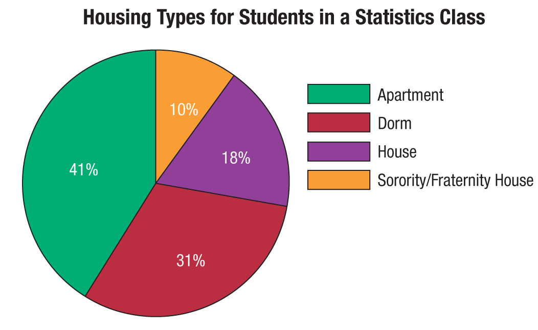
A pie chart visually represents the proportion of each category in a data set. Each wedge corresponds to a category, and its size is proportional to the relative frequency.
Formula for Central Angle:
Used for: Qualitative or categorical data.
Bar Graphs
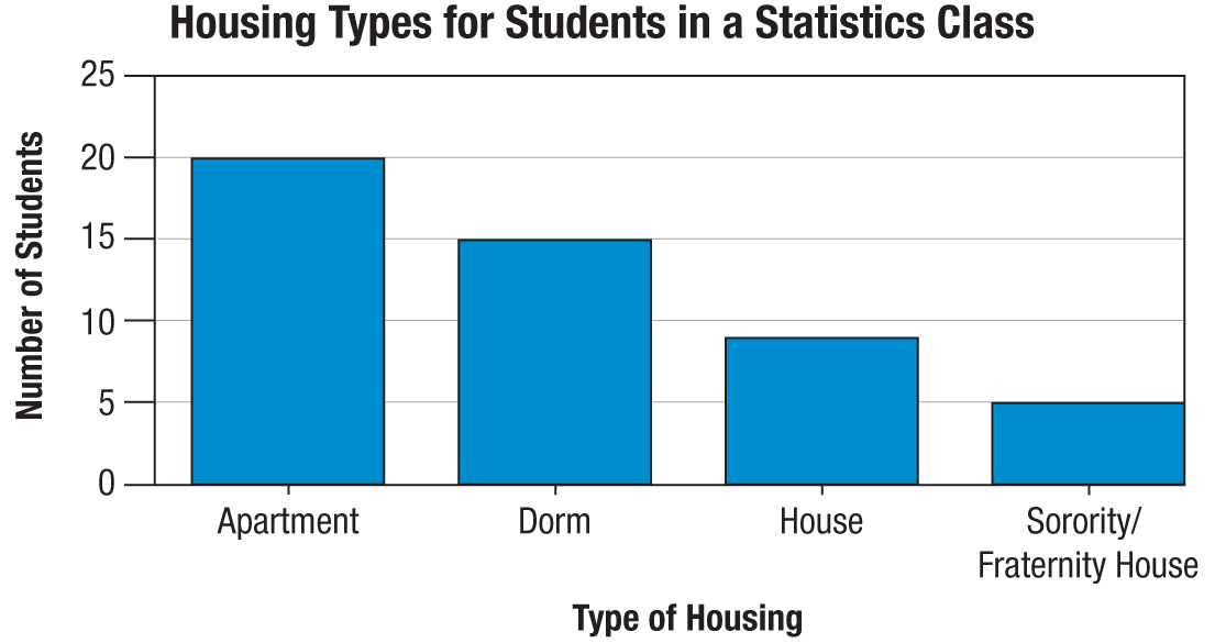
A bar graph uses bars to represent the frequency or count of each category. The height of each bar corresponds to the frequency..
Pareto Chart: Bars are arranged in descending order.
Side-by-Side Bar Graph: Compares categories across different groups.
Stacked Bar Graph: Efficient for displaying data from different samples.
Graphing Advice
Graphs should be able to stand alone without the original data.
Include a title and labels for both axes.
When appropriate, add a legend, source, and date.

Graphs for Quantitative Variables
Histograms Y
A histogram is a bar graph of a frequency distribution for quantitative data. The horizontal axis is a real number line, and the bars touch each other, representing class intervals.
Frequency Histogram: Heights of bars represent frequencies.
Relative Frequency Histogram: Heights represent relative frequencies.
Class Width: The width of each bar corresponds to the class interval.
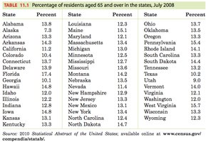
Constructing a Histogram
Divide the range of data into classes of equal width.
Count the number of individuals in each class.
Draw the histogram.
Shapes of Graphs
The shape of a graph provides insight into the distribution of data:
Uniform: Frequencies are relatively the same across classes.
Symmetric: Data are evenly distributed on both sides.
Skewed Right: Most data are on the left; tail is on the right.
Skewed Left: Most data are on the right; tail is on the left.
Outlier: A value that falls outside the normal shape.
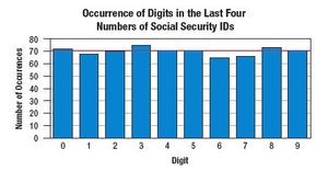
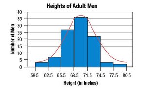
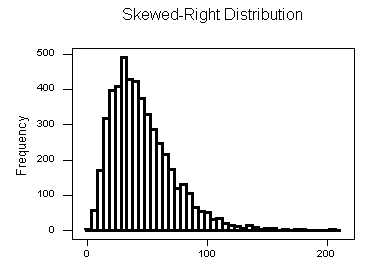
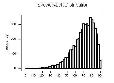
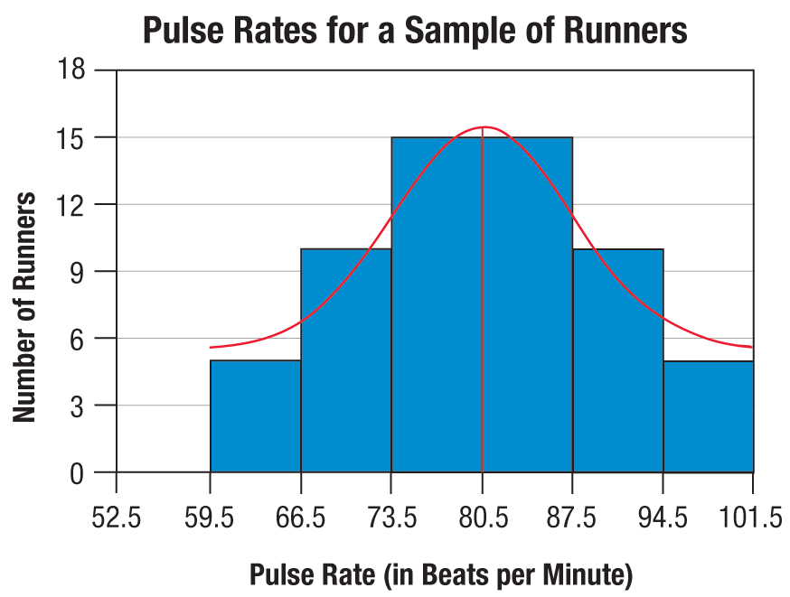
Example: Describing the Shape of a Distribution
When describing the shape, look for symmetry, skewness, and outliers. A symmetric distribution has mirror-image sides.
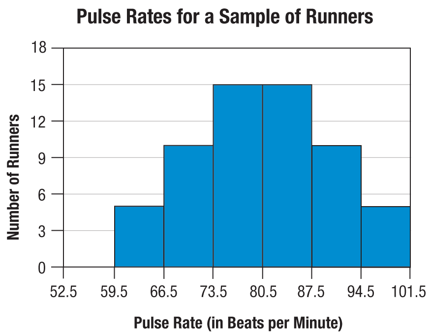
Stem-and-Leaf Plots
Definition and Construction
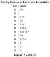
A stem-and-leaf plot is a graphical method for displaying quantitative data. It retains the original data and organizes values into stems (leading digits) and leaves (trailing digits).
Create columns for stems and leaves.
List stems in numerical order.
List leaves next to their stems.
Include a key for interpretation.
Order leaves for clarity.
Example: Starting Salaries for Entry-Level Accountants
Dot Plots and Line Graphs
Dot Plots
A dot plot displays individual data points along a number line. Identical values are stacked.
Line Graphs
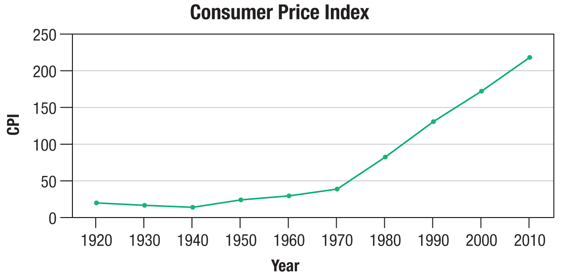
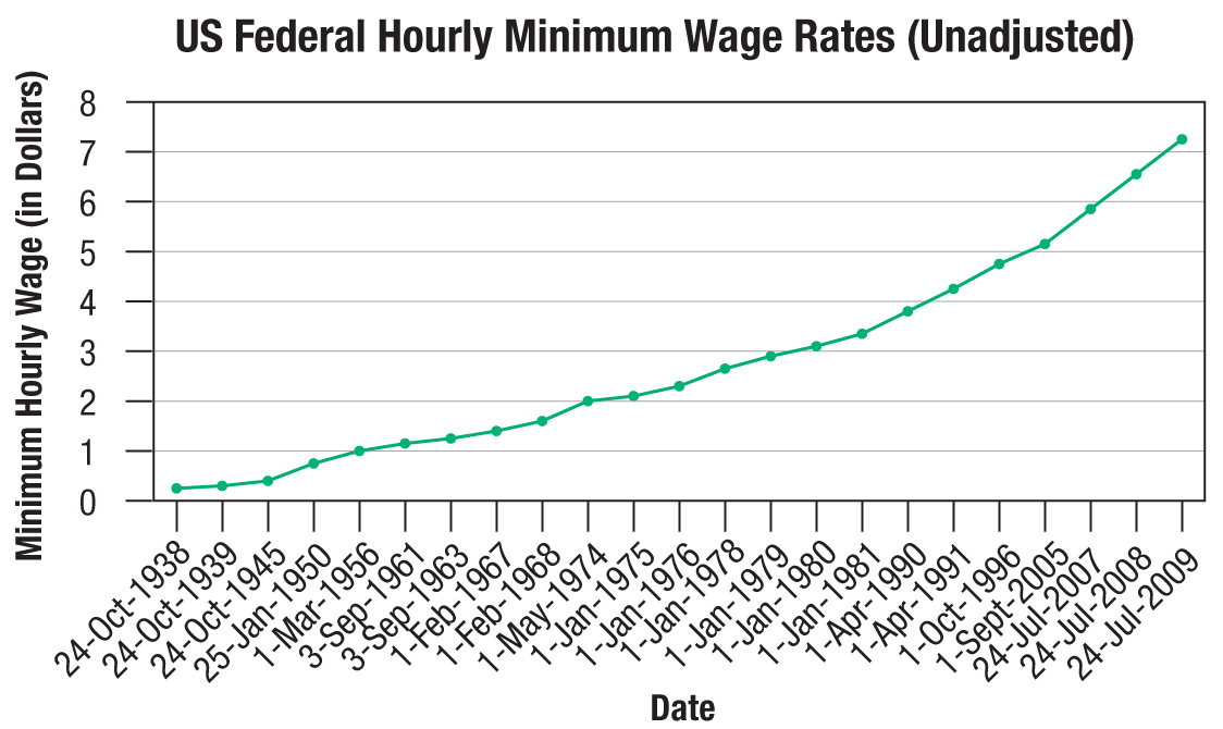
A line graph is used for data measured over time. The horizontal axis represents time, and the vertical axis represents the variable measured. Points are connected by straight lines.
Analyzing Graphs: Appropriateness and Scaling
Types of Graphs
Time-Series Graph: Line graph showing changes over time.
Cross-Sectional Graph: Displays data at one point in time.
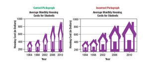
Pictograph: Bar graph using pictures instead of bars; can be misleading.
Scaling of Graphs
Proper scaling is crucial for accurate interpretation. Inconsistent scales can distort the shape and meaning of a graph.
Summary Table: Graph Types and Their Uses
Graph Type | Data Type | Purpose |
|---|---|---|
Pie Chart | Qualitative | Show proportions of categories |
Bar Graph | Qualitative | Compare frequencies of categories |
Histogram | Quantitative | Show distribution of numerical data |
Stem-and-Leaf Plot | Quantitative | Display original data and distribution |
Dot Plot | Quantitative | Show individual data points |
Line Graph | Quantitative (over time) | Show trends over time |
Pictograph | Qualitative/Quantitative | Visual representation, can be misleading |
Key Points for Exam Preparation
Understand the difference between qualitative and quantitative data.
Know how to construct and interpret frequency distributions.
Be able to identify and describe the shape of data distributions.
Recognize appropriate graph types for different data.
Check for proper labeling, scaling, and potential misleading features in graphs.
