Ch. 2 - Descriptive Statistics
Larson - Elementary Statistics: Picturing the World 8th Edition
Larson8th EditionElementary Statistics: Picturing the WorldISBN: 9780137493470당신이 사용하는 게 아니라요?교과서 변경
2장, 문제 2.1.36

Constructing a Frequency Distribution and a Frequency Polygon In Exercises 35 and 36, construct a frequency distribution and a frequency polygon for the data set using the indicated number of classes. Describe any patterns.
Declaration of Independence
Number of classes: 5
Data set: Number of children of those who signed the Declaration of Independence (Source: The U.S. National Archives & Records Administration) 5 2 12 18 7 4 10 8 16 3 3 7 3 1 2 7 13 0 8 3 7 5 2 6 0 6 7 9 0 11 9 10 7 8 13 5 8 3 5 0 3 13 3 15 5 6 3 2 5 2 0 3 7 12 4 1

검증된 단계별 안내
1
Step 1: Organize the data by identifying the minimum and maximum values in the data set. This will help determine the range, which is calculated as \(\text{Range} = \text{Maximum value} - \text{Minimum value}\).
Step 2: Calculate the class width by dividing the range by the number of classes (which is 5). Use the formula \(\text{Class width} = \frac{\text{Range}}{\text{Number of classes}}\). If the result is not a whole number, round up to the next whole number to ensure all data points fit into the classes.
Step 3: Construct the class intervals starting from the minimum value, adding the class width to create each subsequent class. Make sure the classes do not overlap and cover the entire range of data.
Step 4: Tally the data points into each class interval to find the frequency for each class. This will give you the frequency distribution, which lists each class interval alongside its frequency.
Step 5: To create the frequency polygon, plot the midpoints of each class interval on the x-axis and their corresponding frequencies on the y-axis. Connect these points with straight lines. Finally, analyze the shape of the polygon to describe any patterns such as skewness, peaks, or uniformity.

비슷한 문제에 대한 검증된 영상 답변:

이 영상 해법은 위 문제에 도움이 된다고 튜터들이 추천한 것입니다.
영상 길이:
6m
도움이 되었나요?

주요 개념

질문에 올바르게 답하기 위해 반드시 이해해야 하는 핵심 개념들은 다음과 같습니다.

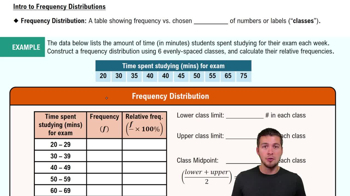
Frequency Distribution

A frequency distribution organizes data into classes or intervals and shows how many data points fall into each class. It helps summarize large data sets by grouping values, making patterns easier to identify. For example, counting how many people have 0-3 children, 4-7 children, etc., provides a clear overview of the data.
추천 영상:
가이드 코스
06:38
Intro to Frequency Distributions

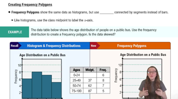
Frequency Polygon

A frequency polygon is a graphical representation of a frequency distribution, created by plotting class midpoints against their frequencies and connecting the points with straight lines. It helps visualize the shape and trends of the data, such as peaks or gaps, and is useful for comparing distributions.
추천 영상:
04:41
Creating Frequency Polygons

Class Intervals and Number of Classes

Class intervals divide the data range into equal segments, and the number of classes determines how many intervals are used. Choosing an appropriate number of classes (like 5 in this question) balances detail and clarity, avoiding too many or too few groups, which affects the interpretability of the frequency distribution and polygon.
추천 영상:
가이드 코스
09:00
Prediction Intervals
관련 실천
교과서 질문

Finding the Mean of a Frequency Distribution In Exercises 49–52, approximate the mean of the frequency distribution.


Social Media The average daily amounts of time (in minutes) spent on Snapchat

267
views

교과서 질문

Finding the Mean of a Frequency Distribution In Exercises 49–52, approximate the mean of the frequency distribution.


Populations The populations (in thousands) of the counties in Montana in 2019 (Source: U.S. Census Bureau)

126
views
교과서 질문

Graphical Analysis In Exercises 19–22, use the box-and-whisker plot to determine whether the shape of the distribution represented is symmetric, skewed left, skewed right, or none of these. Justify your answer.

100
views
교과서 질문

Using and Interpreting Concepts


Finding and Discussing the Mean, Median, and Mode In Exercises 17–34, find the mean, the median, and the mode of the data, if possible. If any measure cannot be found or does not represent the center of the data, explain why.


Video Durations The lengths (in minutes) of seven educational videos from the Public Broadcasting Service (PBS) (Source: PBS)

83 67 90 55 56 119 52

102
views
교과서 질문

In Exercises 37– 40, without performing any calculations, determine which measure of central tendency best represents the graphed data. Explain your reasoning.


" style="" width="300">

88
views
교과서 질문

Comparing Variation in Different Data Sets In Exercises 45–50, find the coefficient of variation for each of the two data sets. Then compare the results.

Annual Salaries Sample annual salaries (in thousands of dollars) for entry level architects in Denver, CO, and Los Angeles, CA, are listed.

156
views