Ch. 2 - Descriptive Statistics
Larson - Elementary Statistics: Picturing the World 8th Edition
Larson8th EditionElementary Statistics: Picturing the WorldISBN: 9780137493470당신이 사용하는 게 아니라요?교과서 변경
2장, 문제 2.T.6

The number of minutes it took 12 students in a statistics class to complete the final exam are listed. Use a scatter plot to display this data set and the data set in Exercise 1. The data sets are in the same order. Describe any patterns.
61 85 67 48 54 61 59 80 67 55 88 84

검증된 단계별 안내
1
Step 1: Organize the data into two variables. The first variable represents the student index (e.g., 1 through 12), and the second variable represents the time it took each student to complete the exam (e.g., 61, 85, 67, etc.).
Step 2: Create a scatter plot. On the x-axis, plot the student index (1 through 12), and on the y-axis, plot the corresponding exam completion times (61, 85, 67, etc.).
Step 3: Plot each data point on the scatter plot. For example, the first point will be (1, 61), the second point will be (2, 85), and so on, until the last point (12, 84).
Step 4: Observe the scatter plot to identify any patterns. Look for trends such as clustering, increasing or decreasing trends, or any outliers that deviate significantly from the rest of the data.
Step 5: Compare this scatter plot with the scatter plot from Exercise 1. Analyze whether the patterns in the two data sets are similar or different, and describe any notable observations.

비슷한 문제에 대한 검증된 영상 답변:

이 영상 해법은 위 문제에 도움이 된다고 튜터들이 추천한 것입니다.
영상 길이:
2m
도움이 되었나요?

주요 개념

질문에 올바르게 답하기 위해 반드시 이해해야 하는 핵심 개념들은 다음과 같습니다.

Scatter Plot

A scatter plot is a graphical representation that uses dots to represent the values obtained for two different variables, one plotted along the x-axis and the other along the y-axis. In this context, it will display the time taken by students to complete the exam, allowing for visual analysis of any correlation or patterns in the data.
추천 영상:
07:38
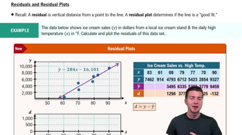
Residuals and Residual Plots

Descriptive Statistics

Descriptive statistics summarize and describe the main features of a data set. This includes measures such as mean, median, mode, and range, which help in understanding the central tendency and variability of the exam completion times, providing context for any patterns observed in the scatter plot.
추천 영상:
05:53
Parameters vs. Statistics

Correlation

Correlation refers to a statistical measure that describes the extent to which two variables change together. In the context of the scatter plot, identifying correlation can help determine if there is a relationship between the exam completion times of the students and any other variable, such as their performance or study habits.
추천 영상:
05:43
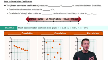
Correlation Coefficient
관련 실천
교과서 질문

Use frequency distribution formulas to estimate the sample mean and the sample standard deviation of the data set in Exercise 2.

289
views

교과서 질문

The data set represents the number of movies that a sample of 20 people watched in a year.

121 148 94 142 170 88 221 106 18 67

149 28 60 101 134 168 92 154 53 66

b. Display the data using a frequency histogram and a frequency polygon on the same axes.

23
views
교과서 질문

"According to data from the city of Toronto, Ontario, Canada, there were nearly 112,000 parking infractions in the city for December 2020, with fines totaling over 5,500,000 Canadian dollars. The fines (in Canadian dollars) for a random sample of 105 parking infractions in Toronto, Ontario, Canada, for December 2020 are listed below. (Source: City of Toronto)


In Exercises 1–5, use technology. If possible, print your results.


Draw a histogram for the data. Does the distribution appear to be bell-shaped?"

54
views
교과서 질문

Use the frequency distribution in Exercise 4 to estimate the sample mean and sample standard deviation of the data. Do the formulas for grouped data give results that are as accurate as the individual entry formulas? Explain.

139
views
교과서 질문

The table lists the number of albums by The Beatles that received sales certifications. Display the data using (b) a Pareto chart. (Source: Recording Industry Association of America)

114
views
교과서 질문

The data set represents the number of movies that a sample of 20 people watched in a year.

121 148 94 142 170 88 221 106 18 67

149 28 60 101 134 168 92 154 53 66


c. Display the data using a relative frequency histogram.

95
views