Ch. 2 - Descriptive Statistics
Larson - Elementary Statistics: Picturing the World 8th Edition
Larson8th EditionElementary Statistics: Picturing the WorldISBN: 9780137493470당신이 사용하는 게 아니라요?교과서 변경
2장, 문제 2.T.2b

The data set represents the number of movies that a sample of 20 people watched in a year.
121 148 94 142 170 88 221 106 18 67
149 28 60 101 134 168 92 154 53 66
b. Display the data using a frequency histogram and a frequency polygon on the same axes.

검증된 단계별 안내
1
Step 1: Organize the data by determining the range. Find the minimum and maximum values in the data set to understand the spread. The minimum is the smallest number, and the maximum is the largest number in the data.
Step 2: Decide on the number of class intervals (bins) for the histogram. A common rule of thumb is to use between 5 and 10 bins for a data set of this size. Calculate the class width using the formula: \(\text{Class Width} = \frac{\text{Maximum} - \text{Minimum}}{\text{Number of Classes}}\), then round up to a convenient number.
Step 3: Create the frequency distribution table by listing the class intervals and counting how many data points fall into each interval. This frequency count will be used to plot the histogram and frequency polygon.
Step 4: Draw the frequency histogram by plotting the class intervals on the horizontal axis and the frequencies on the vertical axis. For each class interval, draw a bar whose height corresponds to the frequency of that interval. Ensure the bars are adjacent with no gaps to represent continuous data.
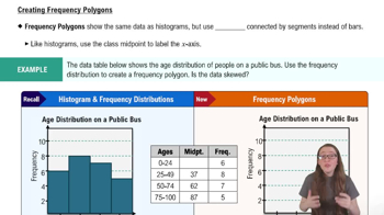
Step 5: To draw the frequency polygon on the same axes, first find the midpoints of each class interval using \(\text{Midpoint} = \frac{\text{Lower Class Limit} + \text{Upper Class Limit}}{2}\). Then plot points at these midpoints with heights equal to the corresponding frequencies. Connect these points with straight lines. Optionally, add points at the beginning and end with zero frequency to close the polygon.

비슷한 문제에 대한 검증된 영상 답변:

이 영상 해법은 위 문제에 도움이 된다고 튜터들이 추천한 것입니다.
영상 길이:
7m

주요 개념

질문에 올바르게 답하기 위해 반드시 이해해야 하는 핵심 개념들은 다음과 같습니다.

Frequency Histogram

A frequency histogram is a graphical representation of data where the data range is divided into intervals called bins, and the height of each bar shows the number of data points within each bin. It helps visualize the distribution and frequency of data values, making patterns and skewness easier to identify.
추천 영상:
가이드 코스
05:54
Intro to Histograms

Frequency Polygon

A frequency polygon is a line graph that connects the midpoints of the tops of the bars in a histogram. It provides a clear view of the shape of the data distribution and is useful for comparing multiple data sets on the same axes by showing trends and frequencies smoothly.
추천 영상:
가이드 코스
04:41
Creating Frequency Polygons

Data Grouping and Class Intervals

Data grouping involves organizing raw data into class intervals or bins to simplify analysis and visualization. Choosing appropriate class widths and intervals is essential for accurately representing the data distribution in histograms and frequency polygons without losing important details.
추천 영상:
가이드 코스
4:01
Introduction to Collecting Data