
Ch. 9 - Correlation and Regression
Larson - Elementary Statistics: Picturing the World 8th Edition
Larson8th EditionElementary Statistics: Picturing the WorldISBN: 9780137493470당신이 사용하는 게 아니라요?교과서 변경
9장, 문제 9.1.12

Graphical Analysis In Exercises 11–14, determine whether there is a perfect positive linear correlation, a strong positive linear correlation, a perfect negative linear correlation, a strong negative linear correlation, or no linear correlation between the variables.
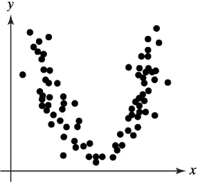
Scatterplot showing a curved pattern of black dots, indicating no linear correlation between the x and y variables.

검증된 단계별 안내
1
Step 1: Observe the scatterplot provided. The data points form a curved pattern resembling a 'U' shape, which indicates a non-linear relationship between the variables.
Step 2: Recall the definition of linear correlation. Linear correlation measures the strength and direction of a straight-line relationship between two variables. If the data points do not align along a straight line, there is no linear correlation.
Step 3: Analyze the pattern further. Since the data points curve upward and do not follow a straight-line trend, this suggests that the relationship between the variables is not linear.
Step 4: Conclude that the scatterplot does not exhibit a perfect positive linear correlation, a strong positive linear correlation, a perfect negative linear correlation, or a strong negative linear correlation.
Step 5: Final interpretation: The scatterplot shows no linear correlation between the variables, as the relationship is clearly non-linear.

비슷한 문제에 대한 검증된 영상 답변:

이 영상 해법은 위 문제에 도움이 된다고 튜터들이 추천한 것입니다.
영상 길이:
2m
도움이 되었나요?

주요 개념

질문에 올바르게 답하기 위해 반드시 이해해야 하는 핵심 개념들은 다음과 같습니다.

Correlation

Correlation measures the strength and direction of a linear relationship between two variables. It is quantified using the correlation coefficient, which ranges from -1 to 1. A value of 1 indicates a perfect positive correlation, -1 indicates a perfect negative correlation, and 0 indicates no linear correlation.
추천 영상:
가이드 코스
05:43
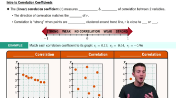
Correlation Coefficient

Scatterplot

A scatterplot is a graphical representation of two variables, where each point represents an observation. It helps visualize the relationship between the variables, allowing for the identification of patterns, trends, or correlations. In this case, the scatterplot shows a curved pattern, indicating a non-linear relationship.
추천 영상:
가이드 코스
06:36
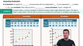
Scatterplots & Intro to Correlation

Linear vs. Non-linear Relationships

Linear relationships imply that changes in one variable result in proportional changes in another, represented by a straight line. Non-linear relationships, however, do not follow this pattern, as seen in the provided scatterplot, which suggests a quadratic relationship rather than a linear one, indicating no linear correlation.
추천 영상:
가이드 코스
07:01
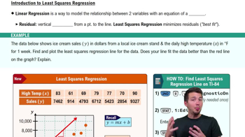
Intro to Least Squares Regression
관련 실천
교과서 질문

"Constructing and Interpreting a Prediction Interval In Exercises 21-30, construct the indicated prediction interval and interpret the results.

28. Total Assets Construct a 90% prediction interval for the total assets in federal defined benefit plans in Exercise 18 when the total assets in IRAs are \$6400 billion."

60
views
교과서 질문

"Constructing and Interpreting a Prediction Interval In Exercises 21-30, construct the indicated prediction interval and interpret the results.

30. New Vehicle Sales Construct a 99% prediction interval for new vehicle sales for Honda in Exercise 20 when the number of new vehicles sold by Toyota is 2159 thousand."

48
views
교과서 질문

"In Exercises 9 and 10, identify the explanatory variable and the response variable.

10. An actuary at an insurance company wants to determine whether the number of hours of safety driving classes can be used to predict the number of driving accidents for each

driver."

102
views
교과서 질문

"Constructing and Interpreting a Prediction Interval In Exercises 21-30, construct the indicated prediction interval and interpret the results.

22. Mean Hourly Wage Construct a 95% prediction interval for the mean hourly wage in Exercise 12 when the median hourly wage is \$21.50."

53
views
교과서 질문

"Graphical Analysis In Exercises 1–3, use the figure.

1. Describe the total variation about a regression line in words and in symbols."

74
views
교과서 질문

"In Exercises 7-10, use the value of the correlation coefficient r to calculate the coefficient of determination r^2. What does this tell you about the explained variation of the data about the regression line? about the unexplained variation?

8.r =- 0.328"

71
views