Ch. 10 - Correlation and Regression
Triola - Elementary Statistics 14th Edition
Triola14th EditionElementary StatisticsISBN: 9780137366446당신이 사용하는 게 아니라요?교과서 변경
10장, 문제 10.1.10a

Clusters Refer to the Minitab-generated scatterplot. The four points in the lower left corner are measurements from women, and the four points in the upper right corner are from men.
Scatterplot showing four points in the lower left corner representing women's measurements and four in the upper right for men.
a. Examine the pattern of the four points in the lower left corner (from women) only, and subjectively determine whether there appears to be a correlation between x and y for women.

검증된 단계별 안내
1
Step 1: Observe the scatterplot and focus on the four points in the lower left corner, which represent measurements from women. These points are located in the region where both x and y values are relatively small.
Step 2: Analyze the pattern of these four points. Check if there is a visible trend or relationship between the x-values (horizontal axis) and y-values (vertical axis). For example, determine if the points seem to increase or decrease together, or if they appear randomly scattered.
Step 3: Consider the concept of correlation. Correlation measures the strength and direction of a linear relationship between two variables. If the points form a clear upward or downward trend, there may be a positive or negative correlation, respectively. If the points are scattered without any discernible pattern, the correlation may be weak or nonexistent.
Step 4: Subjectively assess the alignment of the points. For example, if the x-values increase while the y-values remain relatively constant, this suggests no correlation. If both x and y values increase or decrease together, this suggests a positive or negative correlation.
Step 5: Conclude your subjective determination based on the visual inspection of the scatterplot. Note that this is a qualitative assessment and does not involve calculating the correlation coefficient, which would require numerical data.

비슷한 문제에 대한 검증된 영상 답변:

이 영상 해법은 위 문제에 도움이 된다고 튜터들이 추천한 것입니다.
영상 길이:
4m
도움이 되었나요?

주요 개념

질문에 올바르게 답하기 위해 반드시 이해해야 하는 핵심 개념들은 다음과 같습니다.

Scatterplot

A scatterplot is a graphical representation of two variables, where each point represents an observation in the dataset. The x-axis typically represents one variable, while the y-axis represents another. By plotting the data points, one can visually assess the relationship between the two variables, such as correlation, trends, or clusters.
추천 영상:
가이드 코스
06:36
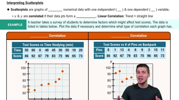
Scatterplots & Intro to Correlation

Correlation

Correlation refers to the statistical relationship between two variables, indicating how one variable may change in relation to another. It can be positive, negative, or zero, with positive correlation meaning that as one variable increases, the other does as well, and negative correlation indicating that as one increases, the other decreases. Correlation is often quantified using the correlation coefficient, which ranges from -1 to 1.
추천 영상:
가이드 코스
05:43
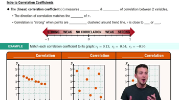
Correlation Coefficient

Subjective Analysis

Subjective analysis involves interpreting data based on personal judgment rather than strict statistical methods. In the context of examining a scatterplot, it means assessing the visual patterns and relationships between points without relying solely on numerical measures. This approach can provide insights into trends or anomalies that may not be immediately evident through quantitative analysis.
추천 영상:
가이드 코스
09:27
Difference in Proportions: Hypothesis Tests
관련 실천
교과서 질문

Effects of Clusters Refer to the Minitab-generated scatterplot given in Exercise 10 of Section 10-1.


a. Using the pairs of values for all 8 points, find the equation of the regression line.

173
views

교과서 질문

Explore!

Exercises 11 and 12 provide two data sets from “Graphs in Statistical Analysis,” by F. J. Anscombe, the American Statistician, Vol. 27. For each exercise,


a. Construct a scatterplot.

155
views
교과서 질문

Notation Using the weights (lb) and highway fuel consumption amounts (mi/gal) of the 48 cars listed in Data Set 35 “Car Data” of Appendix B, we get this regression equation:

y^ = 58.9 - 0.00749x, where x represents weight.

a. What does the symbol y^ represent?

149
views
교과서 질문

Variation and Prediction Intervals

In Exercises 17–20, find the (a) explained variation, (b) unexplained variation, and (c) indicated prediction interval. In each case, there is sufficient evidence to support a claim of a linear correlation, so it is reasonable to use the regression equation when making predictions.

Altitude and Temperature Listed below are altitudes (thousands of feet) and outside air temperatures (°F) recorded by the author during Delta Flight 1053 from New Orleans to Atlanta. For the prediction interval, use a 95% confidence level with the altitude of 6327 ft (or 6.327 thousand feet).

85
views
교과서 질문

Outlier Refer to the accompanying Minitab-generated scatterplot.

b. After identifying the 10 pairs of coordinates corresponding to the 10 points, find the value of the correlation coefficient r and determine whether there is a linear correlation.

134
views
교과서 질문

Notation The author conducted an experiment in which the height of each student was measured in centimeters and those heights were matched with the same students’ scores on the first statistics test.

b. Without doing any research or calculations, estimate the value of r.

249
views