
Ch. 2 - Exploring Data with Tables and Graphs
Triola - Elementary Statistics 14th Edition
Triola14th EditionElementary StatisticsISBN: 9780137366446당신이 사용하는 게 아니라요?교과서 변경
2장, 문제 2.3.15

In Exercises 15 and 16, construct the frequency polygons.


Chicago Commute Times Use the frequency distribution from Exercise 13 in Section 2-1 to construct a frequency polygon. Does the graph suggest that the distribution is skewed? If so, how?

검증된 단계별 안내
1
Step 1: Recall that a frequency polygon is a graphical representation of a frequency distribution. It is created by plotting points corresponding to the midpoints of each class interval on the x-axis and their respective frequencies on the y-axis, and then connecting these points with straight lines.
Step 2: Identify the class intervals and their corresponding frequencies from the frequency distribution provided in Exercise 13 of Section 2-1. Calculate the midpoint of each class interval using the formula: Midpoint=Lower+Upper2. These midpoints will serve as the x-coordinates for the frequency polygon.
Step 3: Plot the midpoints on the x-axis and their corresponding frequencies on the y-axis. For each class interval, place a point at the intersection of the midpoint and its frequency.
Step 4: Connect the plotted points with straight lines. To complete the frequency polygon, extend the lines to the x-axis at the midpoints of the intervals immediately before the first class and after the last class, with frequencies of zero.
Step 5: Analyze the shape of the frequency polygon. If the graph is not symmetric and has a longer tail on one side, it suggests that the distribution is skewed. For example, a longer tail on the right indicates positive skewness, while a longer tail on the left indicates negative skewness.

비슷한 문제에 대한 검증된 영상 답변:

이 영상 해법은 위 문제에 도움이 된다고 튜터들이 추천한 것입니다.
영상 길이:
3m
도움이 되었나요?

주요 개념

질문에 올바르게 답하기 위해 반드시 이해해야 하는 핵심 개념들은 다음과 같습니다.

Frequency Distribution

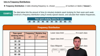
A frequency distribution is a summary of how often each value occurs in a dataset. It organizes data into categories or intervals, showing the number of observations within each category. This foundational concept is crucial for visualizing data patterns and understanding the overall distribution of values.
추천 영상:
가이드 코스
06:38
Intro to Frequency Distributions

Frequency Polygon

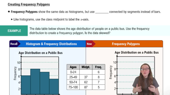
A frequency polygon is a graphical representation of a frequency distribution, created by plotting points for the frequency of each category and connecting them with straight lines. This type of graph helps to visualize the shape of the distribution, making it easier to identify trends, peaks, and potential skewness in the data.
추천 영상:
04:41
Creating Frequency Polygons

Skewness

Skewness refers to the asymmetry of a distribution, indicating whether data points are concentrated on one side of the mean. A distribution is positively skewed if it has a long tail on the right, while a negatively skewed distribution has a long tail on the left. Understanding skewness is essential for interpreting the shape of the frequency polygon and assessing the nature of the data.
추천 영상:
04:41
Creating Frequency Polygons
관련 실천
교과서 질문

In Exercises 9–18, construct the histograms and answer the given questions.


Analysis of Last Digits Use the frequency distribution from Exercise 21 in Section 2-1 to construct a histogram. What can be concluded from the distribution of the digits? Specifically, do the heights appear to be reported or actually measured?

142
views
교과서 질문

In Exercises 9–18, construct the histograms and answer the given questions.

Chicago Commute Time Use the frequency distribution from Exercise 13 in Section 2-1 to construct a histogram. Does it appear to be the graph of data from a population with a normal distribution?

185
views
교과서 질문

In Exercises 5–8, identify the class width, class midpoints, and class boundaries for the given frequency distribution. Also identify the number of individuals included in the summary. The frequency distributions are based on real data from Appendix B.

8.

570
views
교과서 질문

In Exercises 5–8, answer the questions by referring to the following Minitab-generated histogram, which depicts the weights (grams) of all quarters listed in Data Set 40 “Coin Weights” in Appendix B. (Grams are actually units of mass and the values shown on the horizontal scale are rounded.)


Sample Size What is the approximate number of quarters depicted in the three bars farthest to the left?

166
views
교과서 질문

Boston Commute Time The accompanying table summarizes daily commute times in Boston. How many commute times are included in the summary? Is it possible to identify the exact values of all of the original data amounts?

191
views
교과서 질문

In Exercises 9–18, construct the histograms and answer the given questions.


Old Faithful Use the frequency distribution from Exercise 15 in Section 2-1 to construct a histogram. Does it appear to be the graph of data from a population with a normal distribution?

147
views