Refer to Figure 5-1. With reference to graph A, at a price of \$5, what is the total revenue?
Total revenue at a price of \$5 is calculated by multiplying the price (\$5) by the quantity demanded at that price. Using the method described in the lesson, find the quantity corresponding to \(5 on the demand curve and multiply: Total Revenue = Price × Quantity. For example, if the quantity demanded at \)5 is 6 units, total revenue would be \(5 × 6 = \)30.
 Back
Back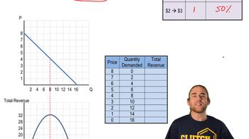
 07:13
07:13