Skip to main content
Statistics
My Course
Learn
Exam Prep
AI Tutor
Study Guides
Textbook Solutions
Flashcards
Explore
Try the app
My Course
Learn
Exam Prep
AI Tutor
Study Guides
Textbook Solutions
Flashcards
Explore
Try the app
Back
Creating Scatterplots and FInding Correlation Coefficient - Excel quiz
You can tap to flip the card.
What is the purpose of creating a scatter plot in Excel when analyzing two variables?
You can tap to flip the card.
👆
What is the purpose of creating a scatter plot in Excel when analyzing two variables?
A scatter plot visually displays the relationship between two variables, helping to identify if a linear correlation exists.
Track progress
Control buttons has been changed to "navigation" mode.
1/15
Related flashcards
Related practice
Recommended videos
Creating Scatterplots and FInding Correlation Coefficient - Excel definitions
Creating Scatterplots and FInding Correlation Coefficient - Excel
15 Terms
11. Correlation
2 topics
4 problems
Chapter
Zachary
02:32
Creating Scatterplots and FInding Correlation Coefficient - Excel Example 1
281
views
17
rank
04:09
Creating Scatterplots and FInding Correlation Coefficient - Excel
500
views
10
rank
Terms in this set (15)
Hide definitions
What is the purpose of creating a scatter plot in Excel when analyzing two variables?
A scatter plot visually displays the relationship between two variables, helping to identify if a linear correlation exists.
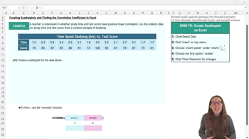
Which Excel menu option do you use to insert a scatter plot?
You use the 'Insert' menu option to insert a scatter plot in Excel.
What does the correlation coefficient r indicate about two variables?
The correlation coefficient r quantifies the strength and direction of the linear relationship between two variables.
How do you select data for a scatter plot in Excel?
You highlight both the x data and the y data in your table before inserting the scatter plot.
What function is used in Excel to calculate the correlation coefficient?
The function used is =CORREL(array1, array2), where array1 and array2 are the data ranges for the two variables.
What does an r value close to 1 signify?
An r value close to 1 indicates a strong positive linear correlation between the two variables.
How can you make your scatter plot easier to interpret in Excel?
You can add axis titles, change the chart title, and adjust the axis scales to make the scatter plot clearer.
What should the chart title of a scatter plot reflect?
The chart title should clearly describe the variables being compared, such as 'Time Spent Studying vs Test Score.'
How do you add axis titles to a scatter plot in Excel?
You can add axis titles by selecting the chart and checking the axis titles option in chart elements or the top ribbon.
What does a positive r value indicate about the relationship between two variables?
A positive r value indicates that as one variable increases, the other variable also tends to increase.
What are the two required inputs for the CORREL function in Excel?
The two required inputs are the data ranges for the x variable (array1) and the y variable (array2).
If a scatter plot shows points roughly forming a straight line, what does this suggest?
It suggests that there is a linear relationship between the two variables.
Why might you want to move your scatter plot away from your data table in Excel?
Moving the scatter plot can make both the chart and the data table easier to view and interpret.
What does it mean if the correlation coefficient r is negative?
A negative r value means that as one variable increases, the other variable tends to decrease, indicating a negative linear correlation.
What is the first step in creating a scatter plot in Excel?
The first step is to select all the data for both variables you want to plot.
 BackBack
 02:32
02:32