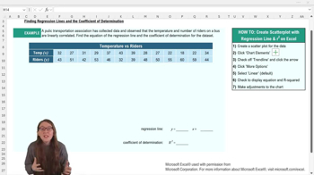
In the context of regression analysis, what does the equation y = mx + b represent?
The equation y = mx + b represents the regression line, where y is the predicted value of the dependent variable, x is the independent variable, m is the slope of the line (indicating the change in y for a one-unit change in x), and b is the y-intercept (the value of y when x is zero).
In the regression line equation y = mx + b, what does the term 'b' represent?
In the regression line equation y = mx + b, the term 'b' represents the y-intercept, which is the predicted value of the dependent variable y when the independent variable x is zero.
What is the first step to finding the regression line equation and R squared in Excel?
The first step is to create a scatter plot of your data by selecting the x and y variables and inserting a scatter plot chart. This visualizes the relationship between the variables before adding further analysis.
How do you add a regression line to a scatter plot in Excel?
You add a regression line by accessing the chart elements menu and checking the 'trend line' option. This will display a dotted trend line on your scatter plot.
Which menu option in Excel allows you to display the regression equation and R squared value on a chart?
You use the 'More Options' under the trend line settings to check 'Display equation on chart' and 'Display R squared value on chart.' This will show both directly on your scatter plot.
Why might you want to move the regression equation and R squared value text box on your Excel chart?
You might move the text box to prevent it from overlapping with data points, making it easier to read. This improves the clarity and presentation of your chart.
What should you consider regarding rounding when writing down the regression equation from Excel?
You should check your professor's policy on rounding, as Excel may not round coefficients in the equation conveniently. Rounding can make the equation easier to use for predictions.
What does an R squared value of 0.87 indicate in the context of the example given?
An R squared of 0.87 means that 87% of the variation in the number of riders is explained by the variation in temperature. This shows a strong linear relationship between the two variables.
After adding a trend line in Excel, what should you ensure about your chart’s titles and labels?
You should make sure that the chart title and axis titles accurately match your data. Proper labeling makes the graph easy to interpret.
Why is it helpful to write the regression equation and R squared value elsewhere after generating them in Excel?
It is helpful because the default font and placement may be hard to read or use directly from the chart. Writing them elsewhere ensures clarity and ease of use for analysis or reporting.