 Back
BackSummarizing Data: Statistical Measures and Applications in Human Biology
Study Guide - Smart Notes
 Tailored notes based on your materials, expanded with key definitions, examples, and context.
Summarizing Data in Human Biology
Examining Numerical Data
Numerical data analysis is fundamental in human biology for understanding trends, relationships, and variability in biological measurements. Statistical tools help summarize and interpret data from experiments, clinical studies, and population surveys.
Scatterplots for Paired Data
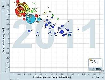
Scatterplots visualize the relationship between two numerical variables, such as height and weight, or fertility and life expectancy.
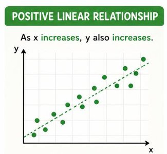
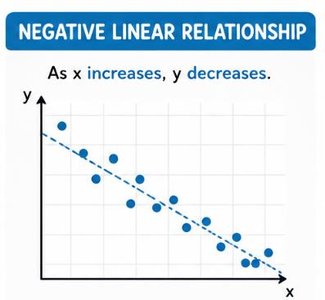
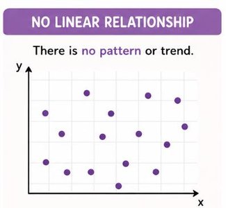
They can reveal linear, nonlinear, or no association between variables.
Example: As fertility increases, life expectancy decreases, indicating a negative linear relationship.
Dot Plots and the Mean
Dot plots display the distribution of a single numerical variable.
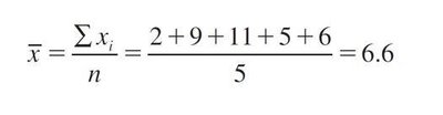
The mean (average) is a measure of central tendency, calculated as the sum of all values divided by the number of values.
Formula:
Example: For values 2, 9, 11, 5, 6, the mean is
Histograms and Shape
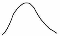
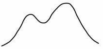
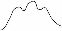
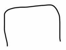
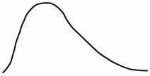
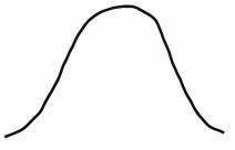
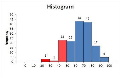
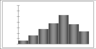
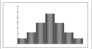
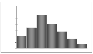
Histograms show data density and distribution shape.
Shape can be unimodal, bimodal, multimodal, or uniform.
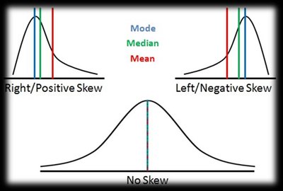
Skewness describes asymmetry: right (positive), left (negative), or symmetric.
Histograms help identify outliers and unusual observations.


Variance and Standard Deviation
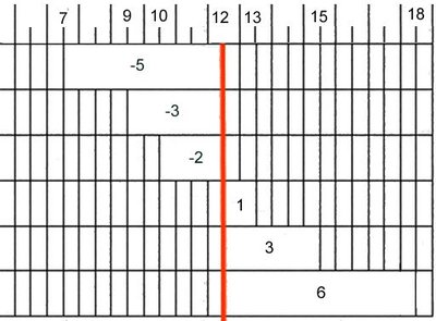
Measures of variability quantify the spread of data values.
Variance is the average squared deviation from the mean.
Sample variance formula:
Standard deviation is the square root of variance, representing average deviation from the mean.
Sample standard deviation formula:
Population variance and standard deviation use and instead of and .
Median
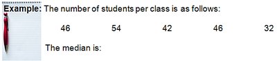
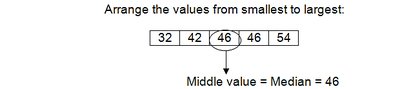
Median is the middle value when data are ordered from smallest to largest.
For odd n, median is the middle value; for even n, it is the average of the two middle values.
Median is preferred when data have extreme values (outliers).
Range and Interquartile Range (IQR)
Range = Largest value – Smallest value. Sensitive to outliers.
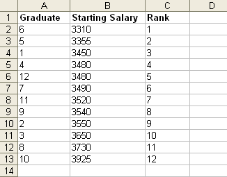
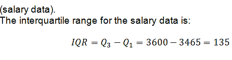
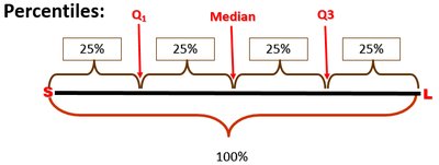
Interquartile Range (IQR) = , the range of the middle 50% of data.
IQR is robust to outliers and extreme values.
Box Plots
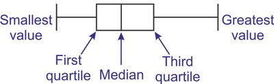
Box plots graphically summarize data using the five-number summary: minimum, , median, , maximum.
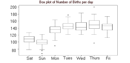
Box plots help visualize spread, center, and outliers.
Outliers are values outside or .
Robust Statistics
Robust statistics are not greatly affected by outliers or skewness.
Median and IQR are robust; mean and standard deviation are not.
For skewed distributions, use median and IQR; for symmetric distributions, use mean and SD.
Transforming Data
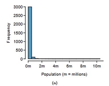
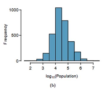
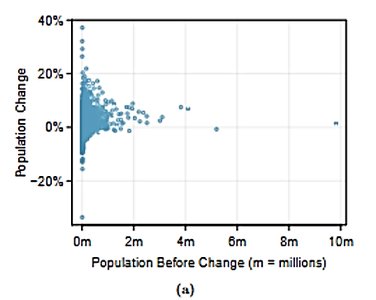
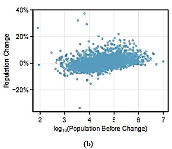
Strongly skewed data can be transformed (e.g., log transformation) to facilitate analysis.
Transformation reduces the impact of outliers and makes data easier to model.
Results in transformed units may be harder to interpret.
Mapping Data
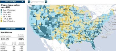
Intensity maps visualize data geographically, such as population changes across regions.
Useful for identifying spatial patterns in biological or demographic data.
Considering Categorical Data
Categorical data analysis is essential for classifying and comparing groups in human biology, such as disease status, treatment groups, or demographic categories.
Contingency Tables
Contingency tables summarize data for two categorical variables.
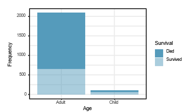
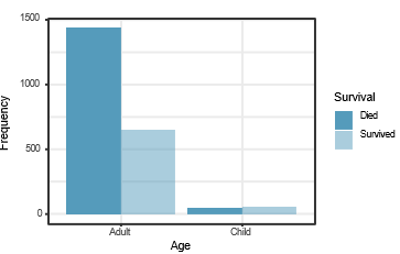
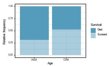
Example: Survival and age of Titanic passengers.
Row and column proportions help identify relationships between variables.
Survival | Died | Survived | Total |
|---|---|---|---|
Adult | 1438 | 654 | 2092 |
Child | 52 | 57 | 109 |
Total | 1490 | 711 | 2201 |
Frequency Distributions
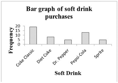
Frequency distribution: Number of items in each category.
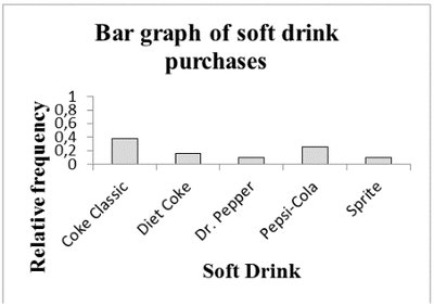
Relative frequency: Fraction or proportion of items in a category.
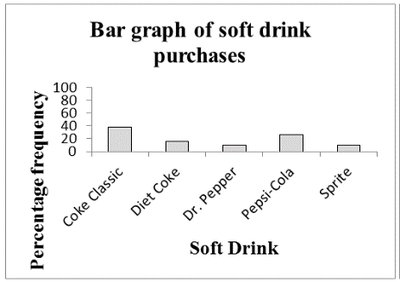
Percent frequency: Percentage of items in a category.
Soft drink | Frequency | Relative frequency | Percent frequency |
|---|---|---|---|
Coke Classic | 19 | 0.38 | 38 |
Diet Coke | 8 | 0.16 | 16 |
Dr. Pepper | 5 | 0.10 | 10 |
Pepsi-Cola | 13 | 0.26 | 26 |
Sprite | 5 | 0.10 | 10 |
Total | 50 | 1 | 100 |
Bar Plots
Bar plots display categorical data using bars for frequency, relative frequency, or percent frequency.
Stacked and side-by-side bar plots compare two categorical variables.
Mosaic Plots
Mosaic plots visualize contingency tables, showing group sizes and proportions.
Useful for comparing categorical variables, such as age and survival.
Pie Charts
Pie charts show proportions of categories as sectors of a circle.
Area of each sector is proportional to the relative frequency of the category.
Case Study: Malaria Vaccine
Statistical analysis is applied to real-world biological studies, such as evaluating the effectiveness of a malaria vaccine.
Study Design and Variables
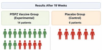
Research question: Does the PfSPZ malaria vaccine prevent infection?
Subjects: 20 volunteers, randomly assigned to vaccine (14) or placebo (6) groups.
Response variable: Infection status after exposure.
Explanatory variable: Treatment received.

Simulating the Study
Simulation uses random chance to test if observed results could occur by chance alone.
Shuffle infection outcomes among patients and compare infection rates between groups.
Repeat simulation many times to create a distribution of possible outcomes.
If observed difference is rare under the null hypothesis, conclude vaccine is effective.
Conclusion
Statistical measures and graphical methods are essential for summarizing and interpreting data in human biology.
Robust statistics, data transformation, and mapping enhance analysis of complex biological data.
Case studies demonstrate the application of statistical principles to real-world biological research.
