

Ch. 2 - Descriptive Statistics
Larson - Elementary Statistics: Picturing the World 8th Edition
Larson8th EditionElementary Statistics: Picturing the WorldISBN: 9780137493470당신이 사용하는 게 아니라요?교과서 변경
2장, 문제 2.4.9

Using and Interpreting Concepts


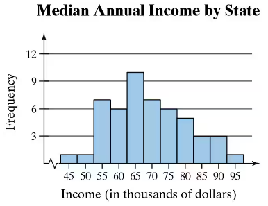
Finding the Range of a Data Set In Exercises 9 and 10, find the range of the data set represented by the graph.


graph

검증된 단계별 안내
1
Step 1: Understand the concept of range. The range of a data set is the difference between the maximum and minimum values in the data set.
Step 2: Identify the minimum value from the graph. Look at the lowest income value represented on the x-axis, which is 45 (in thousands of dollars).
Step 3: Identify the maximum value from the graph. Look at the highest income value represented on the x-axis, which is 95 (in thousands of dollars).
Step 4: Calculate the range by subtracting the minimum value from the maximum value. Use the formula: Range = Maximum - Minimum.
Step 5: Interpret the result. The range represents the spread of the data set, showing the difference between the highest and lowest median annual incomes by state.

비슷한 문제에 대한 검증된 영상 답변:

이 영상 해법은 위 문제에 도움이 된다고 튜터들이 추천한 것입니다.
영상 길이:
2m
도움이 되었나요?

주요 개념

질문에 올바르게 답하기 위해 반드시 이해해야 하는 핵심 개념들은 다음과 같습니다.

Range

The range of a data set is a measure of dispersion that indicates the difference between the maximum and minimum values. It provides a simple way to understand the spread of the data. To calculate the range, subtract the smallest value from the largest value in the data set. In the context of the provided graph, identifying the highest and lowest income values will allow for the calculation of the range.
추천 영상:
가이드 코스
05:45
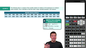
Find 5-Number Summary - TI-84 Calculator Example 1

Histogram

A histogram is a graphical representation of the distribution of numerical data, where the data is divided into intervals (bins) and the frequency of data points within each interval is represented by the height of bars. In the given graph, the x-axis represents income ranges, while the y-axis shows the frequency of states within those income ranges. Understanding histograms is essential for interpreting data distributions and identifying patterns.
추천 영상:
가이드 코스
05:54
Intro to Histograms

Frequency Distribution

Frequency distribution is a summary of how often each value occurs in a data set. It can be represented in various forms, including tables and graphs like histograms. In the context of the graph, the frequency distribution shows how many states fall within specific income ranges, allowing for insights into income distribution across states. This concept is crucial for analyzing data trends and making comparisons.
추천 영상:
가이드 코스
06:38
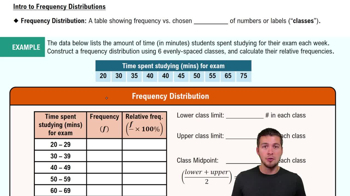
Intro to Frequency Distributions
관련 실천
교과서 질문

Finding Sample Statistics In Exercises 15 and 16, find the range, mean, variance, and standard deviation of the sample data set.


Pregnancy Durations The durations (in days) of pregnancies for a random sample of pregnant people

277 291 295 280 268 278 291

277 282 279 296 285 269 293

267 281 286 269 264 299 275

108
views
교과서 질문

Modified Box-and-Whisker Plot In Exercises 59–62, (a) identify any outliers and (b) draw a modified box-and-whisker plot that represents the data set. Use asterisks (*) to identify outliers.


75 78 80 75 62 72 74 75 80 95 76 72

137
views
교과서 질문

Extending Concepts


A Misleading Graph? A misleading graph is not drawn appropriately, which can misrepresent data and lead to false conclusions. In Exercises 37–40, (a) explain why the graph is misleading, and (b) redraw the graph so that it is not misleading.

255
views
교과서 질문

use the frequency distribution to find the (a) class width, (b) class midpoints, and (c) class boundaries.

Toledo, OH, Average Normal Temperatures (F)

541
views
1
rank
1
comments
교과서 질문

Finding the Sample Mean and Standard Deviation for Grouped Data In Exercises 39 and 40, make a frequency distribution for the data. Then use the table to find the sample mean and the sample standard deviation of the data set.


3 3 5 3 8 0 3 9 6 6 7 1 6 3 2 6 9 1 8 5 0 2 3 4 9

5 8 1 9 7 6 9 6 7 0 6 3 8 6 8 7 3 8 9 3 7 2 4 4 1

279
views
교과서 질문

Graphical Analysis In Exercises 9–12, determine whether the approximate shape of the distribution in the histogram is symmetric, uniform, skewed left, skewed right, or none of these. Justify your answer.

114
views