
Ch. 2 - Descriptive Statistics
Larson - Elementary Statistics: Picturing the World 8th Edition
Larson8th EditionElementary Statistics: Picturing the WorldISBN: 9780137493470당신이 사용하는 게 아니라요?교과서 변경
2장, 문제 2.2.37

Extending Concepts


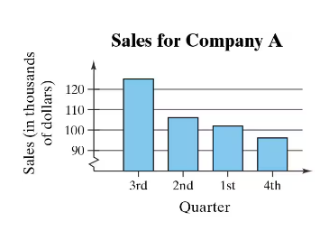
A Misleading Graph? A misleading graph is not drawn appropriately, which can misrepresent data and lead to false conclusions. In Exercises 37–40, (a) explain why the graph is misleading, and (b) redraw the graph so that it is not misleading.
bar1

검증된 단계별 안내
1
Step 1: Analyze the graph provided. Notice that the vertical axis (Sales in thousands of dollars) does not start at zero but instead starts at 90. This can exaggerate the differences between the bars and make the changes in sales appear more dramatic than they actually are.
Step 2: Explain why the graph is misleading. By not starting the vertical axis at zero, the graph visually distorts the proportional differences between the sales figures for each quarter. This can lead viewers to believe that the sales differences are larger than they truly are.
Step 3: To redraw the graph so that it is not misleading, start the vertical axis at zero. This ensures that the visual representation of the data accurately reflects the true differences in sales figures.
Step 4: Ensure that the spacing between the bars and the scaling of the vertical axis are consistent. This helps maintain clarity and avoids any visual distortion.
Step 5: Label the axes clearly and use appropriate increments on the vertical axis to represent the sales data accurately. This will make the graph more honest and easier to interpret.

비슷한 문제에 대한 검증된 영상 답변:

이 영상 해법은 위 문제에 도움이 된다고 튜터들이 추천한 것입니다.
영상 길이:
1m
도움이 되었나요?

주요 개념

질문에 올바르게 답하기 위해 반드시 이해해야 하는 핵심 개념들은 다음과 같습니다.

Misleading Graphs

A misleading graph is one that distorts the data it represents, often through inappropriate scaling, selective data presentation, or visual exaggeration. Such graphs can lead viewers to incorrect interpretations or conclusions about the data. For example, if the y-axis does not start at zero, it can exaggerate differences between data points, making trends appear more dramatic than they are.
추천 영상:
04:13
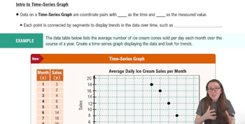
Creating Time-Series Graphs

Bar Graphs

Bar graphs are visual representations of data where individual bars represent different categories or groups. The height or length of each bar correlates with the value it represents, making it easy to compare quantities. However, the design of bar graphs must be clear and proportional to accurately convey the information; otherwise, they can mislead the audience.
추천 영상:
04:52
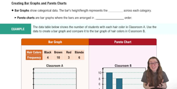
Creating Bar Graphs and Pareto Charts

Data Representation

Data representation refers to the methods used to visually display data, such as graphs, charts, and tables. Effective data representation should accurately reflect the underlying data and allow for easy interpretation. When creating visualizations, it is crucial to consider factors like scale, labeling, and context to ensure that the audience can draw valid conclusions from the presented information.
추천 영상:
4:01
Introduction to Collecting Data