 Back
Back6.5 Assessing Normality in Normal Probability Distributions
Study Guide - Smart Notes
 Tailored notes based on your materials, expanded with key definitions, examples, and context.
Normal Probability Distributions
Assessing Normality
Many statistical methods require that sample data come from a population with a normal distribution. Assessing normality is a crucial step before applying these methods. This section outlines procedures and examples for determining whether sample data are approximately normal.
Key Steps for Assessing Normality
Construct a Histogram: Visualize the data to check if the distribution is roughly bell-shaped.
Construct a Normal Quantile Plot (Normal Probability Plot): Plot each data value against its expected z-score from the standard normal distribution. Analyze the pattern of points.
Procedure for Determining Normality
Histogram: If the histogram is not bell-shaped, the data likely do not follow a normal distribution.
Normal Quantile Plot: If the histogram is symmetric with few outliers, generate a normal Q-Q plot. If the points are close to a straight line and show no systematic deviation, the data are likely normal.
Criteria for Normality
Normal Distribution: Points in the normal quantile plot are close to a straight line without systematic patterns.
Not Normal: Points deviate from a straight line or show systematic non-linear patterns.
Advanced Methods for Assessing Normality
Ryan-Joiner Test: Calculates the correlation between data and normal scores. A correlation coefficient near 1 suggests normality. If the test statistic is less than the critical value, reject normality.
Other Tests: Shapiro-Wilk, D’Agostino-Pearson, chi-square goodness-of-fit, Kolmogorov-Smirnov, Lilliefors, Cramer-von Mises, Jarque-Bera, and Anscombe-Glynn kurtosis tests.
Examples of Assessing Normality
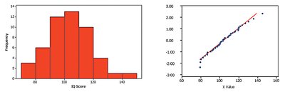
Normal Distribution Example
The histogram of IQ scores is bell-shaped, and the normal quantile plot shows points close to a straight line, indicating normality.
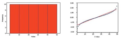
Uniform Distribution Example
The histogram is flat (uniform), and the normal quantile plot, while somewhat linear, shows a systematic pattern that is not a straight line. This indicates the data are not from a normal distribution.
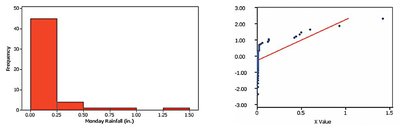
Skewed Distribution Example
The histogram of rainfall amounts is skewed to the right, and the normal quantile plot shows points far from a straight line. The data are not normally distributed.
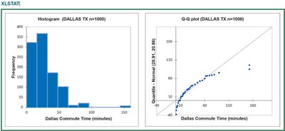
Dallas Commute Times Example
For 1000 Dallas commute times, the histogram is left-skewed and not bell-shaped. The normal Q-Q plot shows points far from a straight line, indicating the data are not from a normal distribution.
Outliers
Outliers can significantly affect statistical results. Always check for outliers and analyze data both with and without them. Outliers should only be discarded if they are confirmed errors, as they may contain important information about the data.
Data Transformations
When data are not normal, transformations can sometimes normalize the distribution. A common transformation is taking the logarithm of each value (using natural or base 10 logarithms). If the transformed data are normal, the original data are said to follow a lognormal distribution.
If original values include 0, use log(x + 1).
Summary Table: Assessing Normality
Method | Purpose | Key Indicator of Normality |
|---|---|---|
Histogram | Visualize data shape | Bell-shaped, symmetric |
Normal Quantile Plot (Q-Q Plot) | Compare data to normal distribution | Points close to straight line |
Ryan-Joiner Test | Formal test of normality | Correlation coefficient near 1 |
Other Tests (e.g., Shapiro-Wilk) | Formal test of normality | p-value > significance level (e.g., 0.10) |
Key Formulas
Z-score: The z-score for a value x is given by: where is the mean and is the standard deviation.
