 Back
BackAssociation, Correlation, and Regression: Analyzing Relationships Between Variables
Study Guide - Smart Notes
 Tailored notes based on your materials, expanded with key definitions, examples, and context.
Chapter 3: Association – Contingency, Correlation, and Regression
Introduction to Association
In statistics, we often analyze the relationship between two or more variables to understand how they interact. This chapter introduces key concepts and methods for examining associations between categorical and quantitative variables, including contingency tables, correlation, and regression analysis.
Association Between Two Categorical Variables
Contingency Tables and Marginal Distributions
Contingency Table: A table that displays the frequency distribution of variables, showing how individuals are distributed across categories of two variables.
Marginal Distribution: The frequency distribution of one variable, found in the margins of the contingency table.
Cross-tabulation: The process of creating a contingency table from raw data.
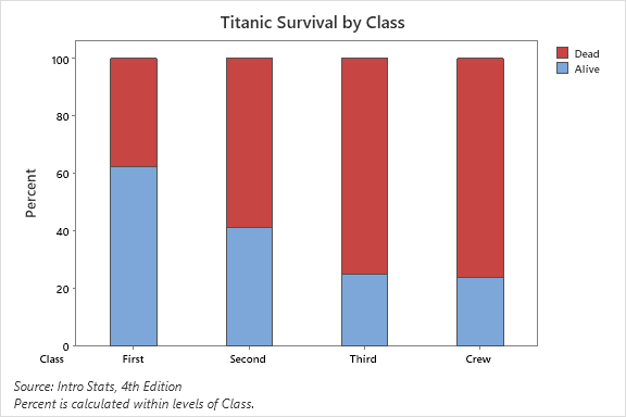
Example: Titanic survival data by class is summarized in a contingency table, showing counts and percentages for each class and survival status.
Conditional Distributions and Proportions
Conditional Distribution: The distribution of one variable for cases that satisfy a condition on another variable (e.g., survival rate within each class).
Conditional Proportion: The proportion of cases in a specific category, conditional on another variable.
Marginal Proportion: The proportion of cases in a category, regardless of other variables.
Conditional distributions help us determine if an association exists between variables (e.g., survival rates differ by class on the Titanic).
Graphical Display: Segmented (Stacked) Bar Chart
A segmented or stacked bar chart visually represents conditional distributions, with each bar divided into segments proportional to the percentage in each group.
Measuring Strength of Association (Categorical Variables)
Difference of Proportions: The absolute difference between conditional proportions.
Risk Ratio (Relative Risk): The ratio of conditional proportions.
Odds Ratio: The ratio of odds for one group to another.
Association Between Two Quantitative Variables
Scatterplots
A scatterplot displays the relationship between two quantitative variables, with each point representing an observation. The explanatory variable is typically on the x-axis, and the response variable on the y-axis.
To interpret a scatterplot, examine the form (linear, curved, etc.), direction (positive or negative), strength (tightness of points), and outliers.
Positive Association: Above-average values of one variable tend to accompany above-average values of the other.
Negative Association: Above-average values of one variable tend to accompany below-average values of the other.
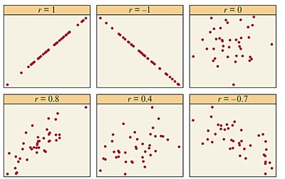
Correlation Coefficient (r)
The correlation coefficient r measures the strength and direction of a linear relationship between two quantitative variables. It ranges from -1 (perfect negative) to +1 (perfect positive), with 0 indicating no linear association.
Formula for r:
Properties of r:
r is unitless and unaffected by changes in measurement units.
r is sensitive to outliers (not resistant).
r only measures linear relationships.
r does not distinguish between explanatory and response variables.
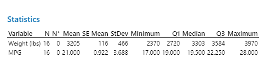
Descriptive Statistics Example
Descriptive statistics summarize the central tendency and spread of variables before further analysis.
Linear Regression: Predicting the Outcome of a Variable
Regression Line and Least-Squares Method
A regression line models the relationship between an explanatory variable x and a response variable y. The least-squares regression line minimizes the sum of squared vertical distances (residuals) between observed and predicted values.
Regression Equation:
Slope (b):
Intercept (a):
Residual:
The regression line always passes through the point .
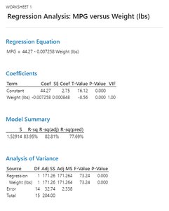
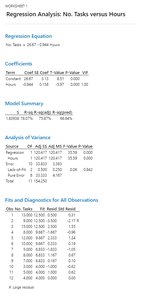
Regression Analysis Example: MPG vs. Weight
Regression analysis can be performed using statistical software, such as Minitab or a TI-84 calculator. The output provides the regression equation, coefficients, and measures of fit.
Using Calculators and Software for Regression
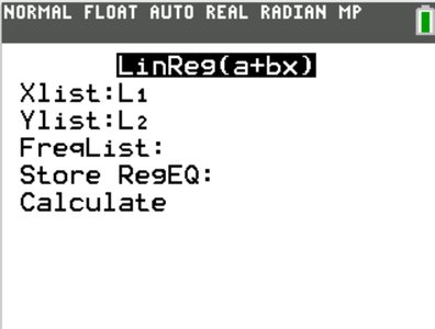
TI-84: Enter data in lists, use LinReg(a+bx) to compute regression equation and statistics.
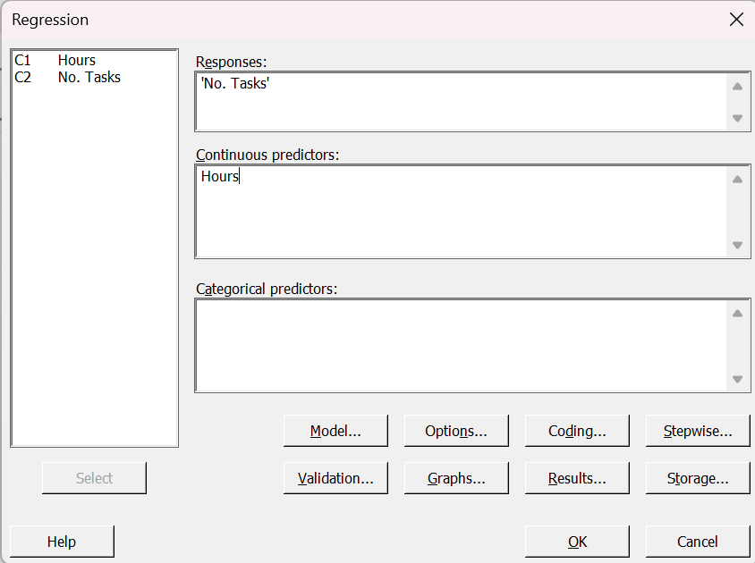
Minitab: Enter data in columns, use regression menu to fit the model.
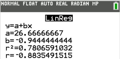
Interpreting Regression Output
Slope: The expected change in y for a one-unit increase in x.
Intercept: The predicted value of y when x = 0 (meaningful only if x = 0 is plausible).
Coefficient of Determination (r2): The proportion of variation in y explained by the regression on x.
Analysis of Residuals
Residual plots help assess the fit of a regression line. A good fit shows no systematic pattern in the residuals. Curved patterns or changing spread indicate that a linear model may not be appropriate.
Cautions in Analyzing Associations
Outliers and Influential Points
Outlier: An observation far from the overall pattern of the data.
Influential Point: An observation that, if removed, would significantly change the regression results. Outliers in the x-direction are often influential.
Correlation and regression are not resistant to outliers or influential points.
Extrapolation
Extrapolation: Using a regression line to predict values far outside the range of observed data. This is risky and may lead to inaccurate predictions.
Lurking Variables and Causation
Lurking Variable: A variable not included in the analysis that affects the relationship between the studied variables.
Association does not imply causation. Even strong associations may be due to lurking variables or confounding factors.
Simpson’s Paradox: The direction of an association changes when a third variable is considered.
Criteria for causation (when experiments are not possible): strength, consistency, dose-response, temporal precedence, and plausibility.
Summary Table: Key Concepts in Association, Correlation, and Regression
Concept | Definition | Key Properties |
|---|---|---|
Contingency Table | Displays frequency distribution for two categorical variables | Shows marginal and conditional distributions |
Correlation (r) | Measures strength and direction of linear association | Range: -1 to 1; unitless; sensitive to outliers |
Regression Line | Best-fit line predicting y from x | Minimizes sum of squared residuals |
Coefficient of Determination (r2) | Proportion of variance in y explained by x | Range: 0 to 1; higher is better fit |
Outlier | Observation far from overall pattern | Can strongly affect r and regression |
Lurking Variable | Unmeasured variable affecting association | Can create or mask associations |
