 Back
BackBoxplots, Outliers, Standardization, and the Normal Model: Study Notes for Statistics
Study Guide - Smart Notes
 Tailored notes based on your materials, expanded with key definitions, examples, and context.
Boxplots and Comparing Distributions
Boxplots: Construction and Interpretation
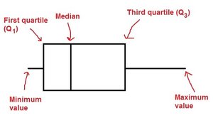
Boxplots are graphical displays that summarize the distribution of a quantitative variable using five-number summaries: minimum, first quartile (Q1), median, third quartile (Q3), and maximum. They are especially useful for comparing groups and identifying outliers.
Five-number summary: Minimum, Q1, Median, Q3, Maximum
Quartiles: Divide the data into four equal parts, each containing 25% of the data
Median: The middle value, divides the data into two equal halves
Outliers: Values that fall outside the typical range, often marked with asterisks
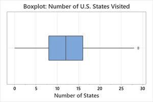
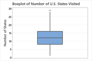
Example: The boxplot for the number of U.S. states visited shows the median, quartiles, and an outlier. 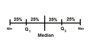
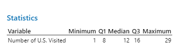
Five-Number Summary Table
Variable | Minimum | Q1 | Median | Q3 | Maximum |
|---|---|---|---|---|---|
Number of U.S. Visited | 1 | 8 | 12 | 16 | 29 |
Comparing Boxplots and Histograms
Boxplots and histograms both display the distribution of data, but boxplots are better for comparing groups and identifying outliers, while histograms show the shape of the distribution.
Boxplot: Summarizes spread, center, and outliers
Histogram: Shows frequency and shape (e.g., symmetric, skewed, bimodal)
Example: The histogram and boxplot for the number of U.S. states visited show a roughly symmetric distribution with one outlier. 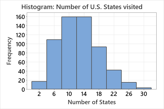
Identifying Outliers
Formal Criterion for Outliers
Outliers are formally identified using the interquartile range (IQR). The boundaries for outliers are:
Lower boundary:
Upper boundary:
Values outside these boundaries are considered outliers. 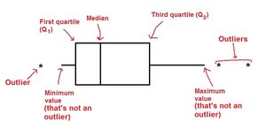
Comparing Groups: Side-by-Side Boxplots
Comparative Studies and Grouping Variables
When comparing groups, side-by-side boxplots are used to visualize differences in distributions. The grouping variable is categorical, and the response variable is quantitative.
Grouping variable: Separates data into categories (e.g., voice part in a choral group)
Response variable: The quantitative variable being measured (e.g., height)
Example: Heights of singers separated by voice part. 
Voice Part | Count |
|---|---|
Bass | 36 |
Tenor | 20 |
Alto | 35 |
Soprano | 39 |
Total | 130 |
Numerical Summaries: Mean, Median, Standard Deviation, and IQR
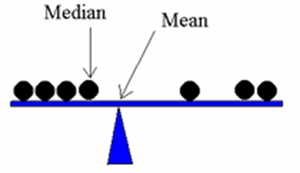
Mean and Median
Mean: The arithmetic average, sensitive to outliers
Median: The middle value, resistant to outliers
Standard Deviation and IQR
Standard deviation (SD): Measures spread around the mean, not resistant to outliers
Interquartile Range (IQR): Measures spread of the middle 50% of data, resistant to outliers
Formula for Standard Deviation: Formula for IQR: 
Standardization: Z-scores
Using the Standard Deviation to Standardize Values
Standardization transforms data into Z-scores, which indicate how many standard deviations an observation is from the mean.
Z-score formula:
Interpretation: Positive Z-score = above mean; Negative Z-score = below mean
Application: Useful for comparing values from different distributions
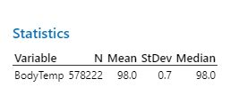
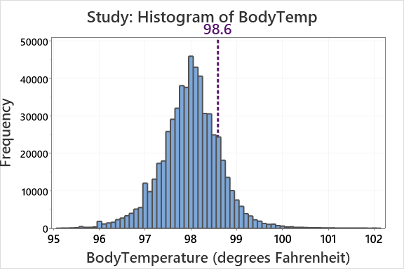
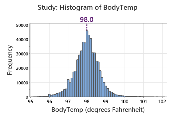
Example: Body temperature observations compared to the mean.
Variable | N | Mean | StDev | Median |
|---|---|---|---|---|
BodyTemp | 578,222 | 98.0 | 0.7 | 98.0 |

The Normal Model and the Empirical Rule
Normal Distribution
The normal model describes a bell-shaped, symmetric distribution defined by its mean () and standard deviation ().
Standard normal distribution:
Notation:
Empirical Rule (68-95-99.7 Rule)
68% of observations within 1 standard deviation of the mean
95% within 2 standard deviations
99.7% within 3 standard deviations
Formula:
contains 68%
contains 95%
contains 99.7%
Application Examples
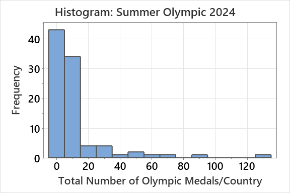
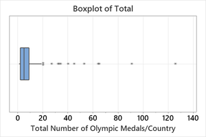
Olympic Medals Data
Histogram and boxplot show right-skewed distribution with multiple outliers
Mean and median comparison helps determine skewness
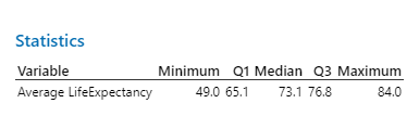
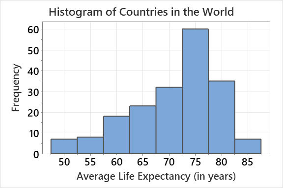
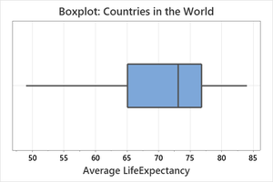
Life Expectancy Data
Histogram and boxplot show distribution of life expectancy across countries
Five-number summary provides key statistics
Variable | Minimum | Q1 | Median | Q3 | Maximum |
|---|---|---|---|---|---|
Average Life Expectancy | 49.0 | 65.1 | 73.1 | 76.8 | 84.0 |
Summary Table: Resistant vs. Non-Resistant Statistics
Statistic | Resistant? |
|---|---|
Mean | No |
Median | Yes |
Standard Deviation | No |
IQR | Yes |
Key Takeaways
Boxplots and histograms are essential for visualizing and comparing distributions
Outliers are formally identified using the IQR criterion
Standardization (Z-scores) allows comparison across different scales
The normal model and empirical rule provide benchmarks for interpreting data
Resistant statistics (median, IQR) are preferred for skewed or outlier-prone data
