 Back
BackChapter 2: Organizing Data – Study Notes for Statistics
Study Guide - Smart Notes
 Tailored notes based on your materials, expanded with key definitions, examples, and context.
Chapter 2: Organizing Data
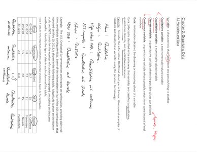
2.1 Statistical Data and Types
Organizing data is a foundational step in statistics, allowing for meaningful analysis and interpretation. Data can be classified into different types, each requiring specific methods for organization and summarization.
Qualitative (Categorical) Data: Data that can be placed into categories based on some characteristic (e.g., gender, color, type).
Quantitative Data: Data that can be measured or counted and expressed numerically (e.g., height, weight, age).
Discrete Data: Quantitative data that can take only specific values (often counts).
Continuous Data: Quantitative data that can take any value within a range (often measurements).
Example: The number of cars in a parking lot (discrete), the height of students in a class (continuous), favorite color (qualitative).
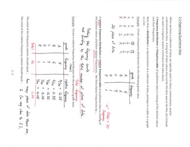
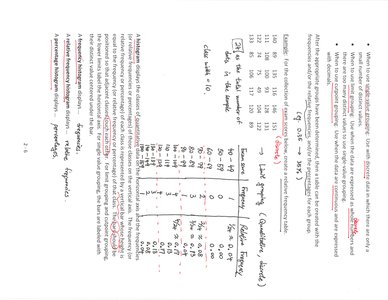
2.2 Organizing Qualitative Data
Qualitative data is often summarized using frequency tables, bar graphs, and pie charts. These methods help visualize the distribution of categories within a dataset.
Frequency Table: Lists categories and the number of observations in each.
Relative Frequency: The proportion of observations in each category, calculated as
Bar Graph: Uses bars to represent the frequency or relative frequency of each category.
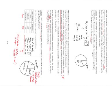
Pie Chart: Represents the proportion of each category as a slice of a circle.
Example: Survey results on favorite ice cream flavors can be summarized in a frequency table and displayed as a bar graph or pie chart.
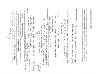
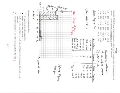
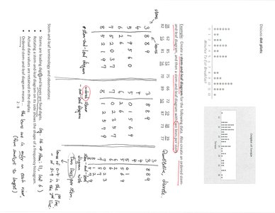
2.3 Organizing Quantitative Data
Quantitative data is organized using frequency distributions, histograms, and stem-and-leaf plots. These tools help reveal patterns, such as the shape and spread of the data.
Frequency Distribution: A table that divides data into intervals (classes) and shows the number of observations in each interval.
Relative Frequency Distribution: Shows the proportion of observations in each class.
Histogram: A bar graph representing the frequency or relative frequency of quantitative data intervals.
Stem-and-Leaf Plot: Displays actual data values while showing the distribution.
Example: Heights of students grouped into intervals (e.g., 150-155 cm, 155-160 cm) and displayed as a histogram.
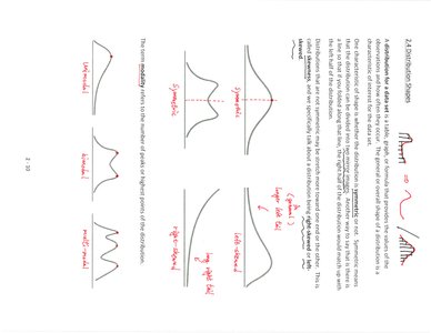
2.4 Distribution Shapes
The shape of a data distribution provides insight into the nature of the data and potential underlying processes. Common shapes include symmetric, skewed, and uniform distributions.
Symmetric Distribution: Both sides of the distribution are mirror images.
Skewed Right (Positively Skewed): The tail on the right side is longer; most data are concentrated on the left.
Skewed Left (Negatively Skewed): The tail on the left side is longer; most data are concentrated on the right.
Uniform Distribution: All values are equally likely; the distribution is flat.
Bimodal Distribution: Has two distinct peaks.
Example: Income data is often right-skewed, while test scores may be symmetric or left-skewed depending on difficulty.
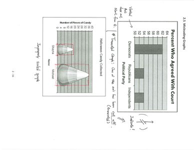
2.5 Misleading Graphs
Graphs can be misleading if not constructed properly. Common issues include inappropriate scales, distorted images, and unclear labeling, which can lead to incorrect interpretations.
Vertical Axis Manipulation: Changing the scale can exaggerate or minimize differences.
3D Effects: Can distort perception of values.
Omitted Baselines: Not starting the axis at zero can misrepresent the magnitude of differences.
Improper Labeling: Missing or unclear labels can confuse the reader.
Example: A bar graph with a truncated y-axis may make small differences appear large.
Summary Table: Types of Data and Graphs
Data Type | Summary Table | Graphical Display |
|---|---|---|
Qualitative | Frequency Table | Bar Graph, Pie Chart |
Quantitative (Discrete) | Frequency Distribution | Histogram, Stem-and-Leaf Plot |
Quantitative (Continuous) | Frequency Distribution | Histogram |
Additional info: These notes expand on the provided material by including definitions, examples, and a summary table for clarity and completeness.
