 Back
BackChapter 3: Displaying and Summarizing Quantitative Data – Study Notes
Study Guide - Smart Notes
 Tailored notes based on your materials, expanded with key definitions, examples, and context.
Displaying and Summarizing Quantitative Data
Displays for Quantitative Variables
Quantitative data are best understood through graphical displays that reveal their distribution, shape, and key features. Unlike categorical data, which use bar charts or pie charts, quantitative data require specialized displays such as histograms, stem-and-leaf plots, and dotplots.
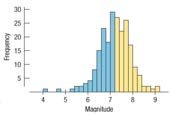
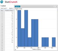
Histogram: Divides the range of data into equal-width bins and plots the frequency of cases in each bin. Useful for visualizing the distribution and identifying patterns such as central tendency and spread.
Stem-and-Leaf Display: Shows individual data values while also revealing the distribution. Each value is split into a "stem" (leading digits) and a "leaf" (trailing digit).
Dotplot: Places a dot for each data point along an axis, providing a simple visual summary.
Quantitative Data Condition: Always ensure the data are quantitative and units are known before choosing a display.
Shape of Distributions
The shape of a distribution provides insight into the underlying data structure. Key aspects include the number of modes, symmetry, skewness, and the presence of unusual features.
Modes: Unimodal (one peak), bimodal (two peaks), or multimodal (three or more peaks).
Uniform: All bars are approximately the same height, indicating no clear mode.
Symmetry: A symmetric histogram can be folded along its center with matching edges.
Skewness: If one tail is longer, the distribution is skewed (left or right).
Outliers and Gaps: Outliers are values far from the main body; gaps may indicate multiple groups.
Centre of a Distribution
The center of a distribution is typically measured by the median or mean. The median divides the data into two equal halves, while the mean is the arithmetic average.
Median: The middle value when data are ordered. For odd n, it is the value at position . For even n, it is the average of the two middle values.
Mean: Calculated as , where are the data values and is the number of values.
Choosing Centre: Use the mean for symmetric distributions; use the median for skewed distributions or when outliers are present.
Spread of a Distribution
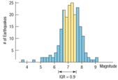
Spread describes how much the data values vary. Common measures include the range, interquartile range (IQR), and standard deviation.
Range: Difference between maximum and minimum values.
Interquartile Range (IQR): The range of the middle 50% of data.
Quartiles: (25th percentile), (median, 50th percentile), (75th percentile)
Percentiles: The value below which a given percentage of data falls.
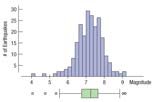
Boxplots and 5-Number Summaries
The five-number summary consists of the minimum, , median, , and maximum. A boxplot graphically displays these values and highlights outliers.
Boxplot Construction: Draw a box from to , mark the median, extend whiskers to the most extreme values within 1.5 IQRs, and mark outliers beyond the fences.
Comparisons: Boxplots are useful for comparing distributions across groups.
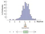
The Mean and Symmetric Distributions
For symmetric, unimodal distributions, the mean is a reliable measure of center. The mean is also the balancing point of the histogram.
Mean Formula:
Balancing Point: The mean is the point at which the histogram would balance if placed on a fulcrum.
Mean vs. Median: In symmetric distributions, mean ≈ median. In skewed distributions, the mean is pulled toward the tail.
Standard Deviation and Spread
The standard deviation measures the average distance of data values from the mean, providing a more comprehensive measure of spread for symmetric distributions.
Variance:
Standard Deviation:
Empirical Rule: For symmetric distributions:
~68% of data within 1 standard deviation of the mean
~95% within 2 standard deviations
~99.7% within 3 standard deviations
Effect of Outliers: Outliers increase the standard deviation but may not substantially affect the IQR.
Summary: What to Tell About a Quantitative Variable
When describing a quantitative variable, always provide:
Shape: Unimodal, bimodal, symmetric, skewed, uniform
Centre: Mean or median, depending on distribution shape
Spread: Range, IQR, and/or standard deviation
Unusual Features: Outliers, gaps, multiple modes
Choose the appropriate summary statistics based on the distribution's shape and presence of outliers.
Examples and Applications
Examples throughout the chapter illustrate how to compute and interpret these statistics for real-world data sets, such as earthquake magnitudes, sports statistics, and bird counts.
Additional info: These notes expand on the original content by providing definitions, formulas, and context for each statistical concept, ensuring a self-contained study guide for exam preparation.
