 Back
BackChapter 3: Numerically Summarizing Data – Study Notes for Statistics
Study Guide - Smart Notes
 Tailored notes based on your materials, expanded with key definitions, examples, and context.
Chapter 3: Numerically Summarizing Data
Section 3.1: Measures of Central Tendency
Measures of central tendency are statistical values that describe the center of a data set. They help summarize a large set of data with a single value that represents the typical or average case.
Mean: The arithmetic average of all data values. Calculated as , where are the data values and is the number of values.
Median: The middle value when data are ordered from least to greatest. If the number of values is even, the median is the average of the two middle values.
Mode: The value that occurs most frequently in the data set.
Application: These measures are used to describe the "typical" value in fields such as economics, health sciences, and social sciences.
Example: For the data set {2, 4, 4, 6, 8}, the mean is 4.8, the median is 4, and the mode is 4.
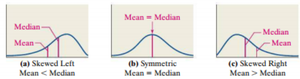
Section 3.1 (continued): Resistance of Statistics
Resistance refers to how much a statistic is affected by extreme values (outliers). A resistant statistic is not substantially influenced by unusually large or small values.
Resistant Statistics: Median, interquartile range (IQR), mode
Non-Resistant Statistics: Mean, standard deviation, correlation coefficient
Note: These trends generally hold for continuous data, but not always for discrete data.
Example: In a data set with one extremely high value, the mean will increase, but the median will remain relatively unchanged.
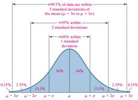
Section 3.2: Measures of Dispersion
Measures of dispersion describe the spread or variability of a data set. They indicate how much the data values differ from each other and from the mean.
Range: The difference between the largest and smallest values.
Variance: The average squared deviation from the mean.
Standard Deviation: The square root of the variance.
Interquartile Range (IQR): The difference between the third quartile (Q3) and the first quartile (Q1).
Example: If the data set is {2, 4, 4, 6, 8}, the range is 6, and the standard deviation can be calculated using the formula above.
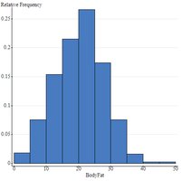
Section 3.3: Measures of Central Tendency and Dispersion from Grouped Data
When data are grouped into intervals (such as in a frequency table), special formulas are used to estimate measures of central tendency and dispersion.
Grouped Mean: , where is the frequency and is the midpoint of each interval.
Grouped Variance: Calculated using midpoints and frequencies.
Example: In a frequency table of body fat percentages, the mean and standard deviation can be estimated using interval midpoints and frequencies.
Section 3.4: Measures of Position and Outliers
Measures of position describe the relative standing of a data value within a data set. Outliers are values that are significantly higher or lower than most other values.
Quartiles: Divide data into four equal parts. Q1 is the 25th percentile, Q2 (median) is the 50th percentile, Q3 is the 75th percentile.
Percentiles: Indicate the percentage of data values below a given value.
Z-score: Measures how many standard deviations a value is from the mean.
Outlier Detection: Values more than 1.5 IQRs above Q3 or below Q1 are considered outliers.
Example: If Q1 = 20, Q3 = 40, then any value below 20 - 1.5*20 or above 40 + 1.5*20 is an outlier.
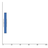
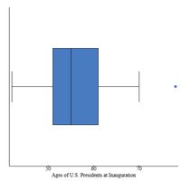
Section 3.5: The Five-Number Summary and Boxplots
The five-number summary provides a concise description of a data set using five key values: minimum, Q1, median, Q3, and maximum. Boxplots visually display these values and highlight outliers.
Five-Number Summary: Minimum, Q1, Median, Q3, Maximum
Boxplot: A graphical representation of the five-number summary. Outliers are often shown as dots.
Application: Boxplots are used to compare distributions and identify skewness and outliers.
Example: The boxplot of U.S. Presidents' ages at inauguration shows the median, quartiles, and an outlier.
Additional info: The images and examples are based on textbook references and real datasets, such as body fat percentages and presidential ages, to illustrate statistical concepts.
