 Back
BackComparing and Summarizing Distributions & The Standard Deviation as a Ruler and the Normal Model
Study Guide - Smart Notes
 Tailored notes based on your materials, expanded with key definitions, examples, and context.
Comparing and Summarizing Distributions
Displaying Quantitative Data
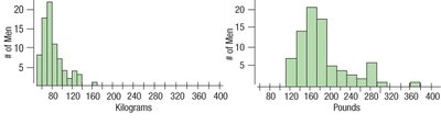
Quantitative data can be visualized using histograms, stem-and-leaf plots, dotplots, and boxplots. These tools help us understand the shape, center, and spread of a distribution.
Shape: Describes modality (number of peaks), symmetry, skewness, and presence of outliers.
Center: Measured by mean, median, or mode.
Spread: Measured by range, interquartile range (IQR), variance, and standard deviation.
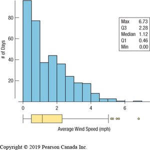
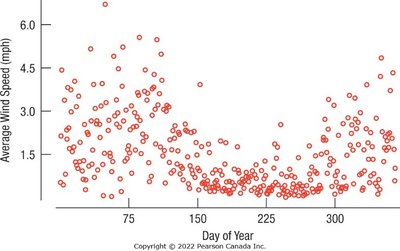
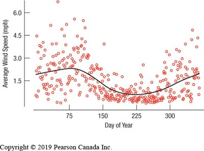
Example: The histogram and boxplot below show the distribution of average wind speed in Hopkins Forest, 2011. The distribution is unimodal and skewed to the right, with several outliers.
Comparing Groups
Comparing groups is a fundamental aspect of statistical analysis. We use summary statistics and graphical displays to compare distributions across categories or time periods.
Histograms and boxplots allow us to compare shapes, centers, and spreads.
Boxplots are especially useful for side-by-side comparisons, as they summarize key features and hide unnecessary details.
Example: The histograms below compare average wind speed in summer and winter.
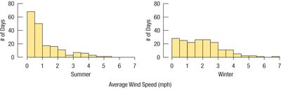
The table summarizes the statistics for each season:
Group | Mean | StdDev | Median | IQR | Q1 | Q3 | Minimum | Maximum |
|---|---|---|---|---|---|---|---|---|
Winter | 1.90 | 1.29 | 1.72 | 1.82 | 0.84 | 2.66 | 0.02 | 6.73 |
Summer | 1.11 | 1.10 | 0.71 | 1.27 | 0.34 | 1.62 | 0.00 | 5.47 |
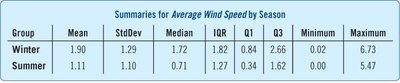
Monthly boxplots further illustrate variation throughout the year:
Timeplots
Timeplots (time series plots) display data values against time, revealing trends and patterns in temporal data. They are useful for identifying point-to-point variation and underlying smooth trends.
Dealing with Outliers
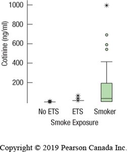
Outliers are values that deviate markedly from the rest of the data. They may indicate exceptional cases or errors. When reporting summary statistics, it is important to consider the effect of outliers.
Report statistics with and without outliers.
Outliers can distort the mean and standard deviation.
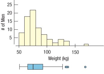
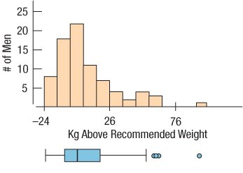
Re-expressing Skewed Data
Skewed distributions can be made more symmetric by applying transformations, such as logarithmic functions. This process, called re-expression, facilitates analysis and interpretation.
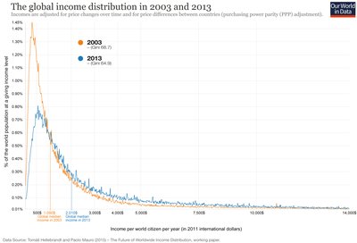
Global Income Distribution Example
Income distributions often exhibit right skewness, with a long tail of high values. Comparing distributions across years can reveal changes in economic inequality.
Common Pitfalls in Displaying Data
Avoid inconsistent scales when comparing displays.
Label axes clearly.
Be cautious when comparing groups with different spreads.

The Standard Deviation as a Ruler and the Normal Model
Standardizing Data: Z-Scores
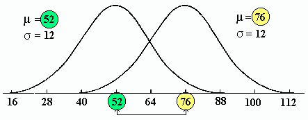
Standardization allows comparison of values measured in different units or scales. The z-score measures the distance of an observation from the mean, expressed in standard deviations.
Formula: for a sample, for a population
Interpretation: z = 0 means the value equals the mean; positive z indicates above the mean; negative z indicates below the mean.
Standardized values allow comparison across different groups or variables.
Shifting and Scaling Data
Shifting (subtracting a constant) changes the center but not the spread. Scaling (multiplying/dividing by a constant) changes the spread. Standardizing (z-scores) shifts the mean to zero and rescales the standard deviation to one.
Properties of Z-Scores
Does not change the shape of the distribution.
Changes the center (mean = 0).
Changes the spread (standard deviation = 1).
Values below the mean have negative z-scores; values above have positive z-scores.
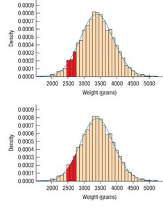
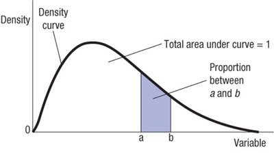
Density Curves and the Normal Model
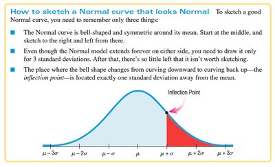
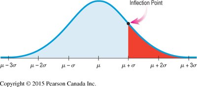
Density curves are smooth curves fitted to histograms of quantitative data. The Normal Model is a bell-shaped, symmetric, unimodal density curve defined by two parameters: mean () and standard deviation ().
Density curves must be non-negative and have total area = 1.
The Normal Model is used to generalize and simplify data analysis.

Parameters and Statistics
Sample summaries use Latin letters (mean , standard deviation ).
Population parameters use Greek letters (mean , standard deviation ).
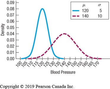
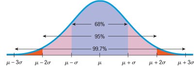
The 68-95-99.7 Rule
In a Normal distribution:
About 68% of values fall within ±1 standard deviation of the mean.
About 95% fall within ±2 standard deviations.
About 99.7% fall within ±3 standard deviations.

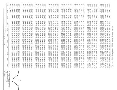
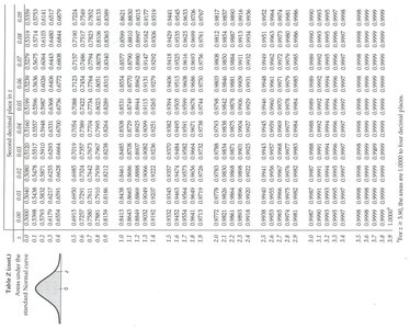
Finding Normal Percentiles
To find the percentile for a value in a Normal distribution:
Convert the value to a z-score.
Use the standard Normal table (Table Z) to find the area to the left of the z-score.
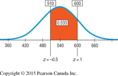
Example: If the mean TOEFL score is 540 and the standard deviation is 60, a score of 648 has a z-score of .
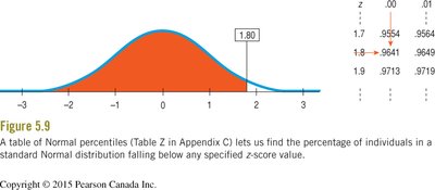
To find the proportion between two z-scores, subtract the areas:
Area (z < 1.0) = 0.8413
Area (z < -0.5) = 0.3085
Proportion = 0.8413 - 0.3085 = 0.5328 (53.28%)
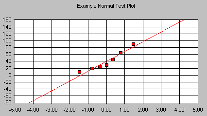
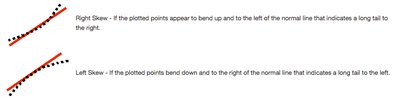
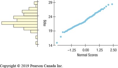
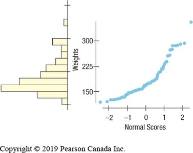
Normal Probability Plots
Normal probability plots help assess whether data are approximately Normal. If the plot is roughly a straight line, the data are nearly Normal. Curvature indicates skewness or deviation from Normality.
What Can Go Wrong?
Do not use the Normal model for distributions that are not unimodal and symmetric.
Do not use mean and standard deviation when outliers are present.
Do not round results in the middle of calculations.
Summary of Key Concepts
Choose appropriate tools for comparing distributions (histograms, boxplots).
Treat outliers with care.
Use timeplots for temporal data.
Re-express skewed data to improve symmetry.
Standardize data using z-scores for comparison.
Check for Normality before applying the Normal model.
Use the 68-95-99.7 Rule and Normal tables to find probabilities and percentiles.
