 Back
BackDescribing Data Graphically: Frequency Tables, Bar Graphs, Pie Charts, and Distribution Shapes
Study Guide - Smart Notes
 Tailored notes based on your materials, expanded with key definitions, examples, and context.
Describing Data Graphically
Organizing Data
Organizing data is a fundamental step in statistical analysis. After collecting data, such as injury records at a clinic, the next step is to arrange the data in a meaningful way, often using tables and charts.
Frequency Table: Lists categories and the number of observations for each unique value.
Relative Frequency: The proportion of observations for each category, expressed as a fraction, decimal, or percentage.
Example: Injury Data Collection
Raw data can be organized into a frequency table for clarity.
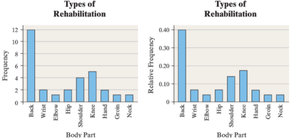
Bar Graphs
Bar graphs are used to visually display frequencies or relative frequencies for categorical data. Each bar represents a category, with the height corresponding to the frequency or relative frequency.
Advantages: Bar graphs make it easy to compare categories and see patterns.
Relative Frequency Bar Graphs: Useful for comparing proportions across groups.
Pie Charts
Pie charts display the relative frequencies of categories as slices of a circle, always summing to 100%. They are best for showing proportions of a whole.
Two-Way Tables and Contingency Tables
Two-way tables (contingency tables) display the relationship between two categorical variables, allowing for comparison across groups.
Purpose: To examine associations between variables.

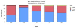
Side-by-Side and Stacked Bar Graphs
These graphs are used to compare groups across two categorical variables. Side-by-side bar graphs show each group separately, while stacked bar graphs combine them for easier comparison of totals.

Describing Quantitative Data
Organizing Quantitative Data
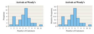
Quantitative data, such as the number of customers arriving at a restaurant, can be organized into frequency and relative frequency tables.
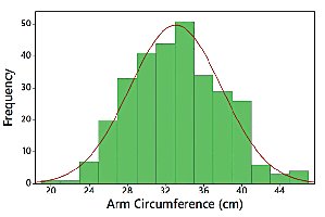
Histograms
Histograms group quantitative data into bins and display the frequency or relative frequency for each bin. They are best for large datasets and show the distribution shape.
No gaps between bars: Unless a bin has no data.
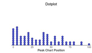
Dotplots
Dotplots display each individual data point as a dot. They are useful for small datasets or when there are few repeated values.
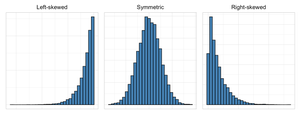
Distribution Shapes
Common shapes include normal (bell-shaped), uniform, right-skewed, and left-skewed distributions. The shape provides insight into the nature of the data.
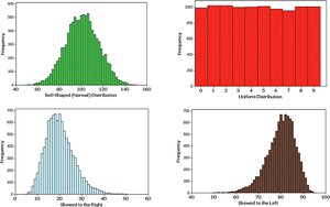
Normal Distribution
A normal distribution is symmetric and bell-shaped. Many natural phenomena follow this pattern.
Skewness
Skewness describes asymmetry in the distribution. Right-skewed distributions have a longer tail on the right; left-skewed have a longer tail on the left.
Describing Distributions: Shape, Center, Spread, and Outliers
Quantitative data distributions are described by their shape, center, spread, and outliers.
Center: The middle or typical value (mean, median, mode).
Spread: The range or variability of the data.
Outliers: Values far from the rest, which can influence statistical results.
Range Formula
The range is calculated as:
Measures of Central Tendency
Three main measures of central tendency are used to describe the "average" or typical value in a dataset:
Mean: The arithmetic average, calculated as the sum of all values divided by the number of values.
Median: The middle value when data are ordered.
Mode: The most frequent observation.
Comparing Graphs for the Same Data
Different graphs (histograms, dotplots, bar graphs, pie charts) can display the same data, but each has advantages and disadvantages depending on the data type and the information needed.
Histograms: Best for large quantitative datasets.
Dotplots: Useful for small datasets or when individual values matter.
Bar Graphs: Good for categorical data.
Pie Charts: Show proportions of a whole.
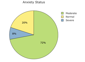
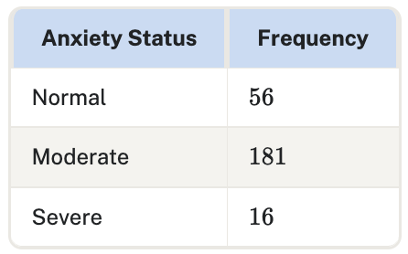
Sample Table: Frequency Table for Anxiety Status
This table summarizes the frequency of different anxiety statuses in a sample.
Anxiety Status | Frequency |
|---|---|
Normal | 56 |
Moderate | 181 |
Severe | 16 |

Sample Table: Contingency Table for First-Generation and ESL Status
Non First Generation | First Generation | |
|---|---|---|
Not ESL | 152,232 | 88,281 |
ESL | 8,145 | 9,875 |
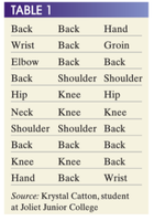
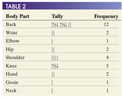
Sample Table: Frequency Table for Body Part Injuries
Body Part | Tally | Frequency |
|---|---|---|
Back | |||| |||| ||| | 12 |
Wrist | || | 2 |
Elbow | | | 1 |
Hip | || | 2 |
Shoulder | |||| | 4 |
Knee | ||||| | 5 |
Hand | || | 2 |
Groin | | | 1 |
Neck | | | 1 |


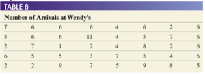
Sample Table: Arrivals at Wendy's
Number of Arrivals |
|---|
7, 6, 6, 6, 4, 6, 2, 6 |
5, 6, 6, 11, 4, 5, 7, 6 |
2, 7, 1, 2, 4, 8, 2, 6 |
6, 5, 3, 7, 5, 4, 6 |
2, 2, 9, 7, 5, 9, 8, 5 |

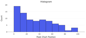
Sample Graphs: Distribution of Peak Chart Positions
Sample Graphs: Common Distribution Shapes
Sample Graph: Normal Distribution
Summary Table: Measures of Central Tendency
Measure | Definition |
|---|---|
Mean | Arithmetic average |
Median | Middle value |
Mode | Most frequent value |
Key Takeaways
Organizing and graphically displaying data is essential for understanding and communicating statistical information.
Frequency tables, bar graphs, and pie charts are fundamental tools for categorical data.
Histograms and dotplots are used for quantitative data, revealing distribution shapes, centers, spreads, and outliers.
Different graphs provide different perspectives; choosing the right one depends on the data and the question of interest.
